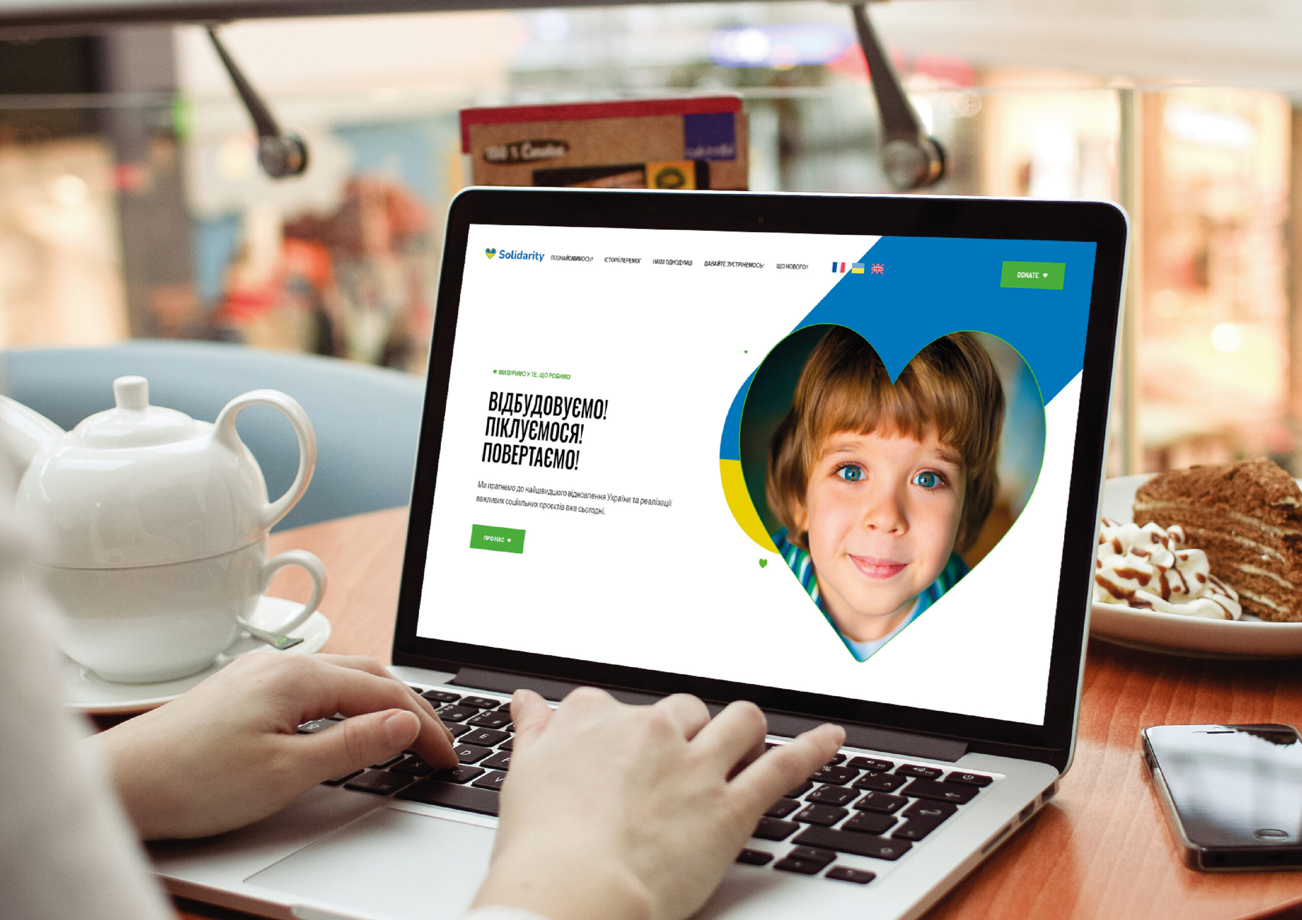
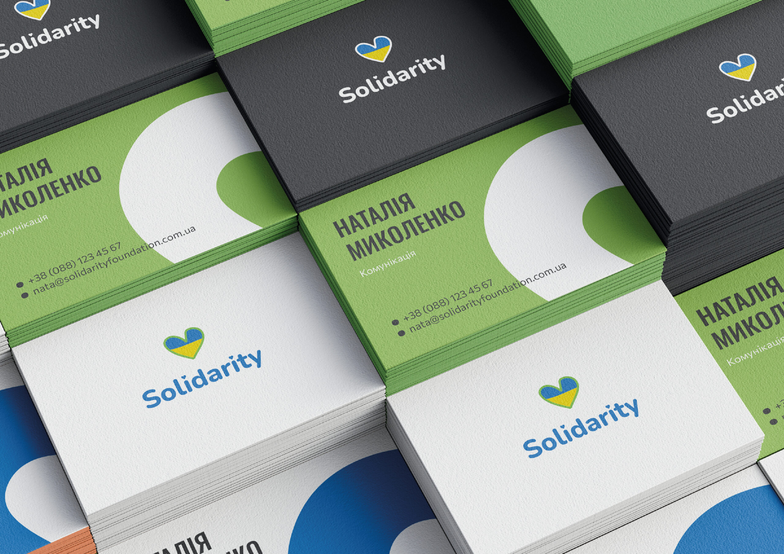
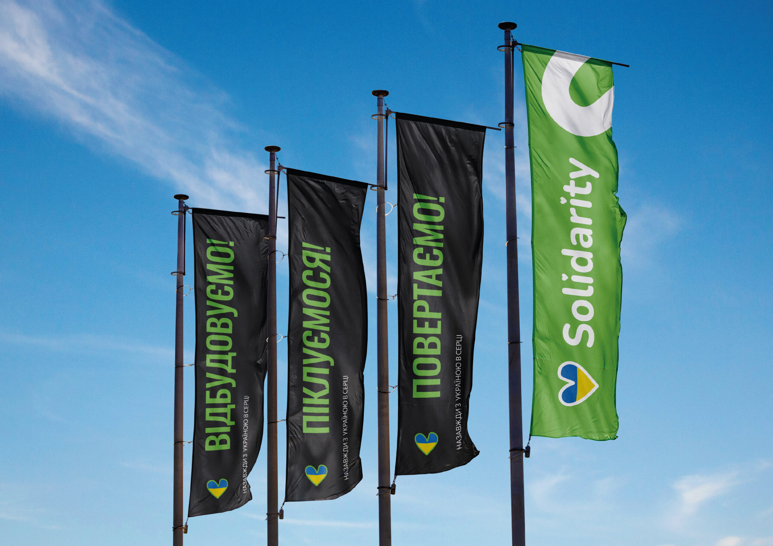
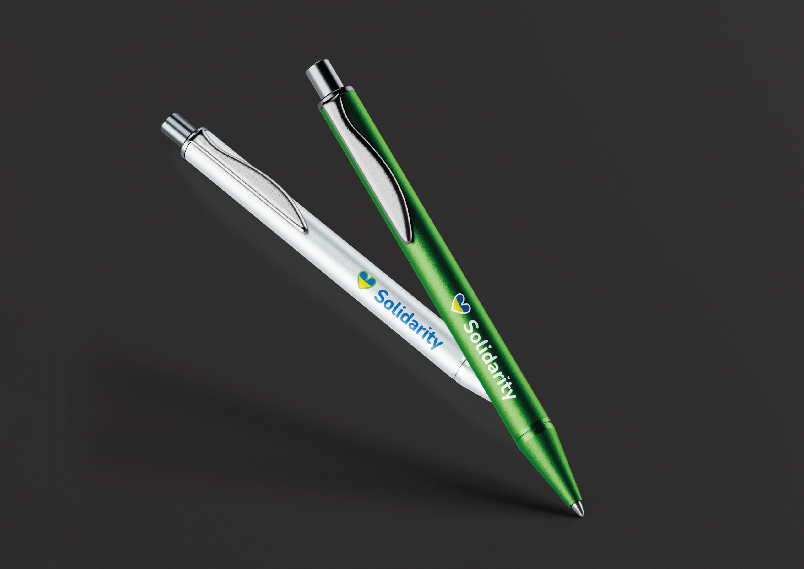
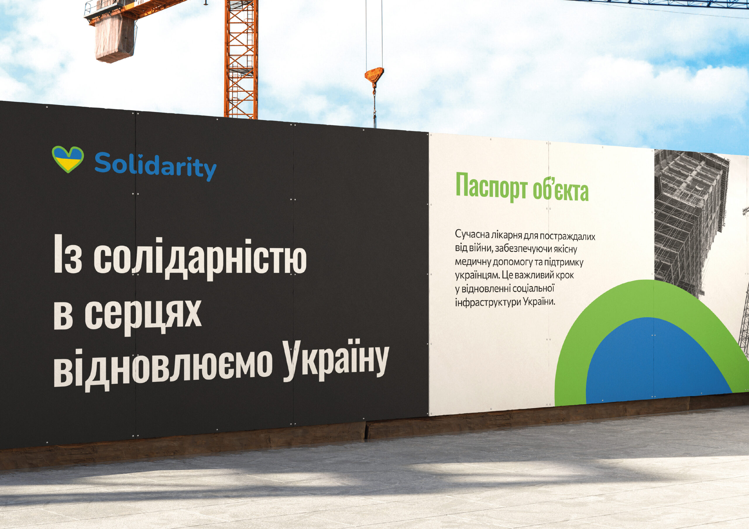
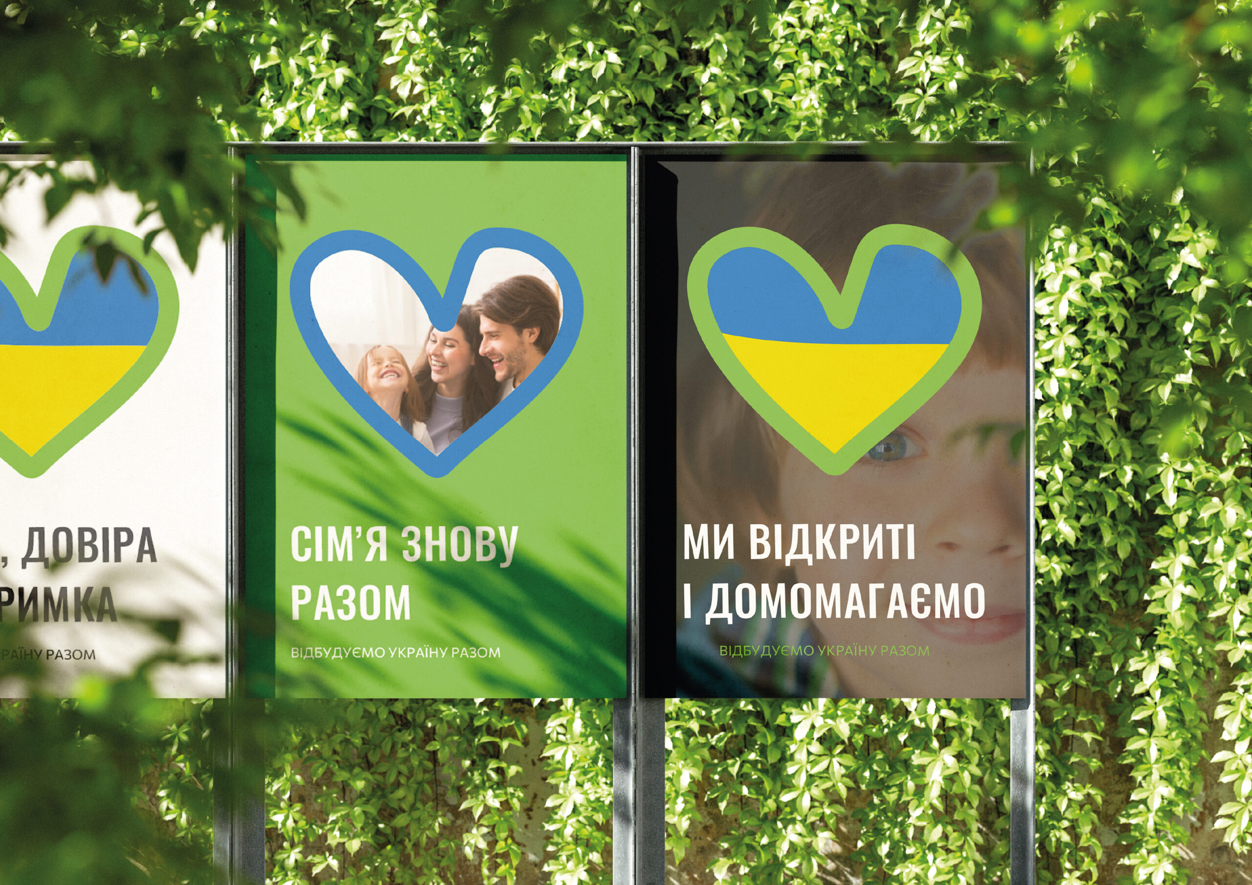
Logo rebranding, development of a printing concept, and layout design in a new concept for the Solidarity charitable foundation.
REASONS FOR REBRANDING
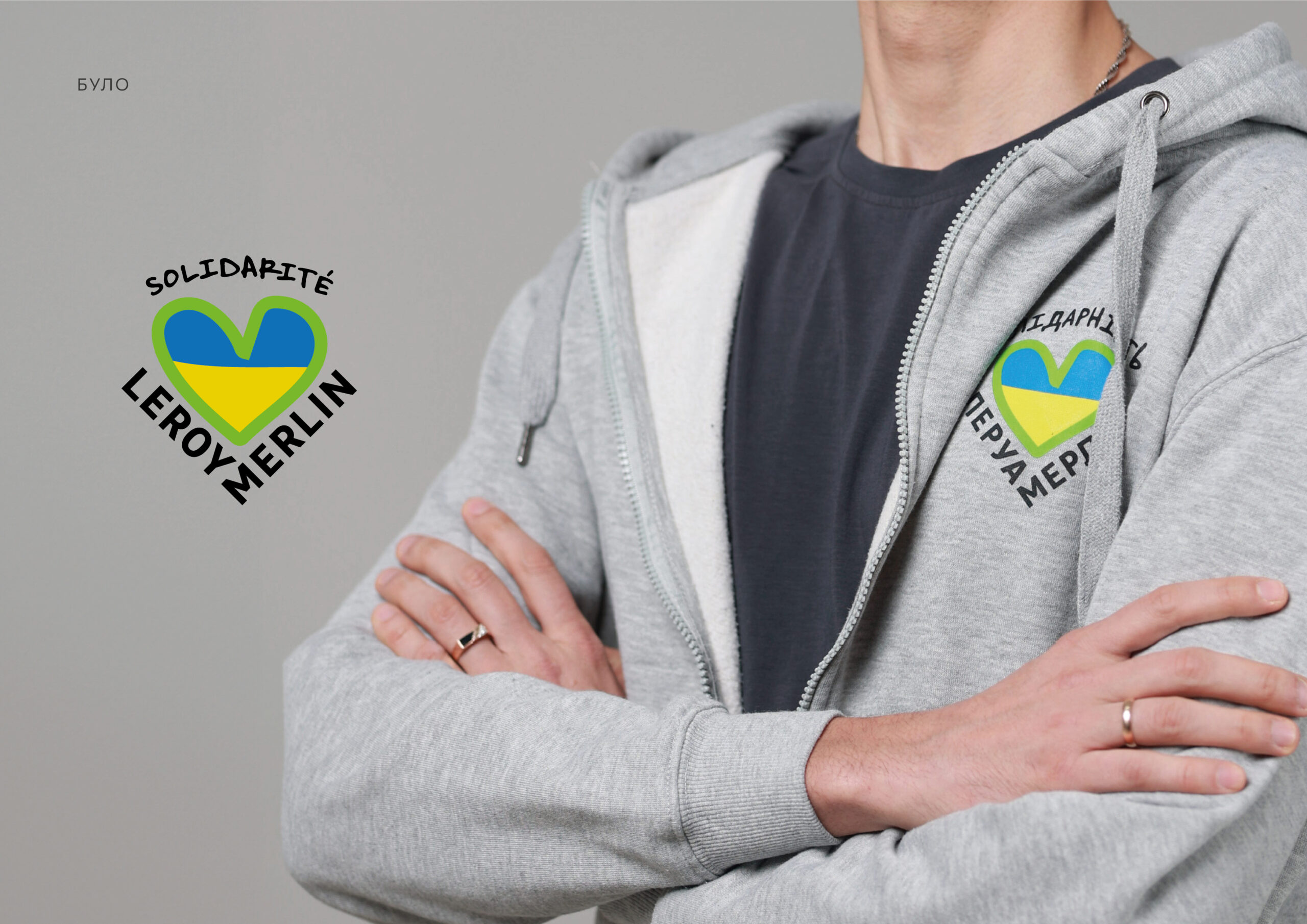
The previous logo was difficult to perceive — it had only one version, which made it difficult to use on the website and in branding, particularly on pens. The client also wanted to remove the commercial reference to Leroy Merlin. There was virtually no visual identity: all media looked different, without a unified system or stylistic integrity.
TASK
The main areas of activity are the reconstruction of private housing and social infrastructure facilities damaged as a result of military operations. It also includes setting up shelters for temporarily displaced persons and homes for children deprived of parental care, rebuilding schools and kindergartens, hospitals and clinics, and creating bomb shelters and mobile medical aid stations.
The main goal of the project is the restoration of Ukraine.
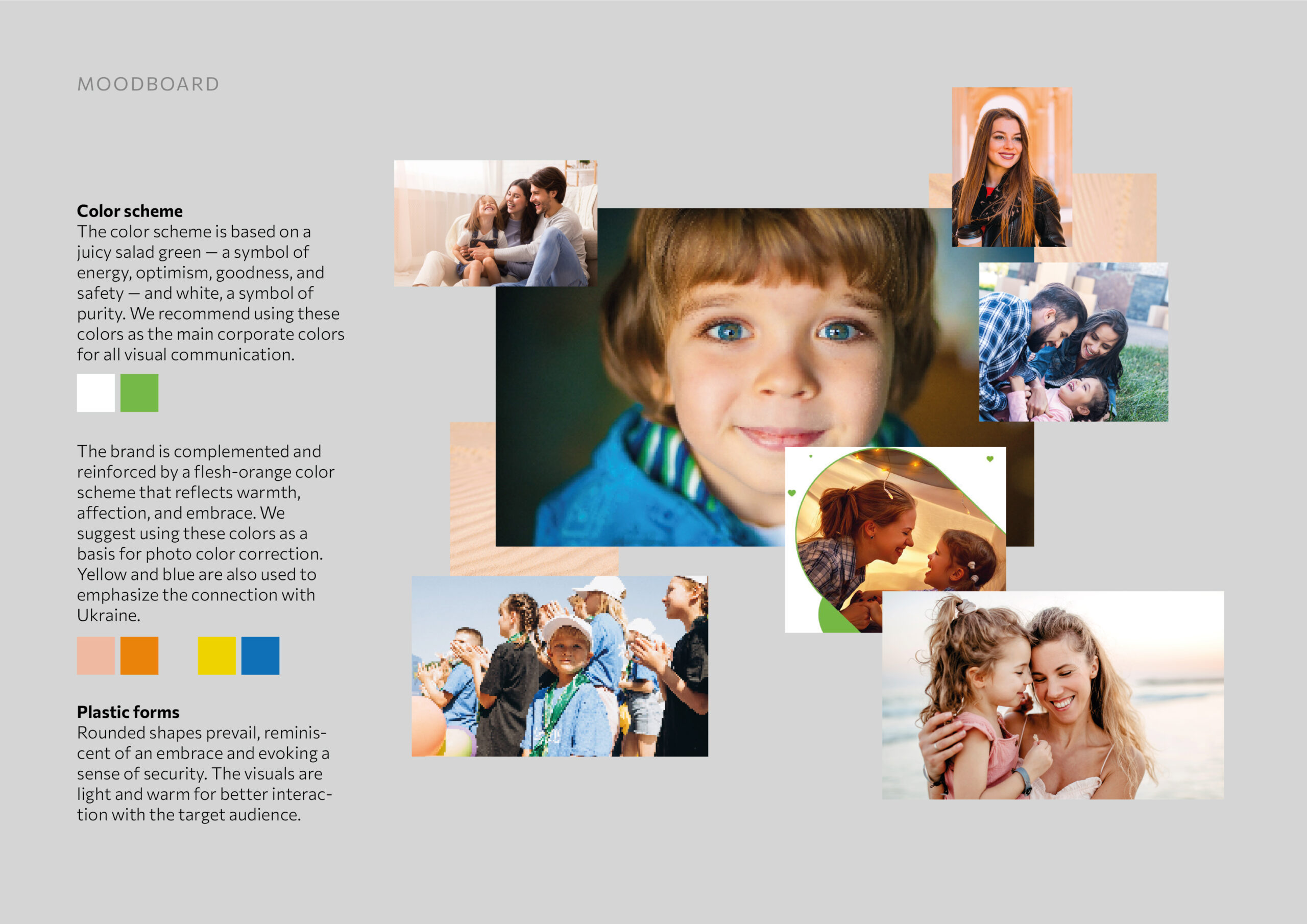
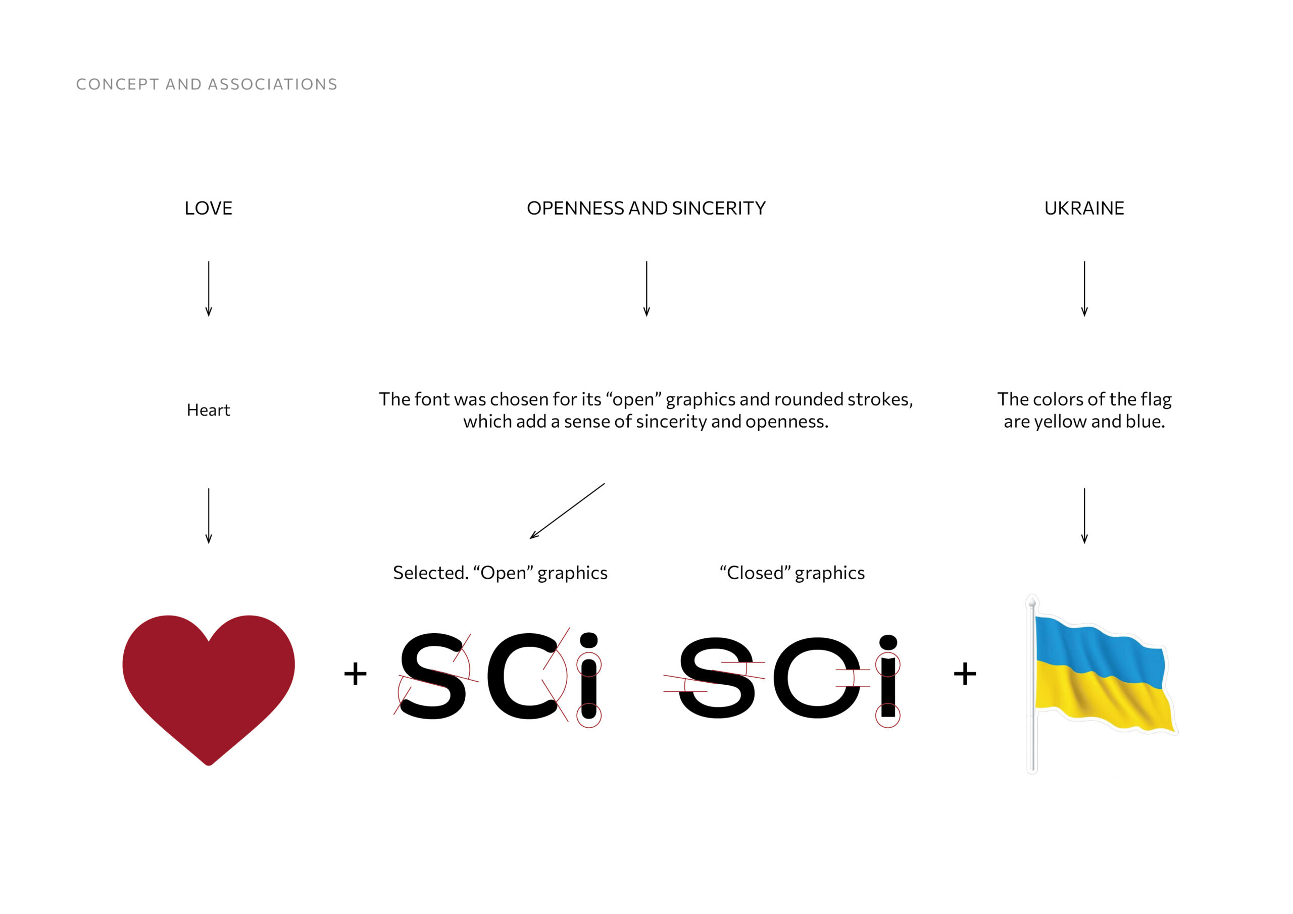
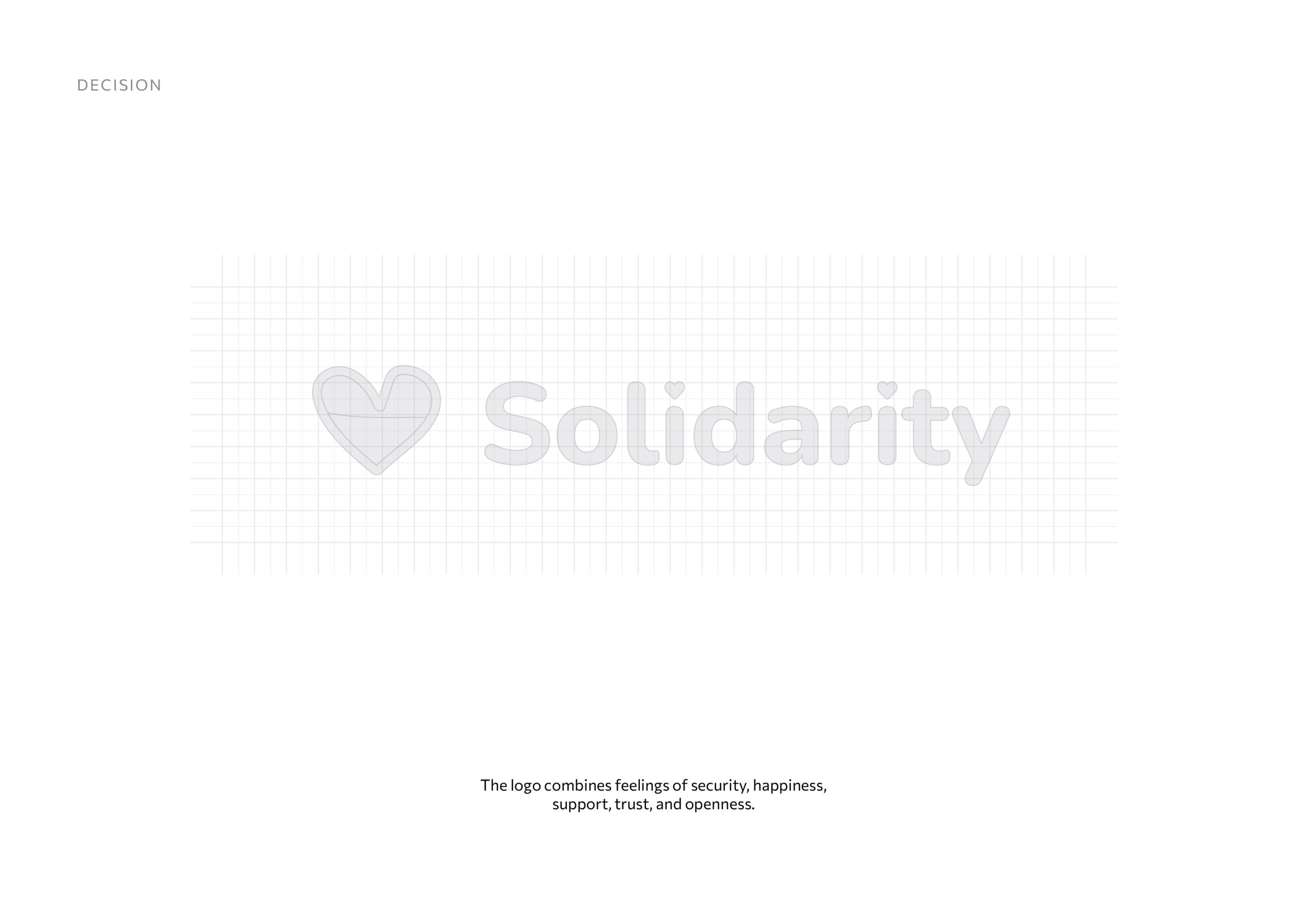
The logo and corporate identity should reflect care, warmth, openness, safety, assistance, and solidarity with Ukrainians and everyone else.