
Clondalkin Dental — Dentistry
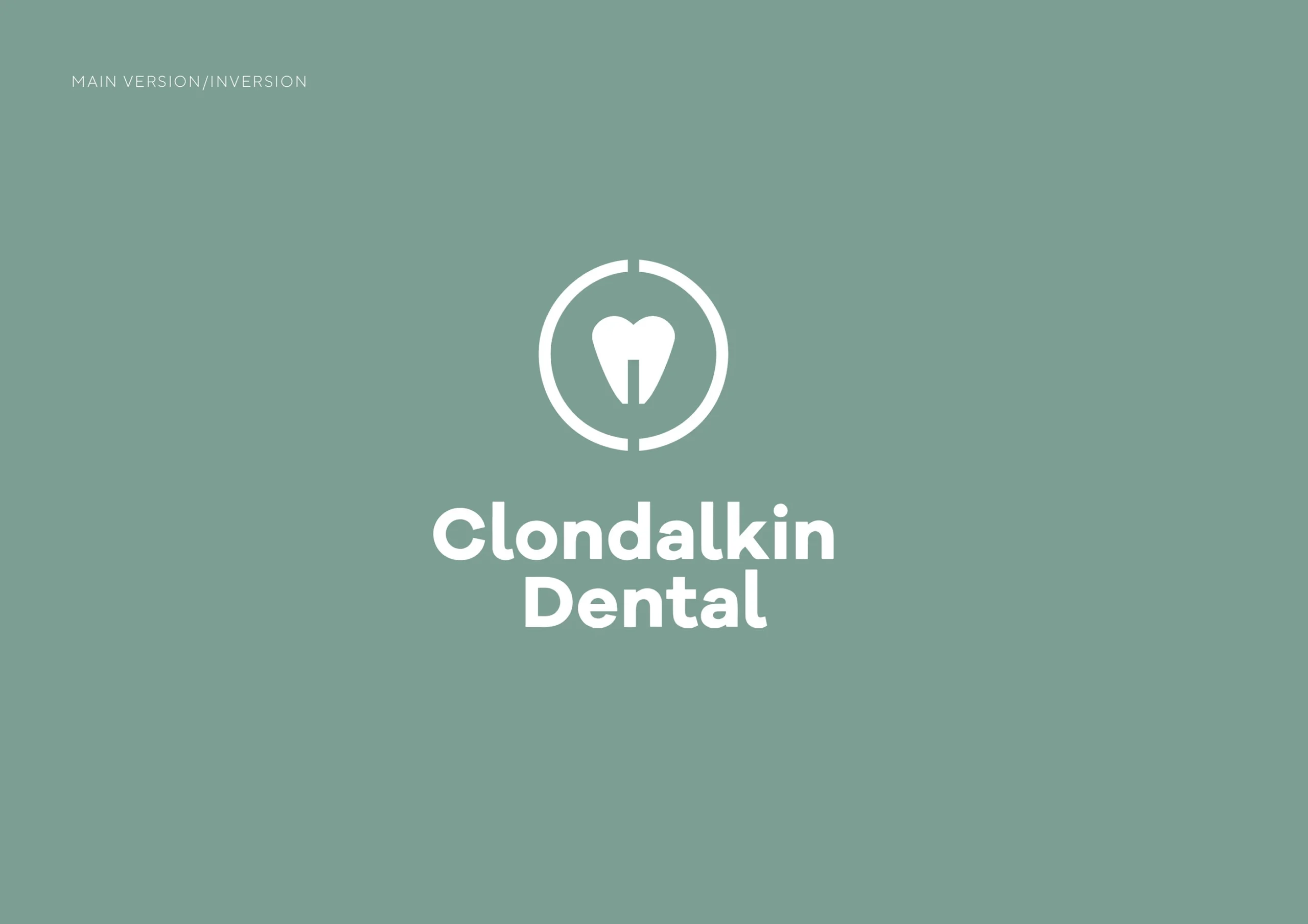
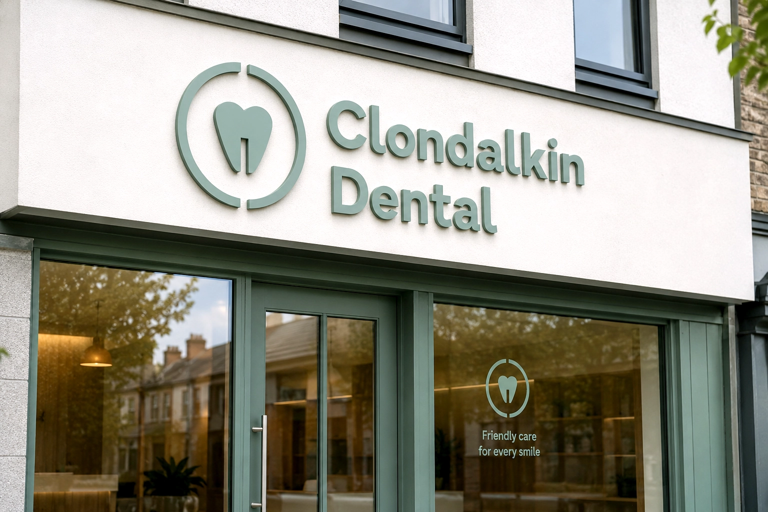
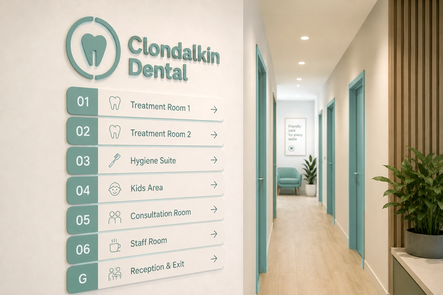
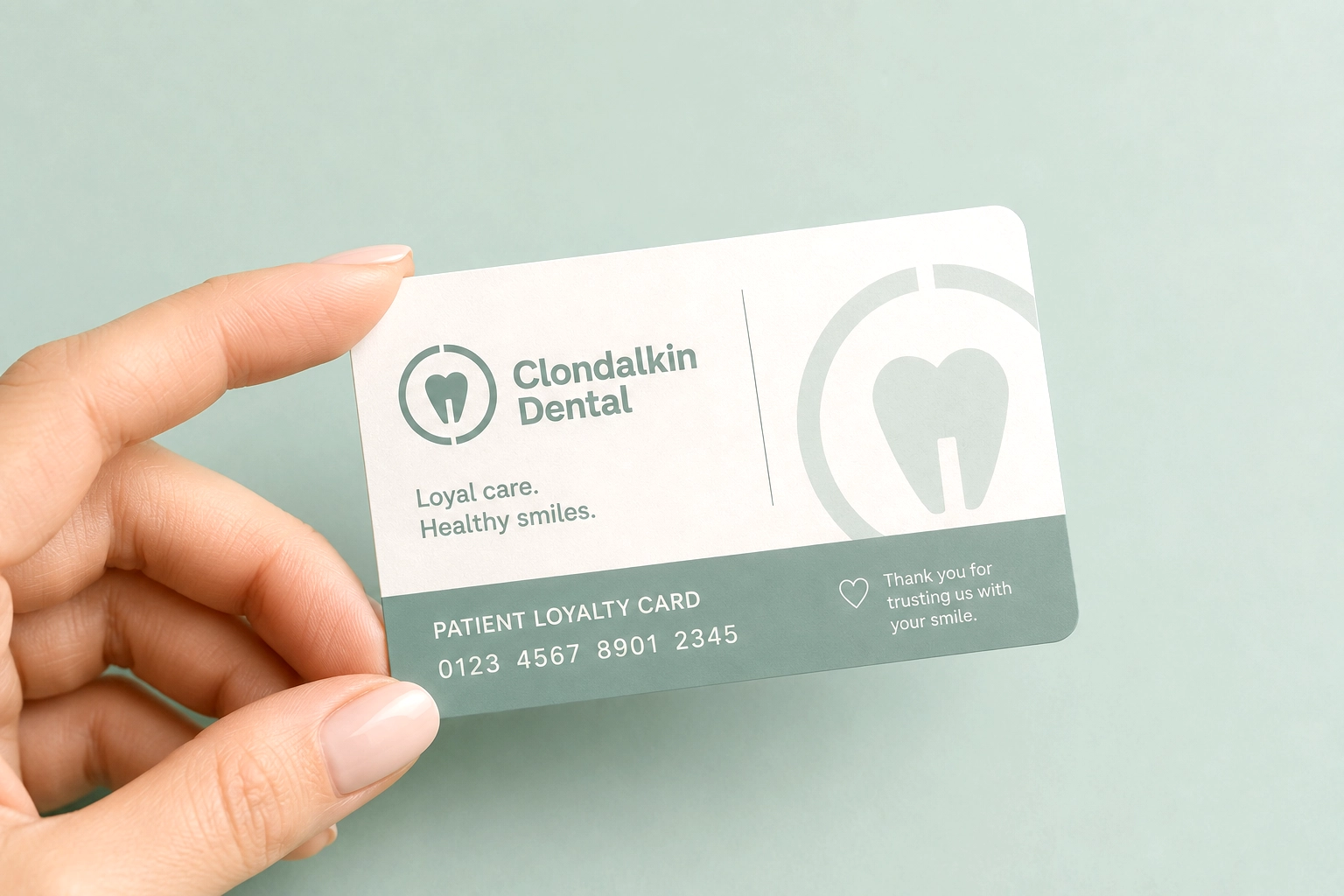
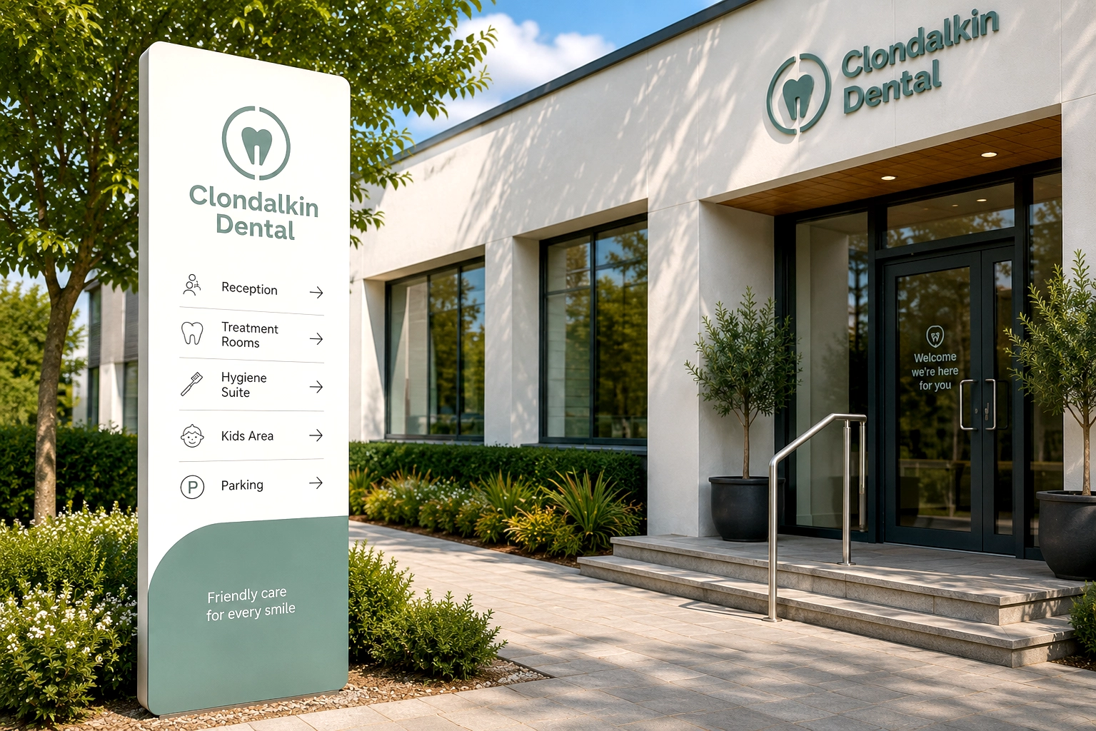
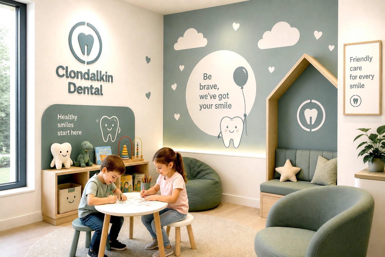
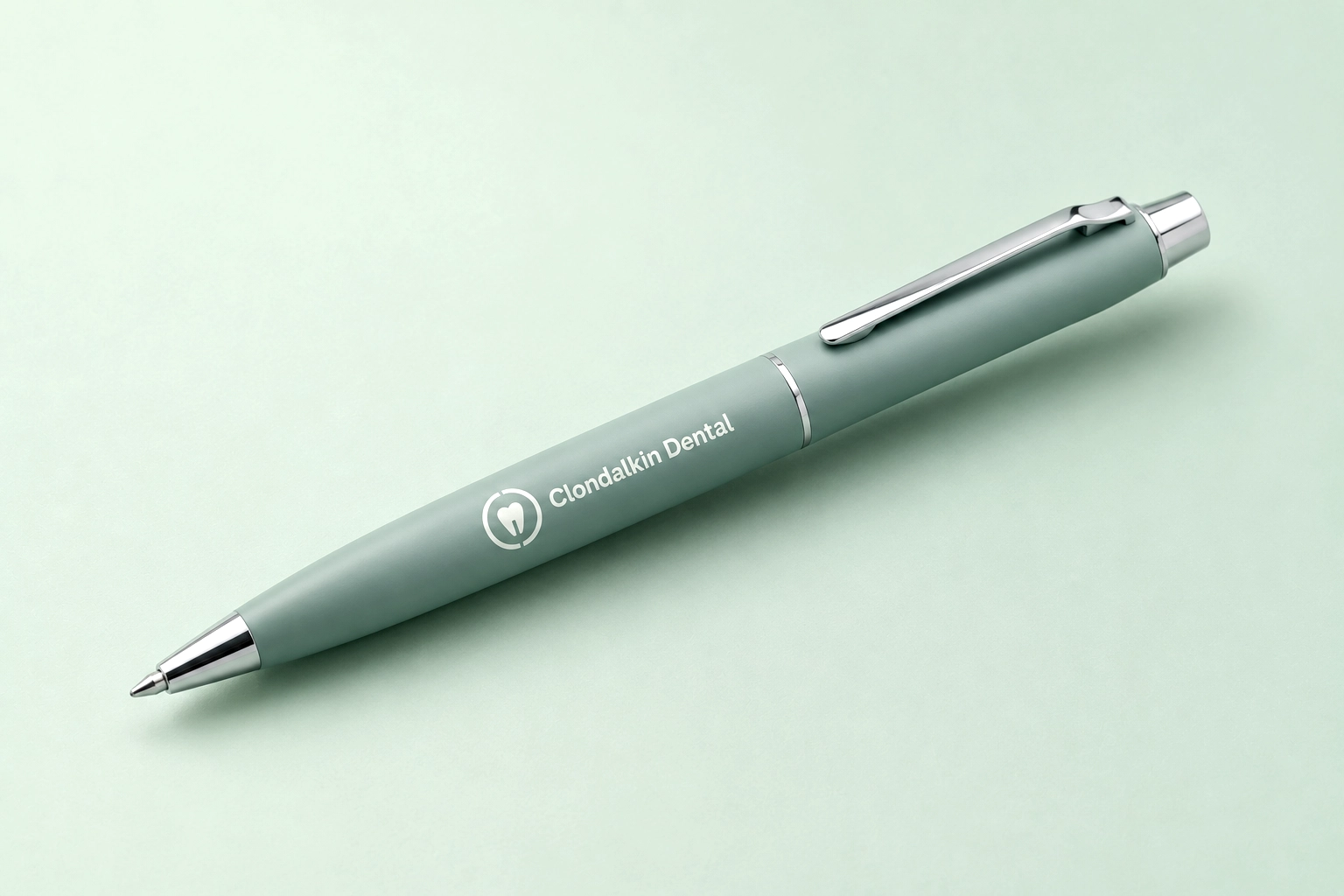
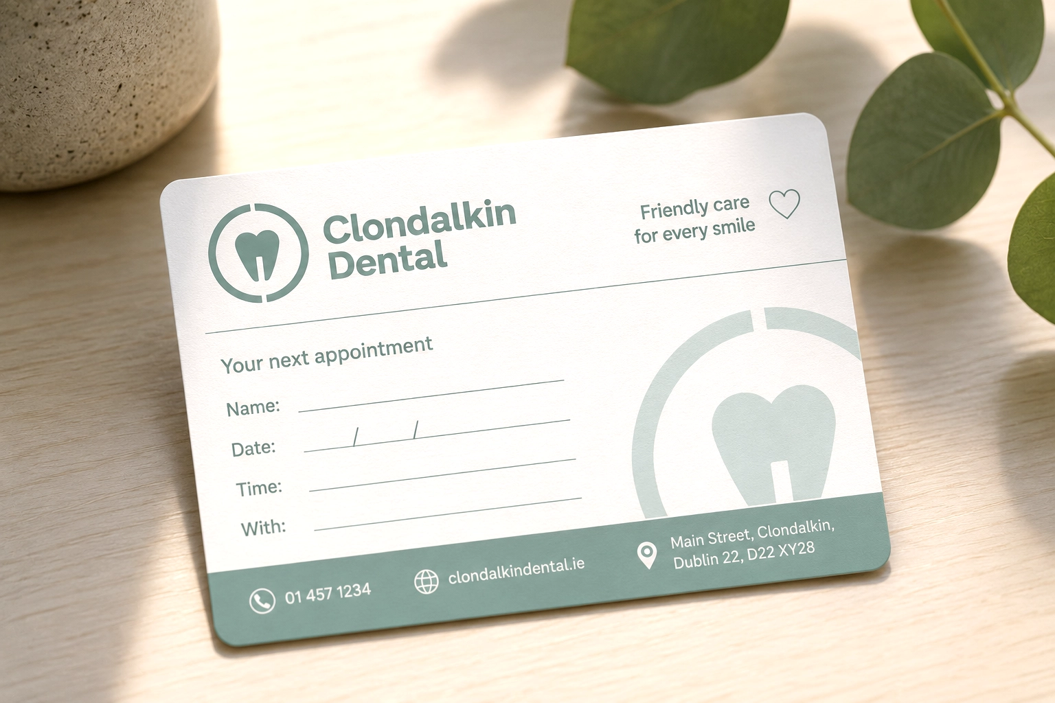
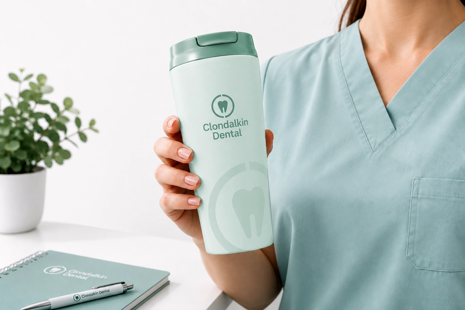
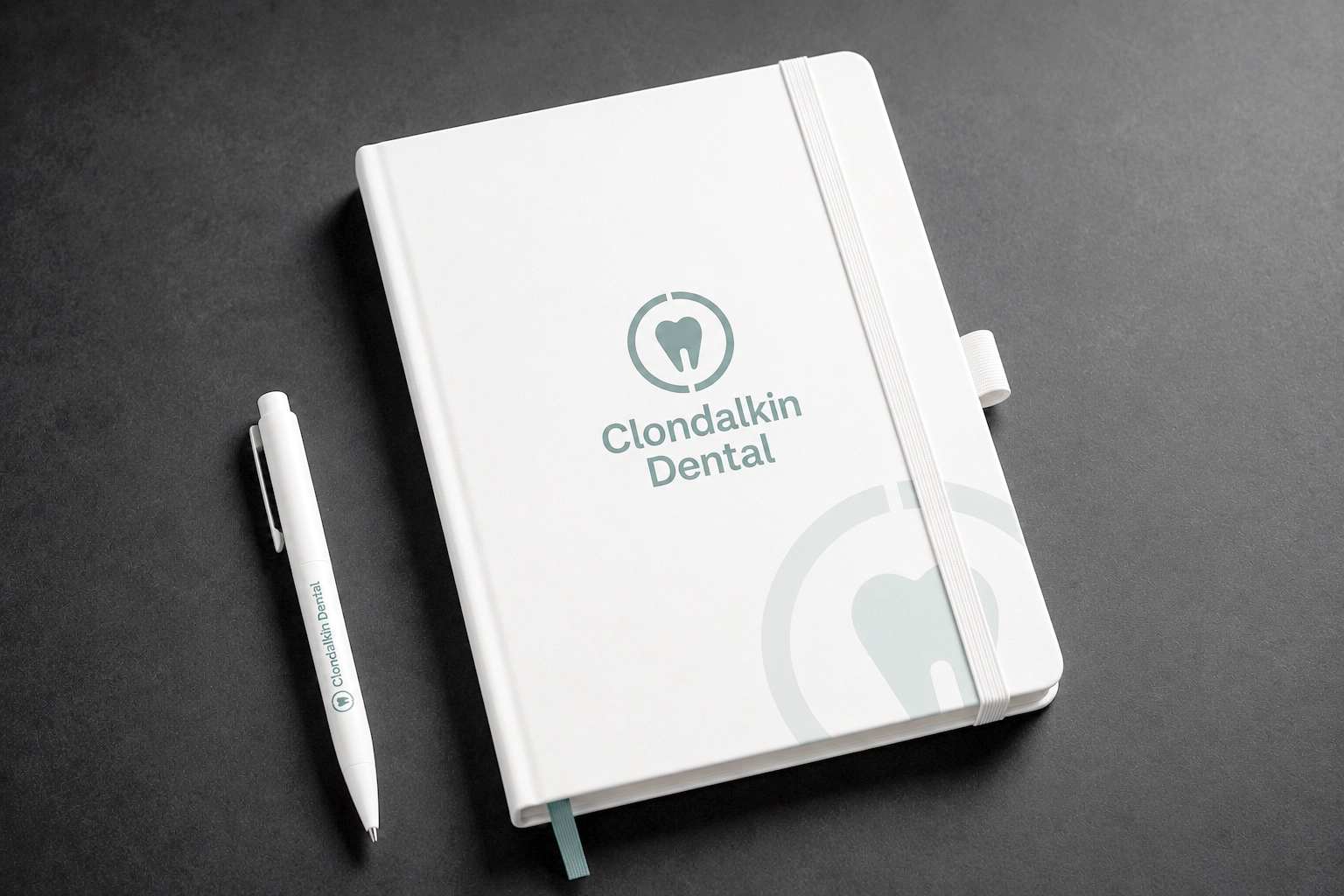
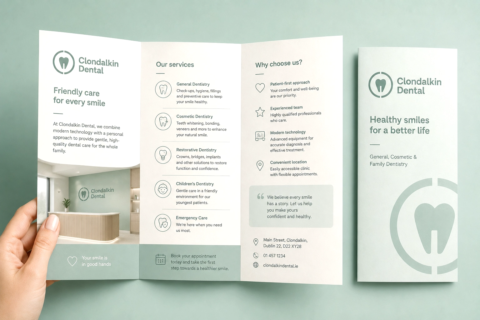
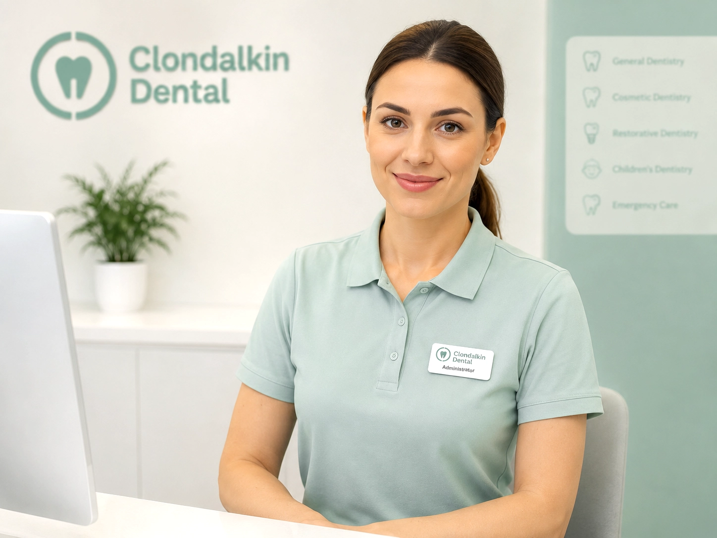
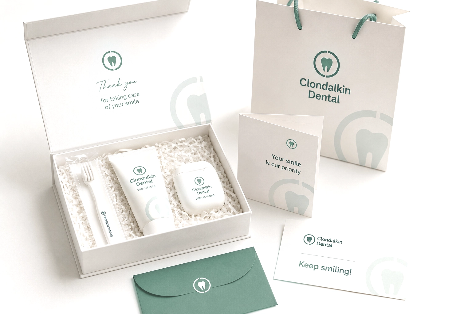
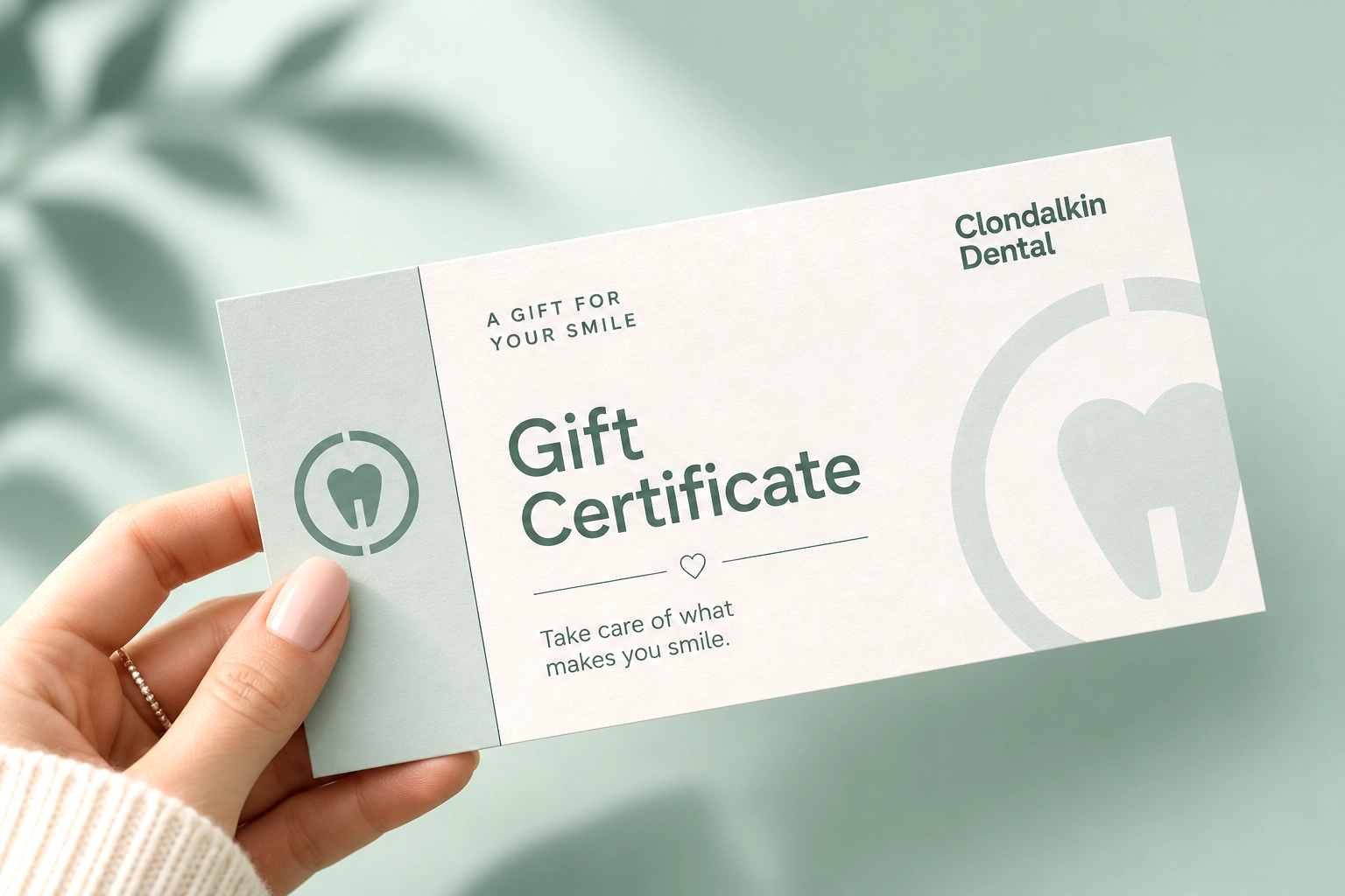
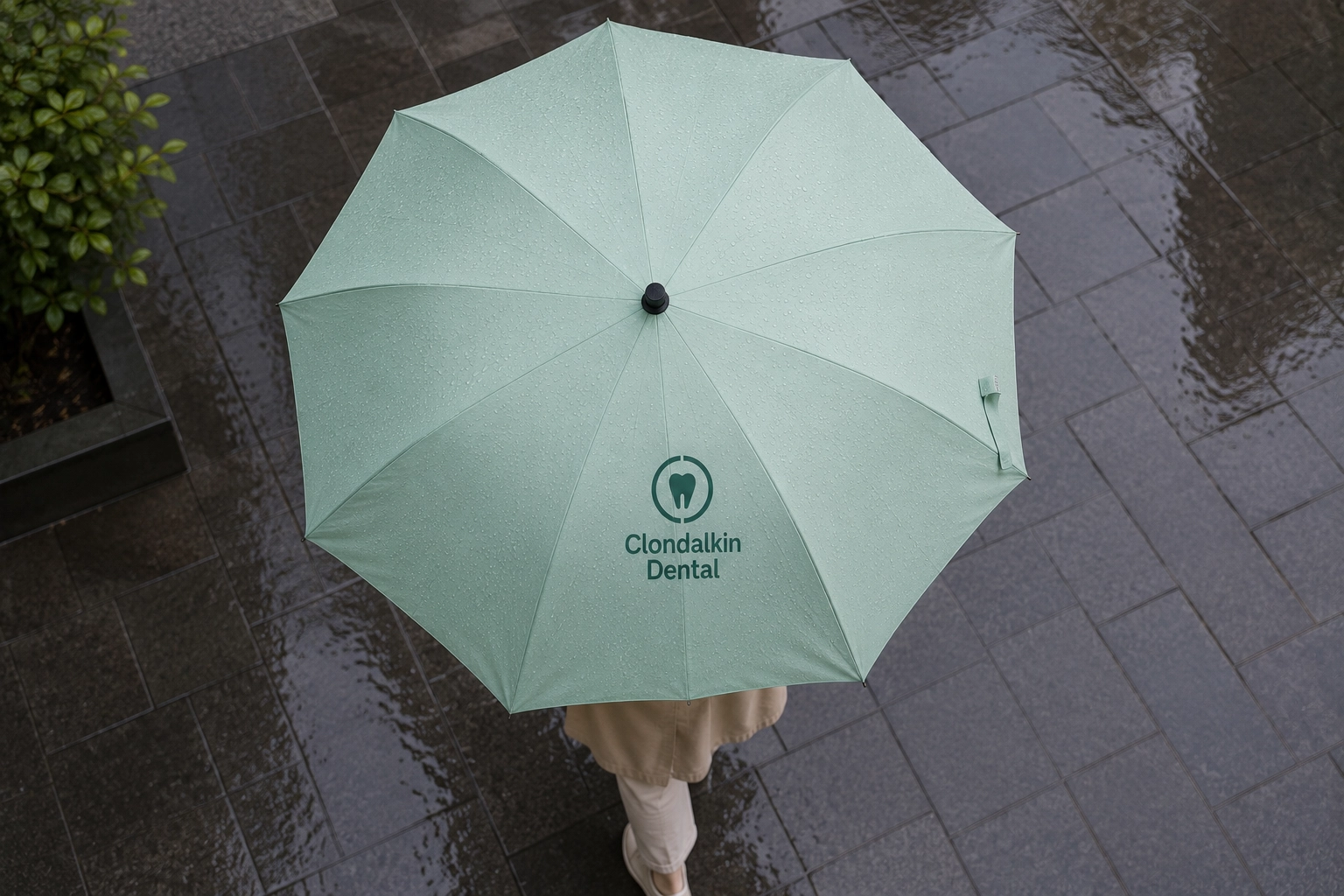
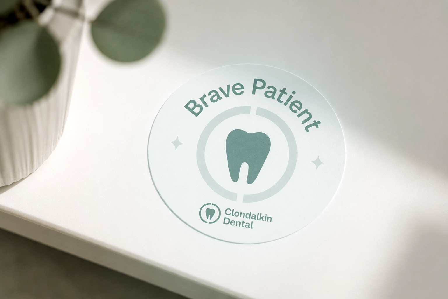
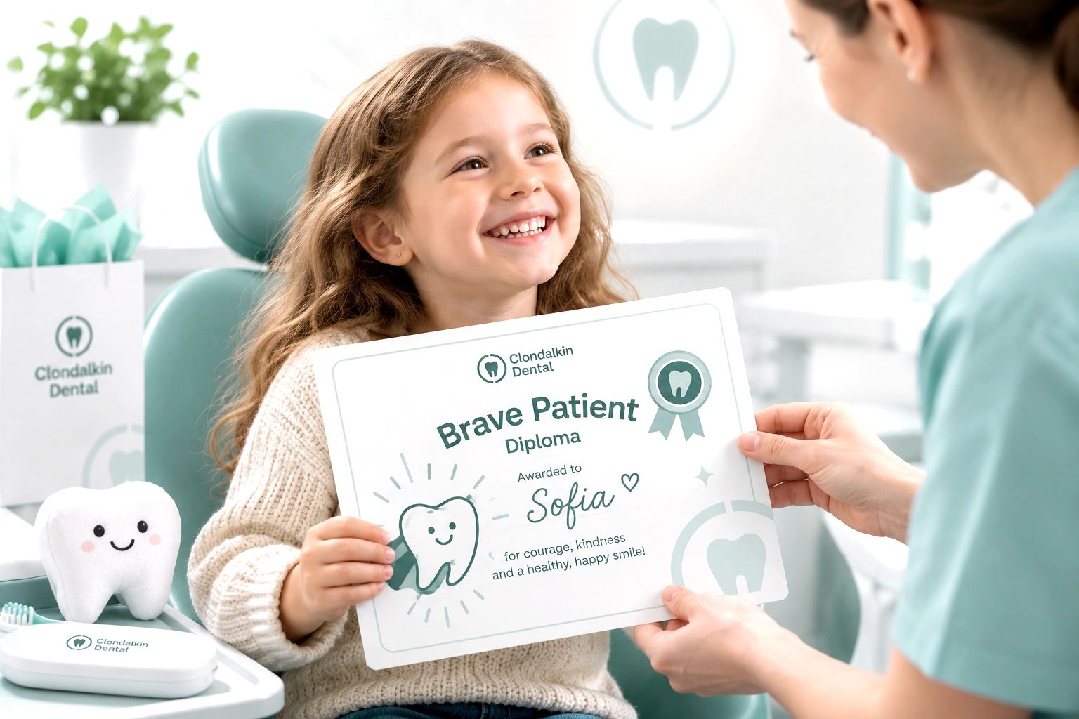
Logo redesign and corporate identity concept, print layout, in a new concept for a dental practice — Clondalkin Dental
REASONS FOR REBRANDING
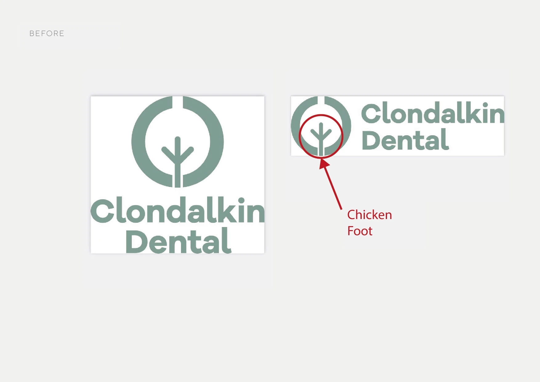
The previous logo and visual identity used by the former owners look strange because of that “chicken foot in the center.” It doesn’t convey any sense of warmth or love at all. But it’s important to keep the color scheme and the circle, which are associated with care.
TASK
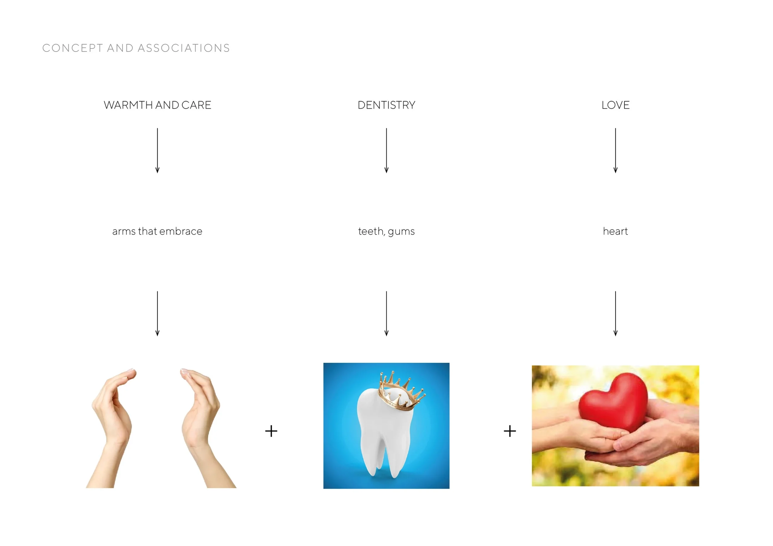
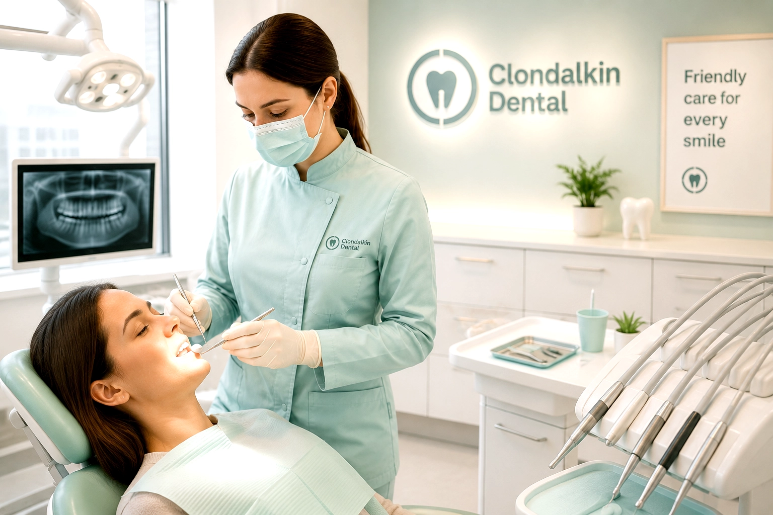
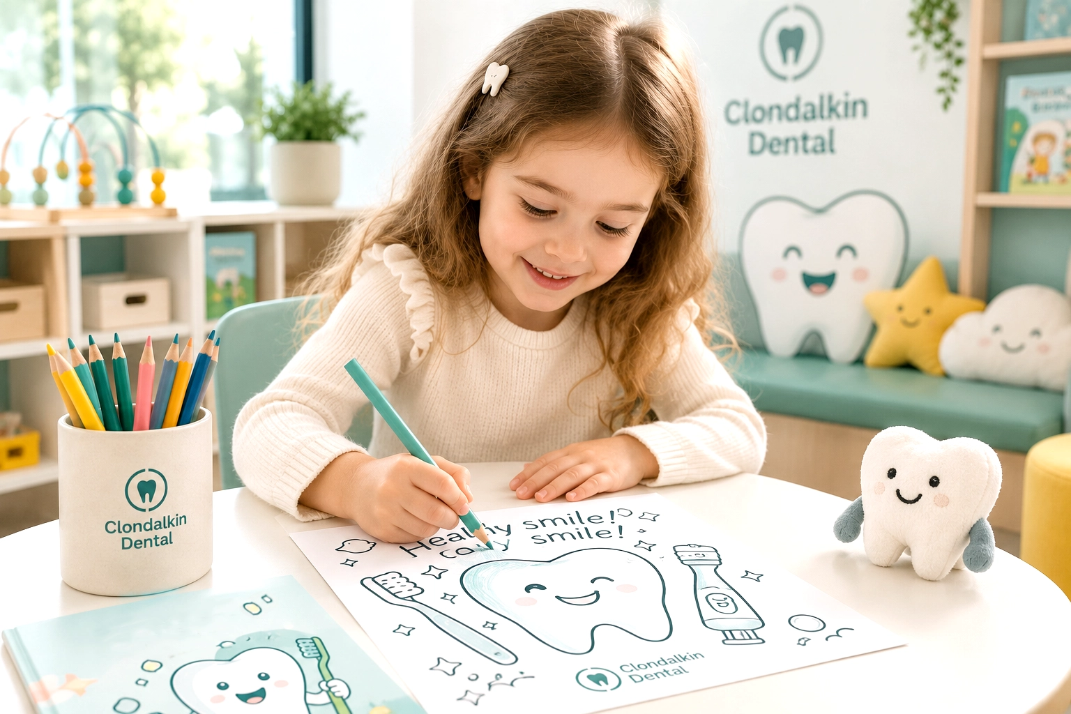
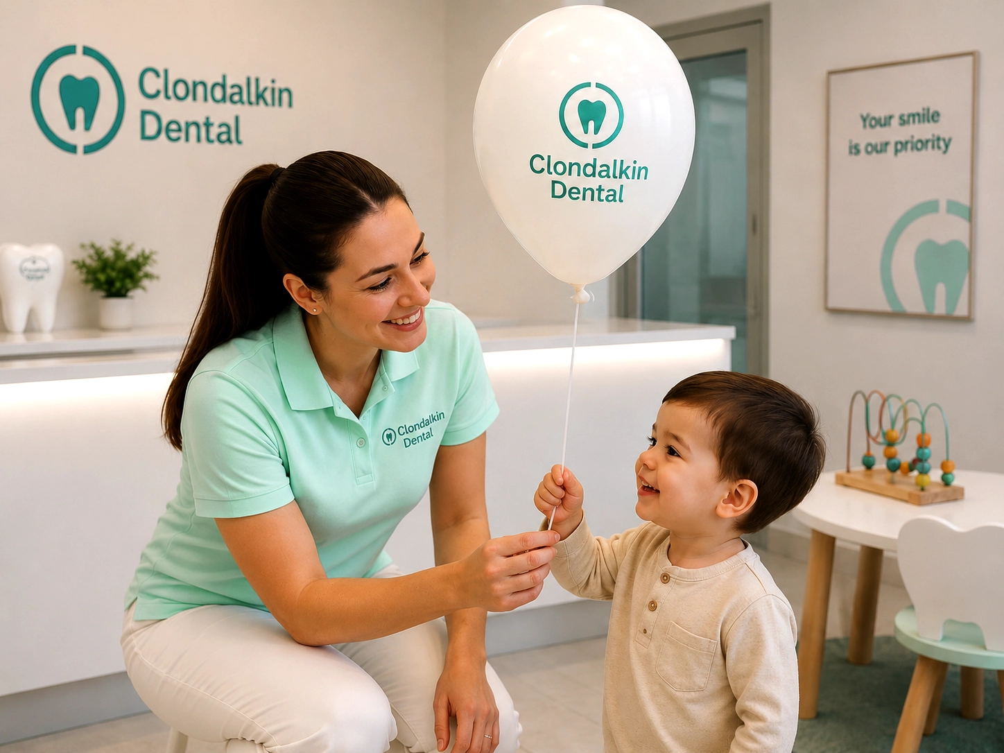
The logo should convey the atmosphere of a family dental practice—a place where patients feel warmth, care, and peace of mind from the very first moment, just as if they were at home. It should convey the idea of genuine care, home-like comfort, and family values, creating the feeling that every patient is in the capable hands of professionals who care for their health just as attentively as they do for the health of their own families.
For the target audience, the logo should become a symbol of a place where a modern professional approach, attentive care for each patient, and genuine concern come together. It should be associated with high-quality medical services, responsibility, transparency, and long-term, trusting relationships, so that people can be confident that here they will always be listened to, supported, and provided with the best care.
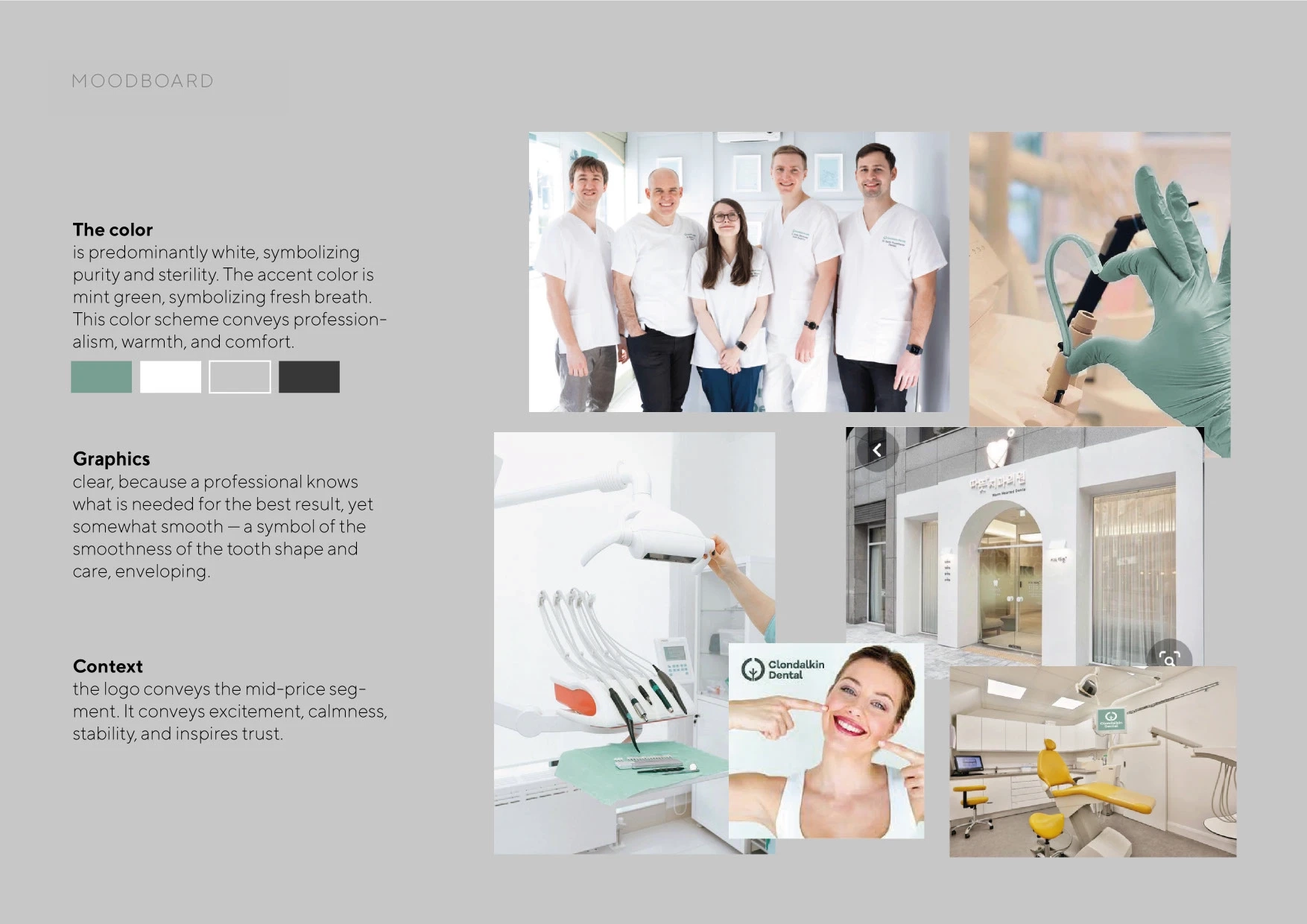
Key Moods
- Care and Warmth
- Comfort
- Family
- Trust
Points of Differentiation
- A “home-away-from-home” experience: a comfortable space, friendly staff, and a peaceful atmosphere.
- We care just as much about your emotional well-being as we do about the quality of your treatment.
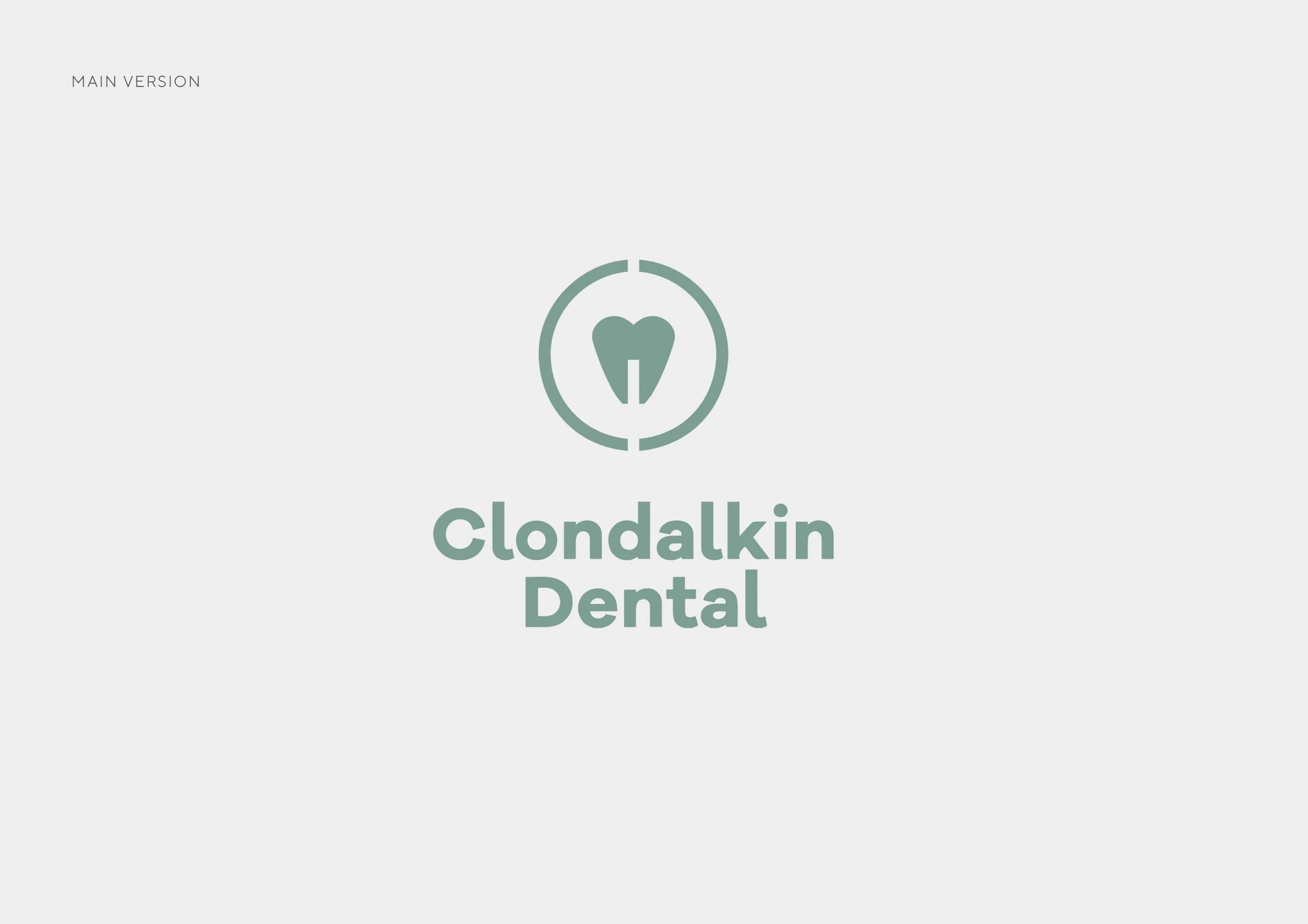
- Use of corporate graphic device
FEEDBACK