
Doshkola — Private Preschool
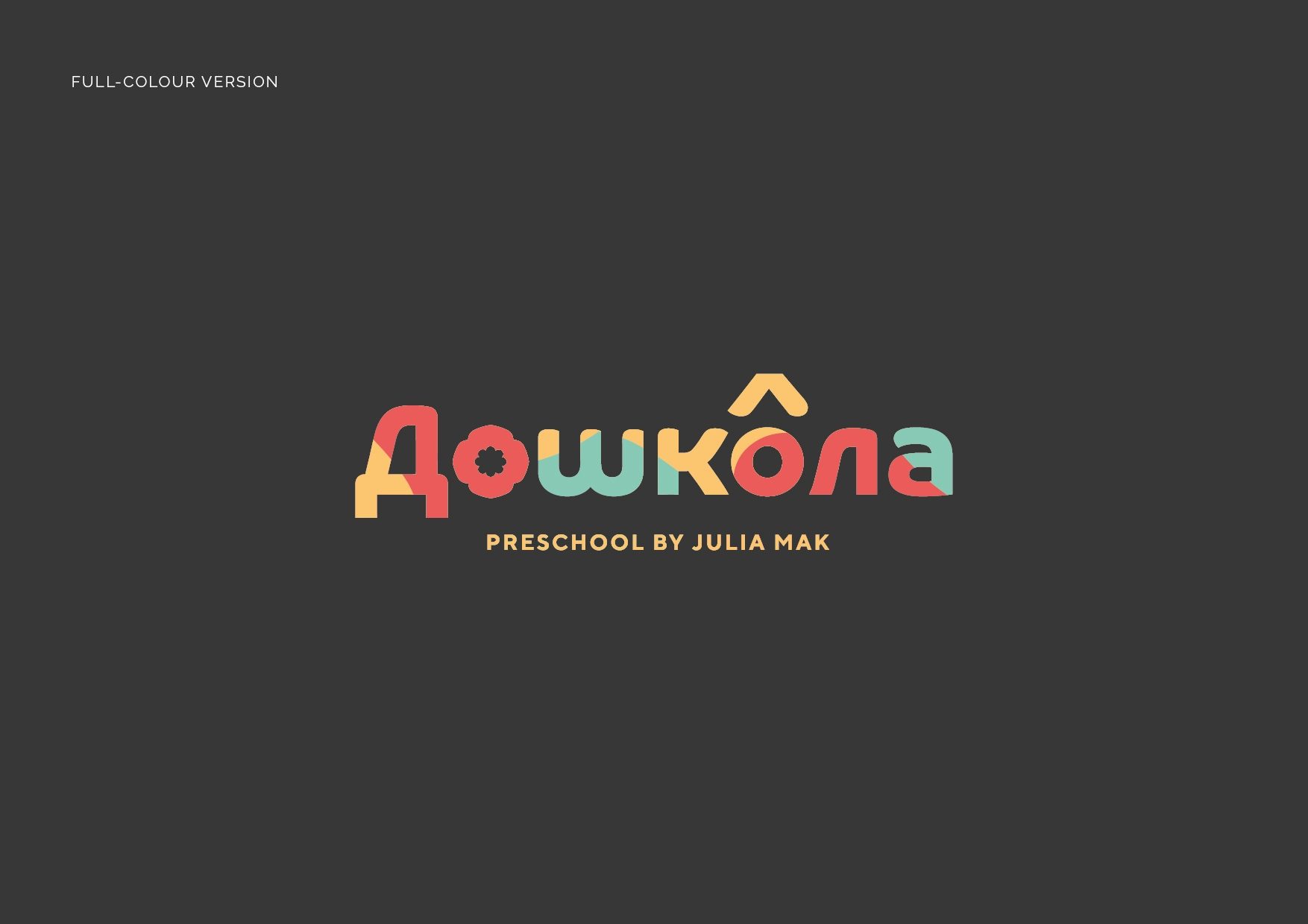
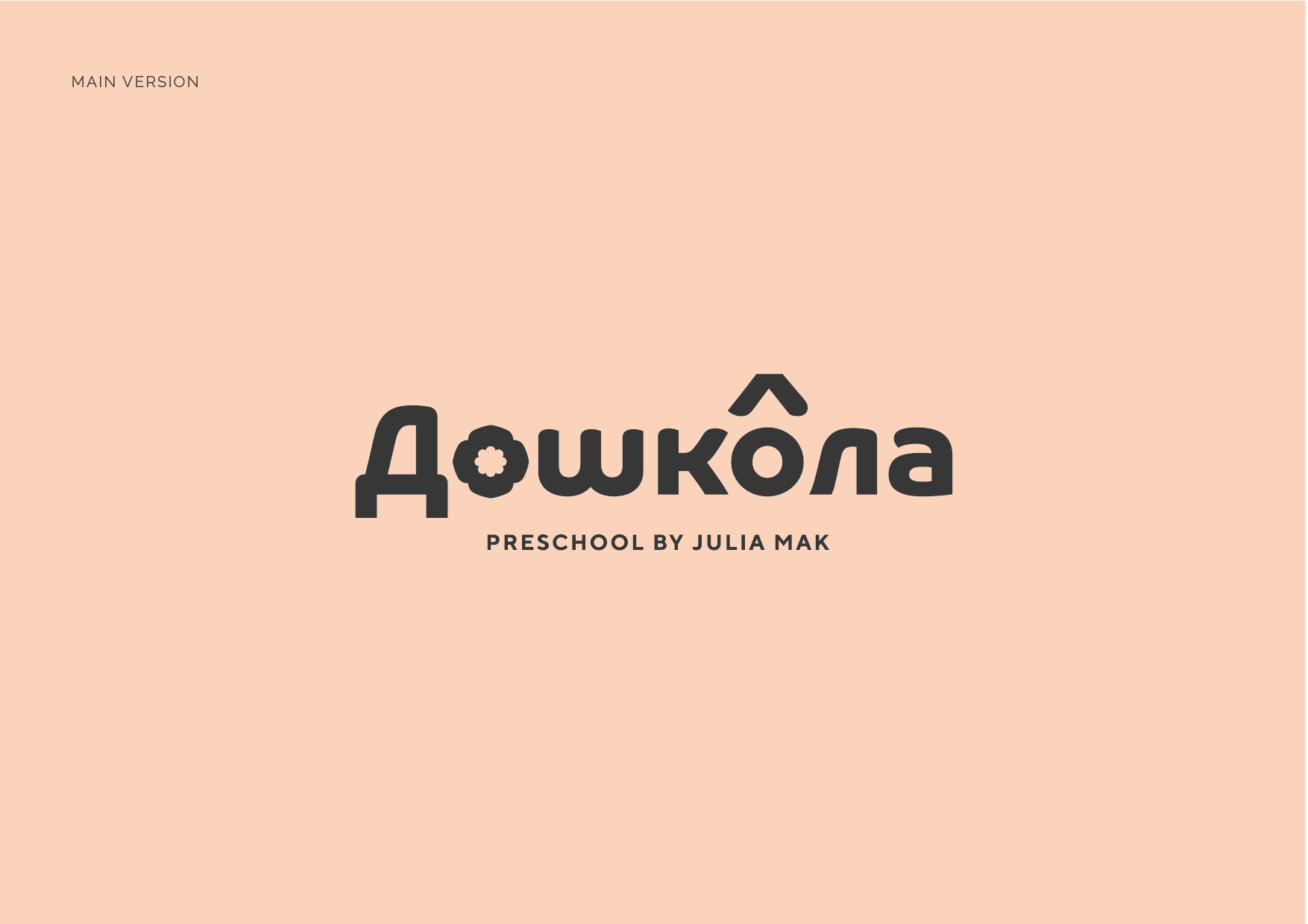
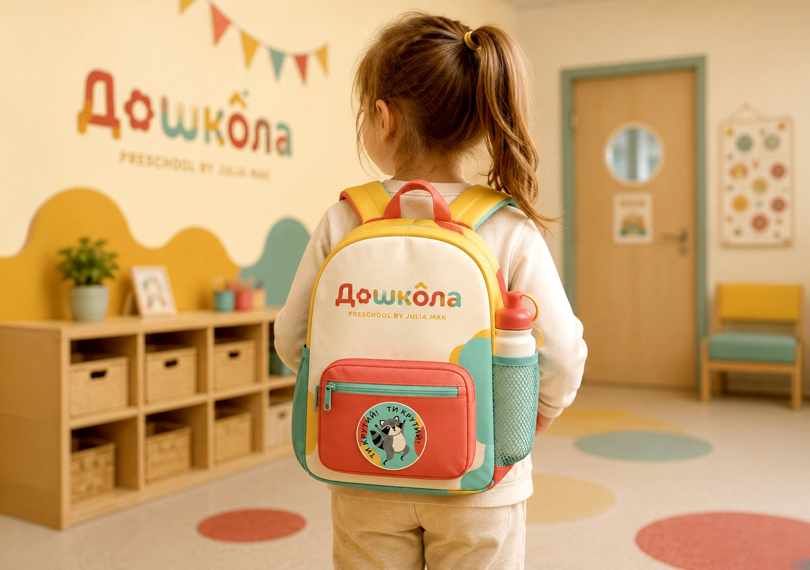
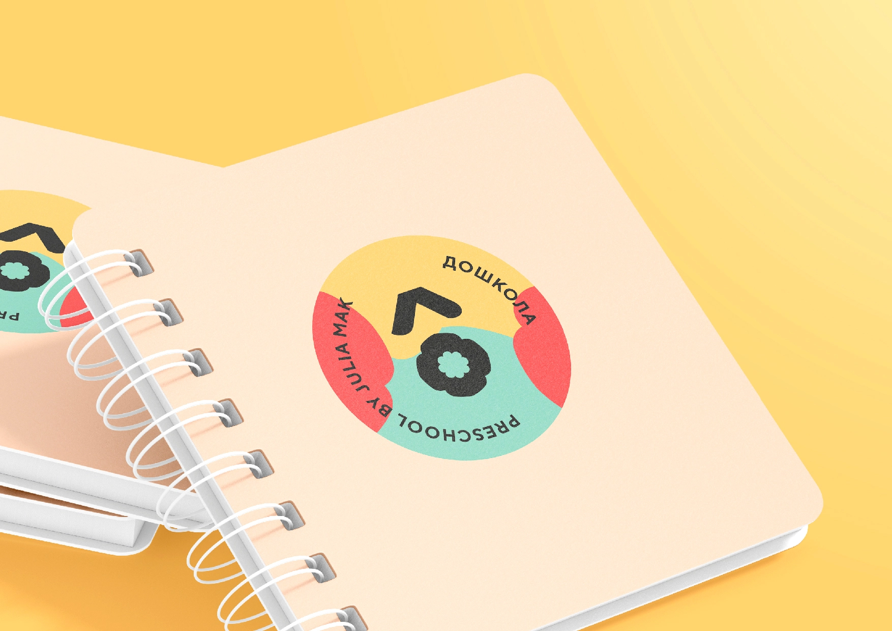
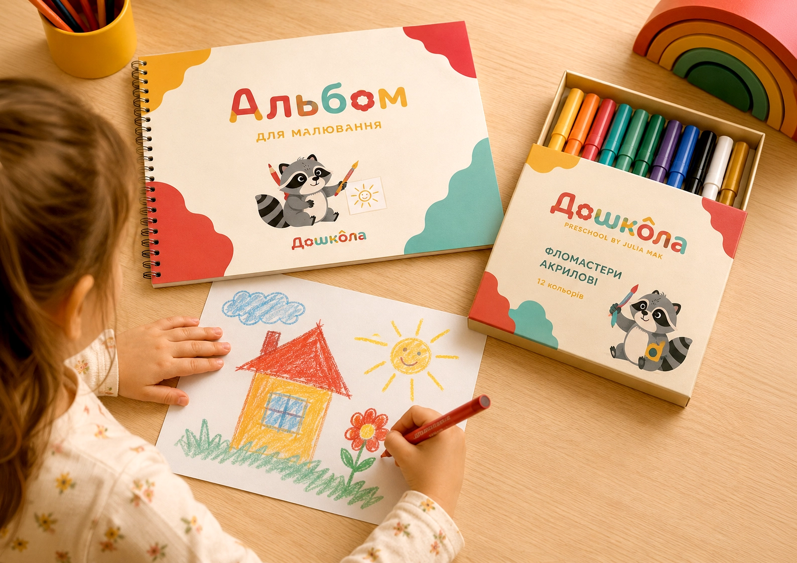
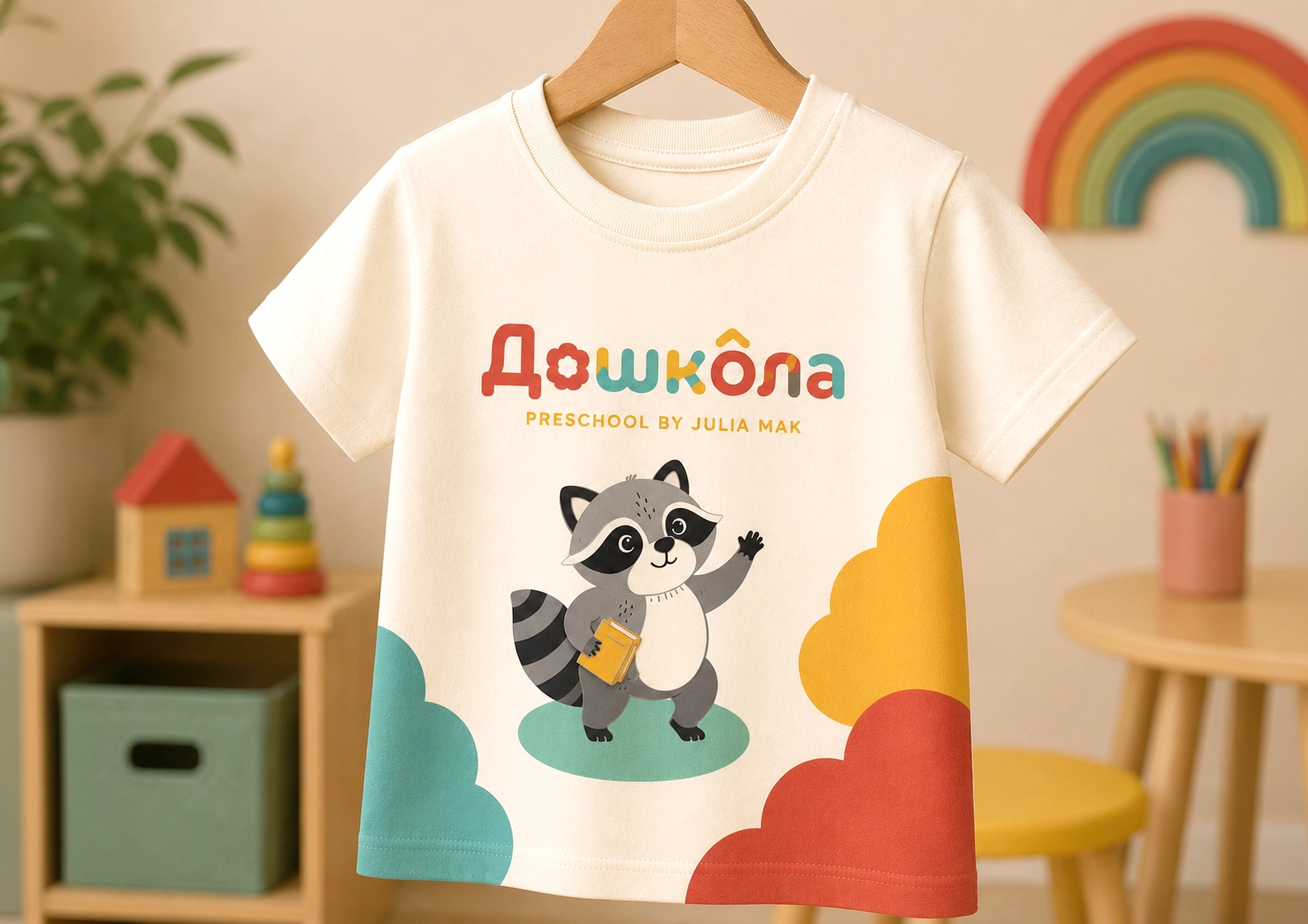
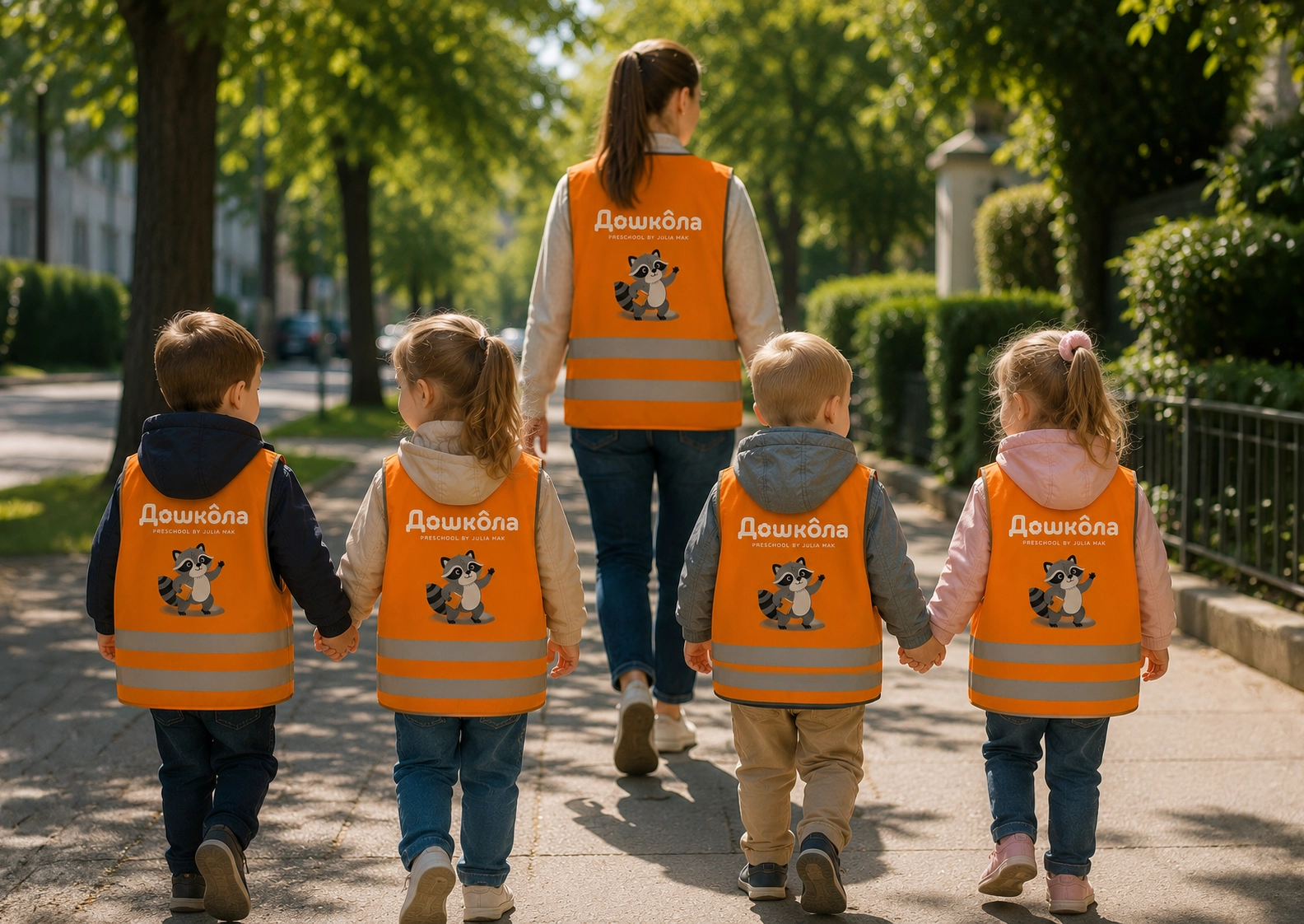
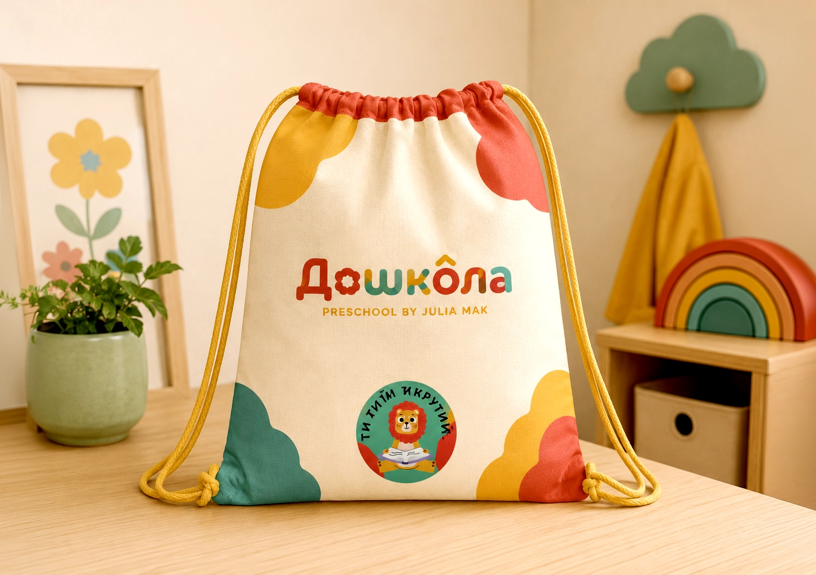
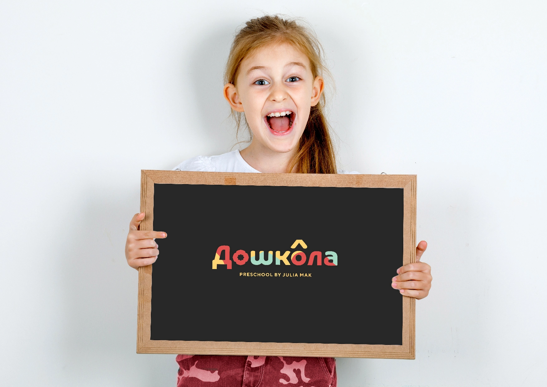
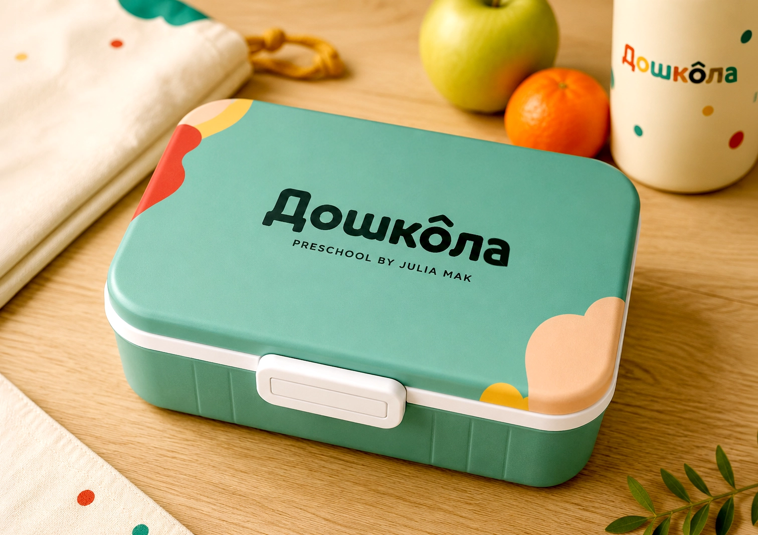
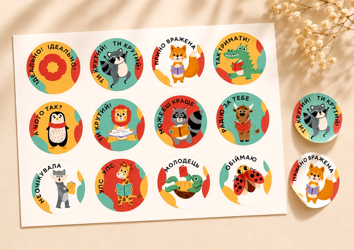
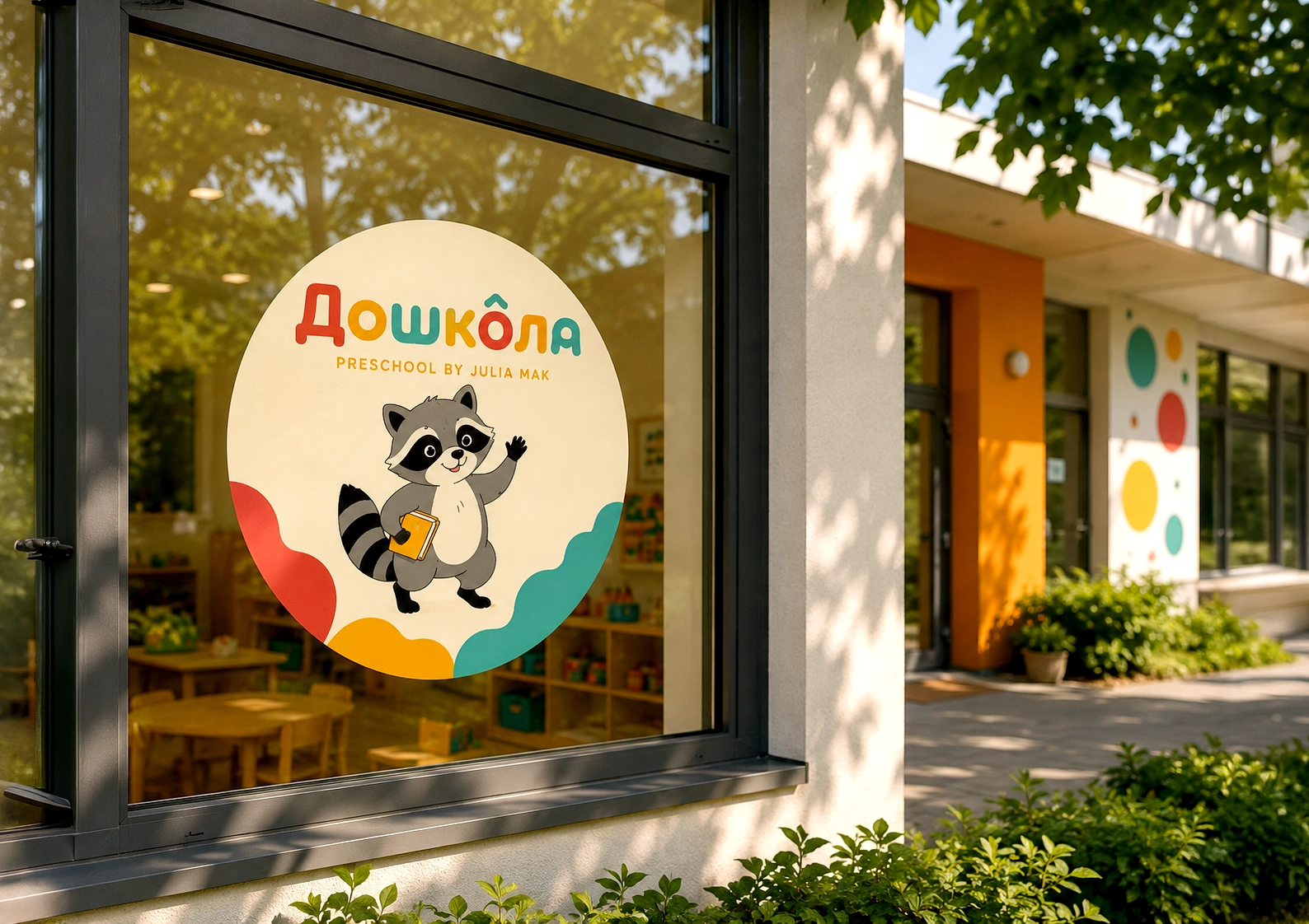
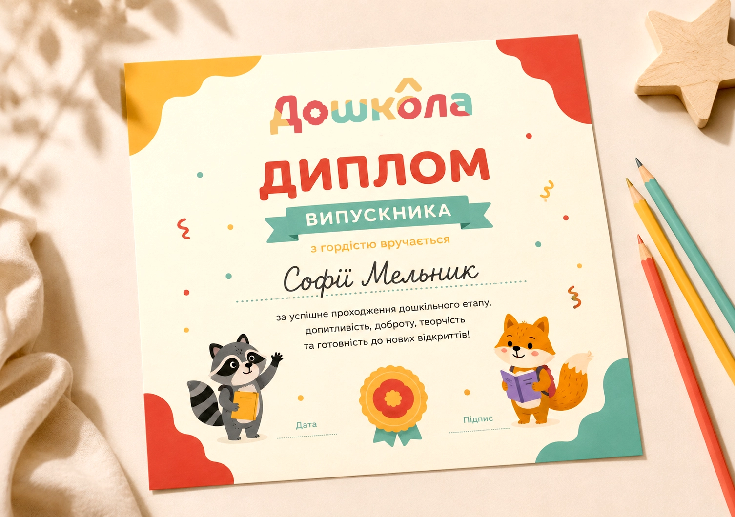
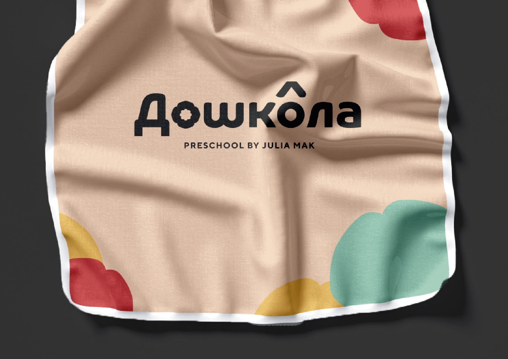
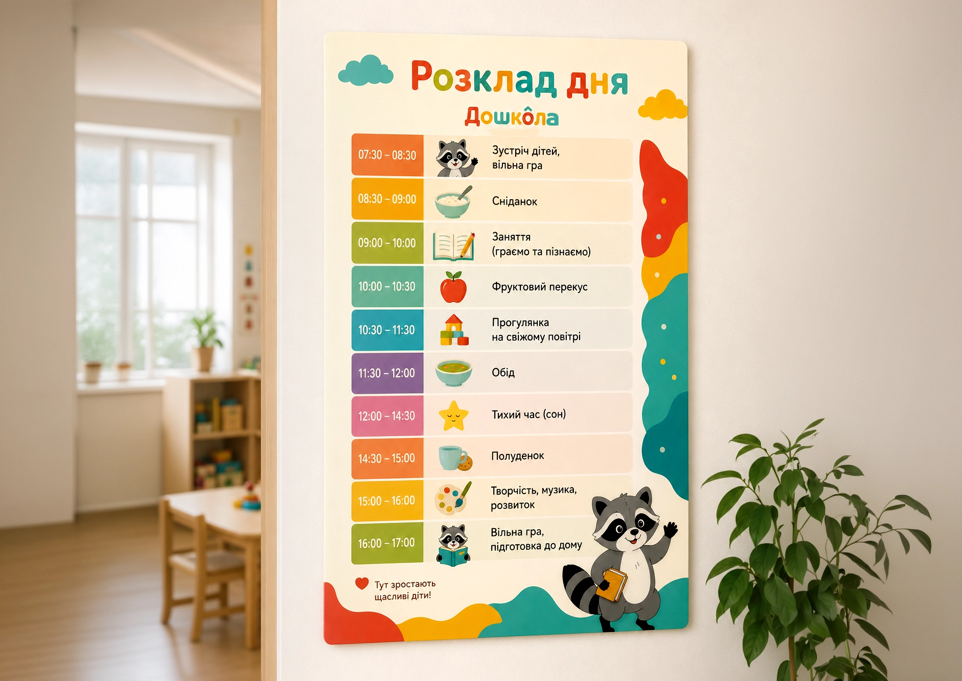
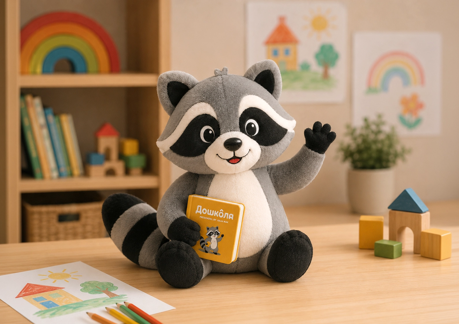
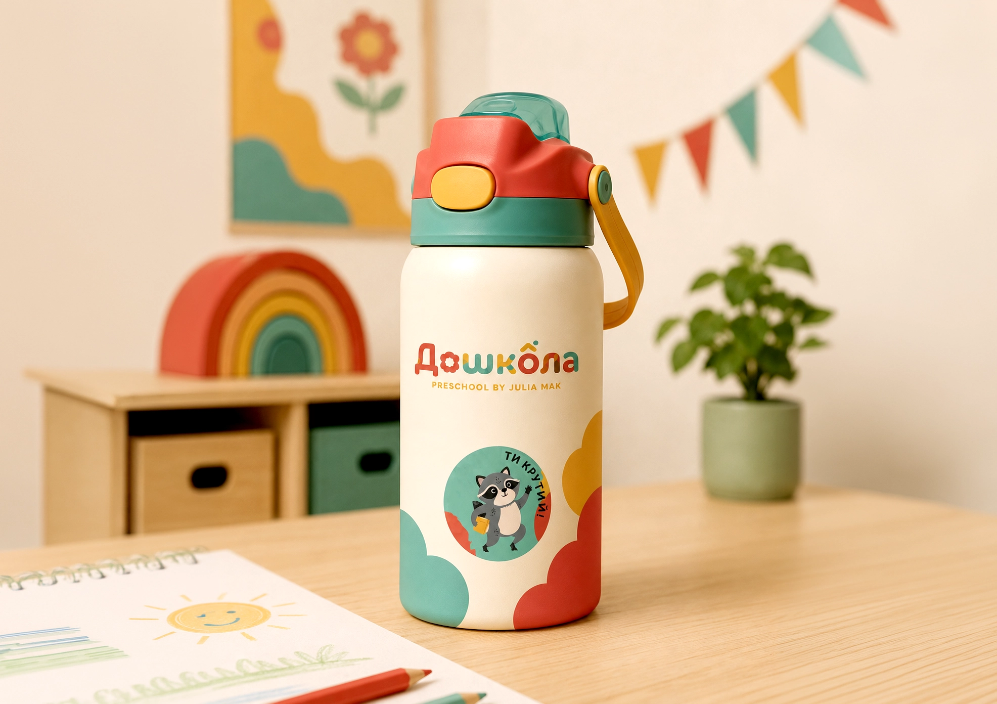
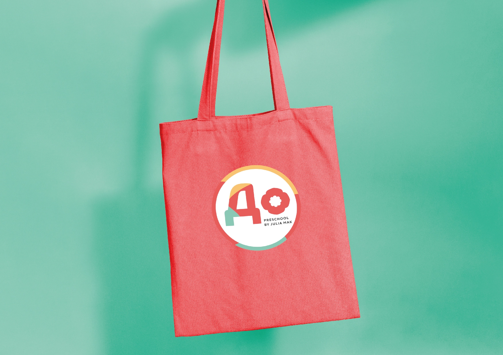
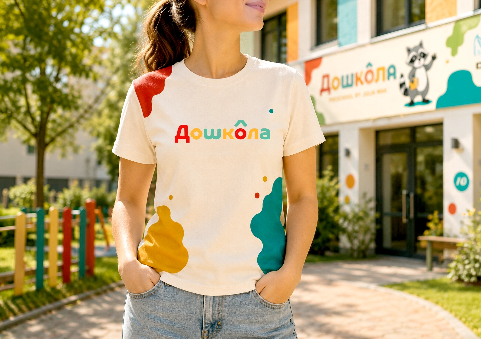
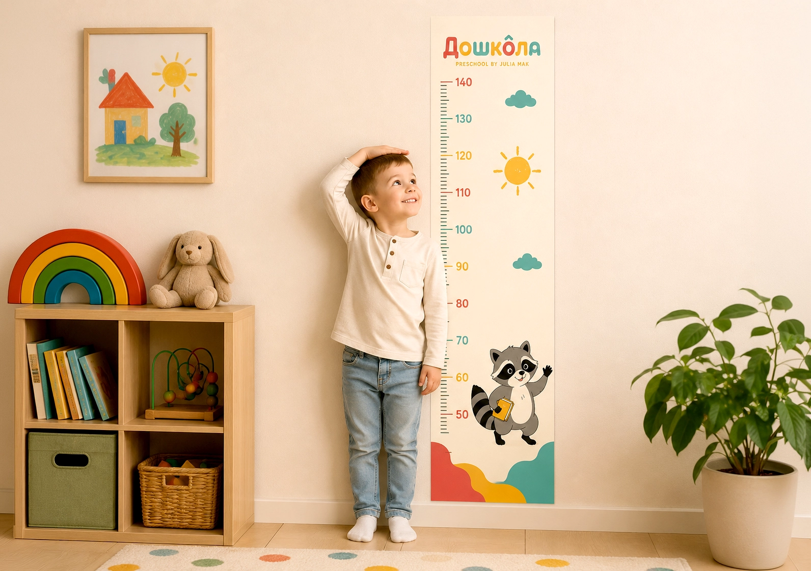
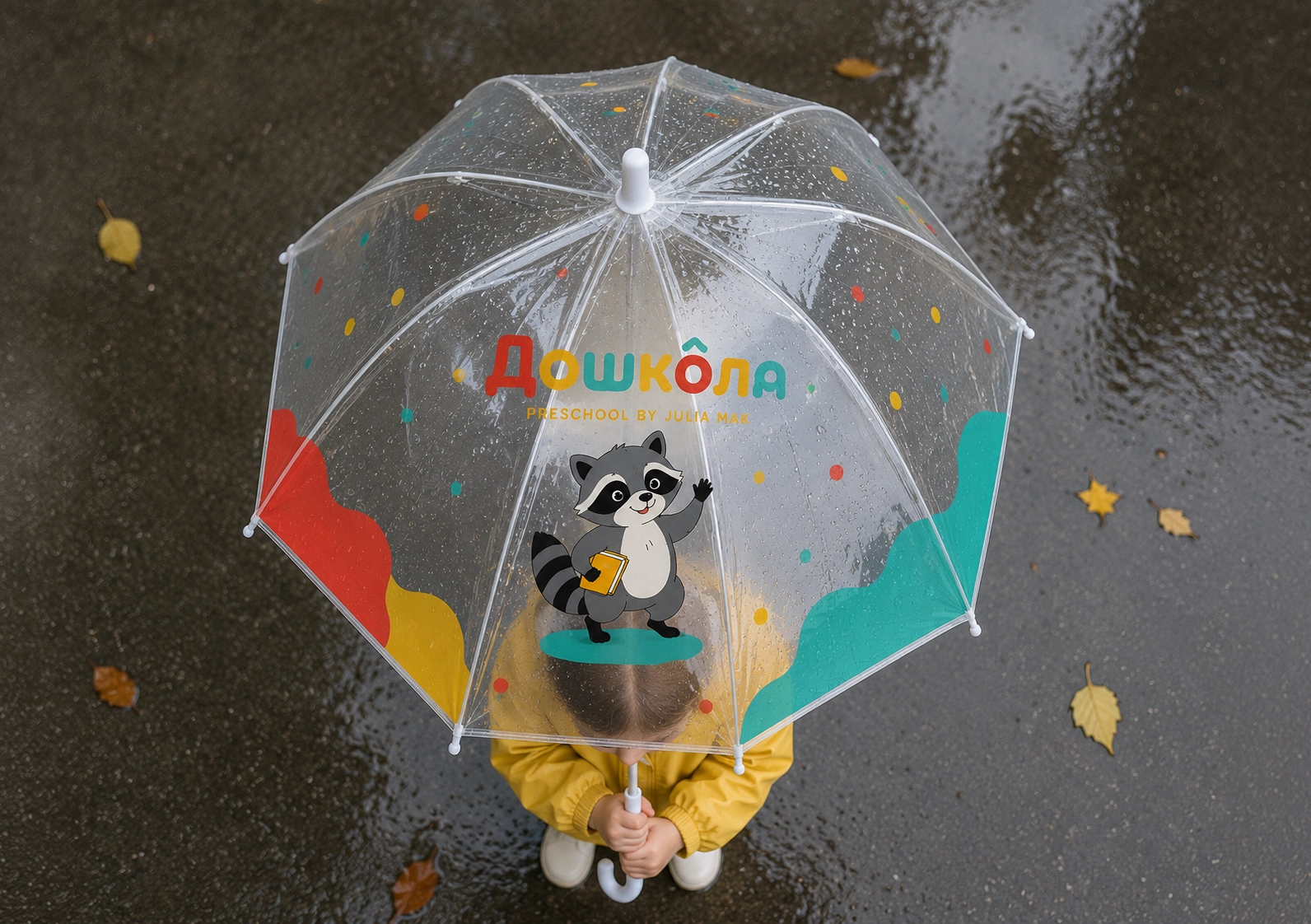
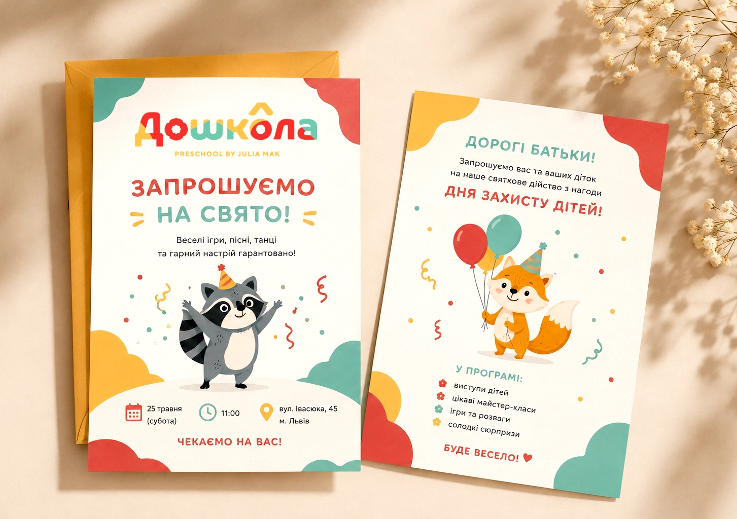
Logo design and corporate identity concept, layout design for printed materials based on the new concept to adapt to the school (private preschool) — Doshkola
ПРИЧИНИ РЕБРЕНДИНГУ
Логотип та візуальна ідентика, розроблені понад 15 років тому, сьогодні виглядають застарілими й відірваними від сучасного контексту. За цей час бренд пройшов значний шлях розвитку, змінилися ринок, аудиторія та внутрішні цінності компанії — але візуальна мова залишилася незмінною. Це створює розрив між тим, ким бренд є сьогодні, і тим, як він себе показує.
TASK
The logo should convey a sense of success—that same childlike “more, I want more” feeling you get when you’ve succeeded and want to keep going. It’s a feeling of lightness, movement, and freedom of self-expression: the logo shouldn’t have a school-like stiffness, but it should have a structure that conveys a serious approach.
Preschool is cool, fun, and exciting, and at the same time, it’s the best place to prepare for school and adapt to it without stress. The logo must capture both aspects simultaneously: lightheartedness for the child and reliability for the parents. It is precisely this balance that forms the foundation of the brand’s integrity.
Parents should be able to sense the institution’s prestige and status even before their first visit and understand that they’ve made the right choice. The logo should convey that everything is under control—there’s a system, a methodology, and people who know what they’re doing. This is the key feeling for parents: peace of mind and confidence that their child is prepared and will be successfully accepted into school.
Key Moods
- The thrill of success—“I want more, I want more”
- The establishment’s prestige and status
- Professionalism
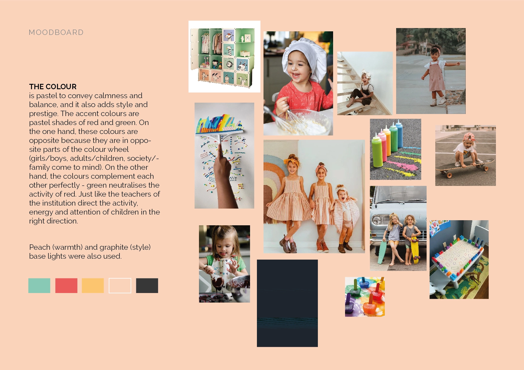
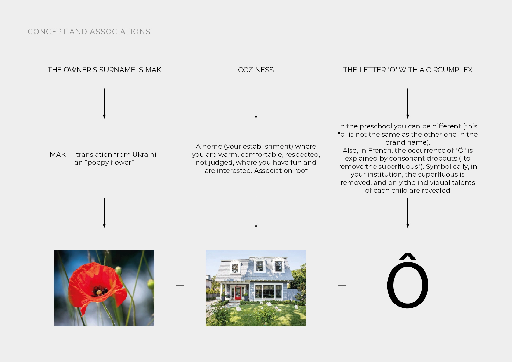
- Cozy atmosphere
- Friendliness
Points of Differentiation
- Friendly and readable typography
- Color shapes as a corporate graphic device
FEEDBACK