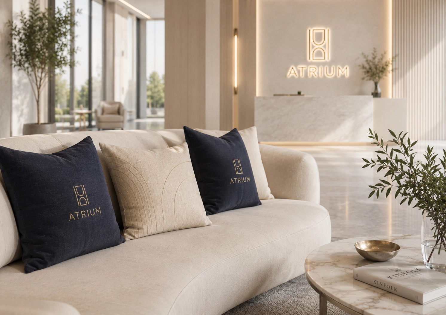
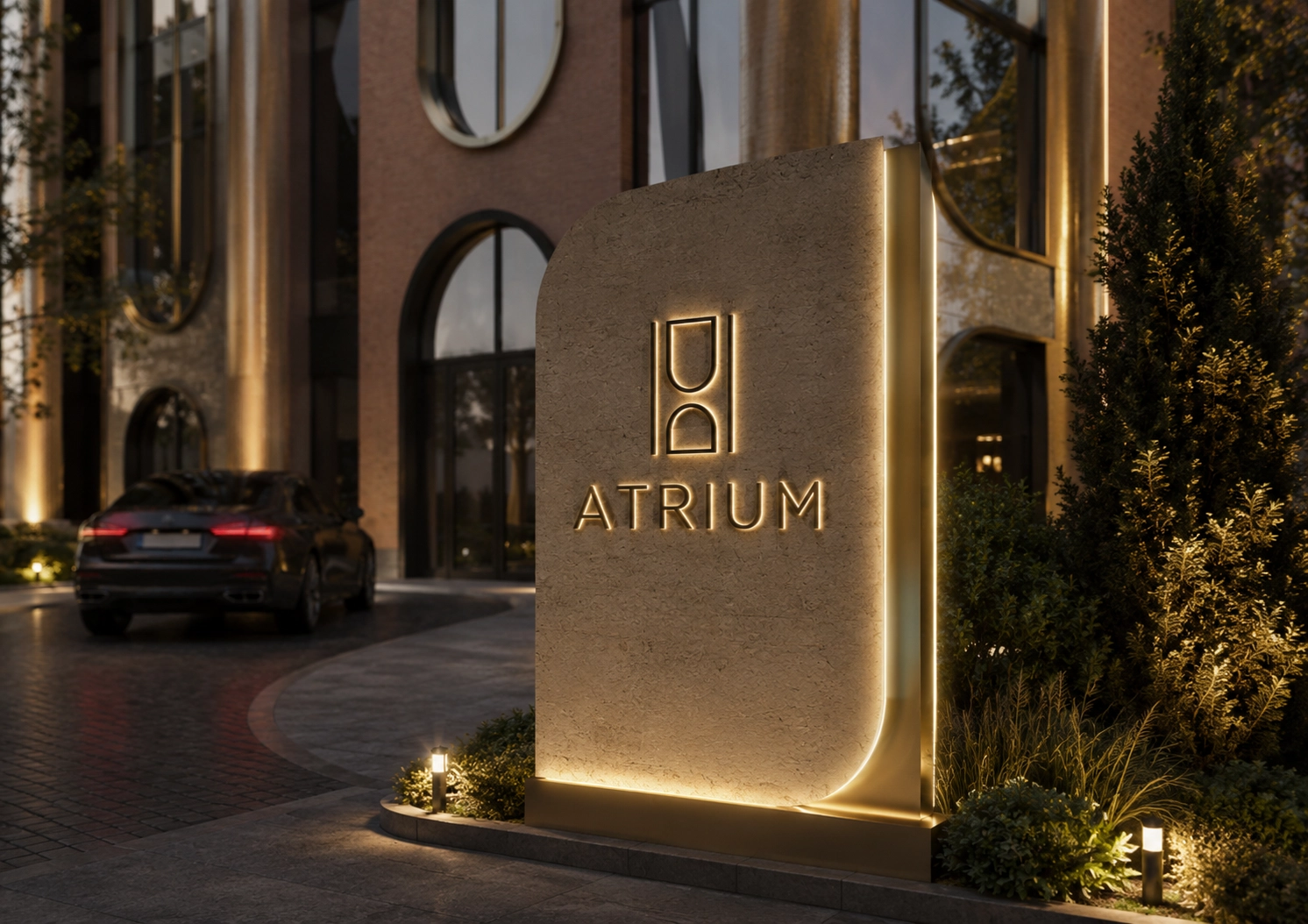
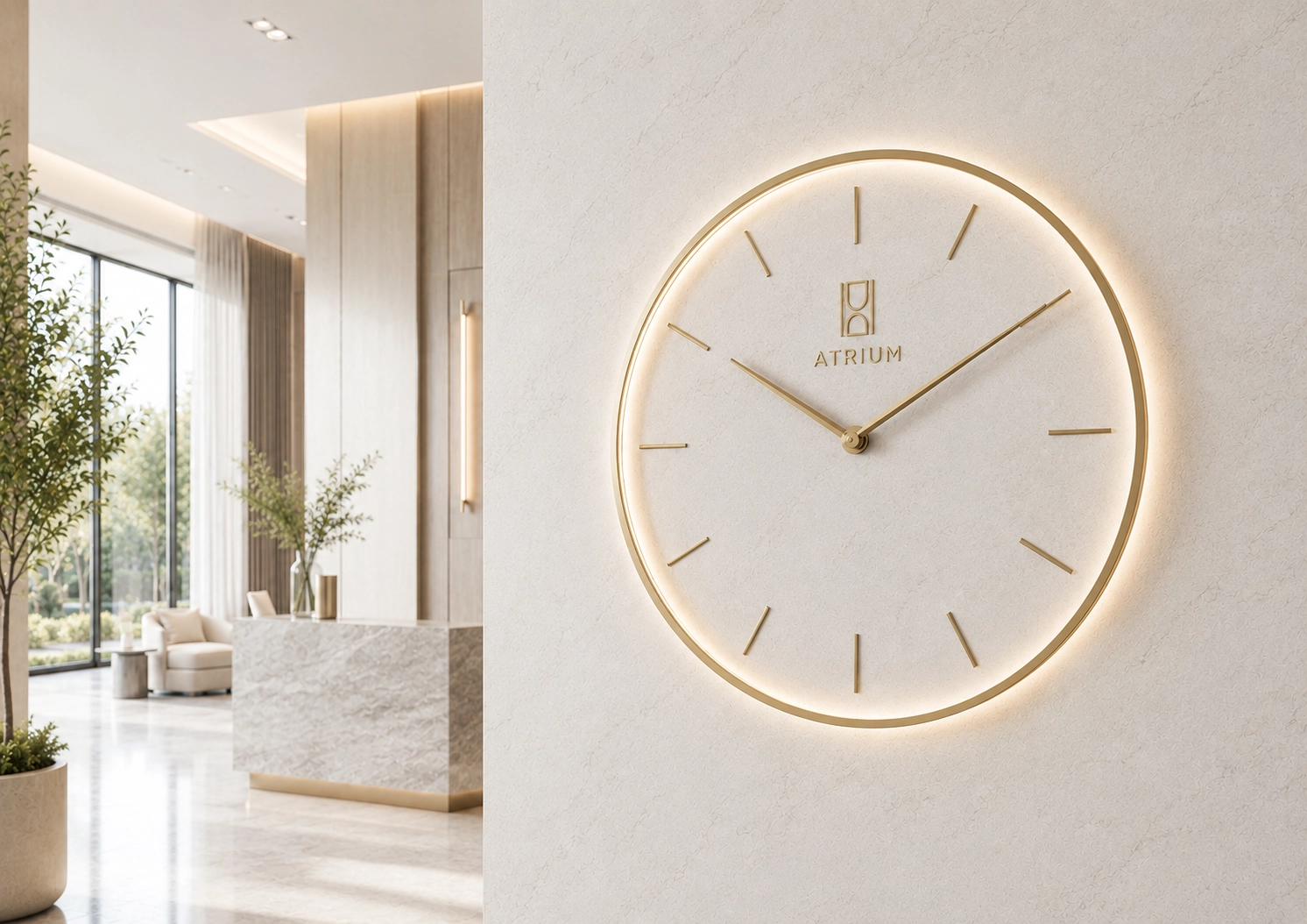
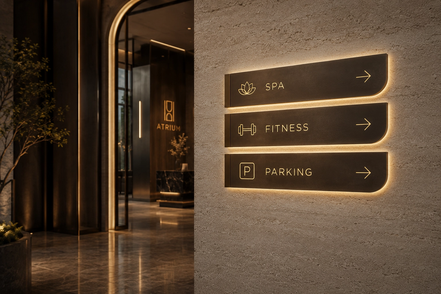
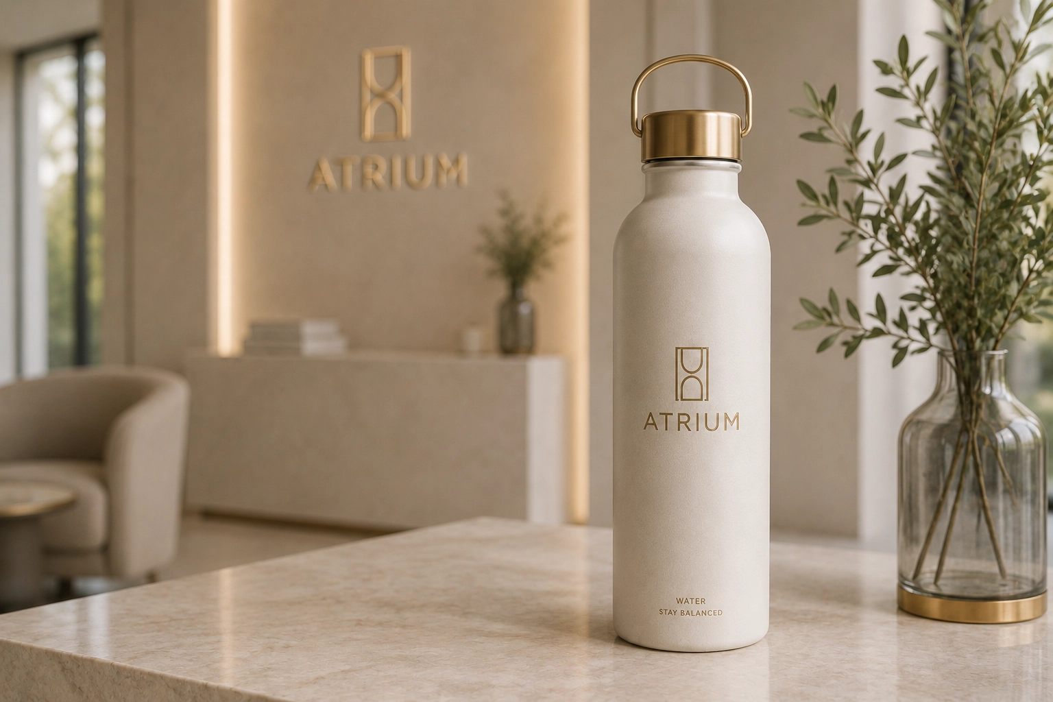
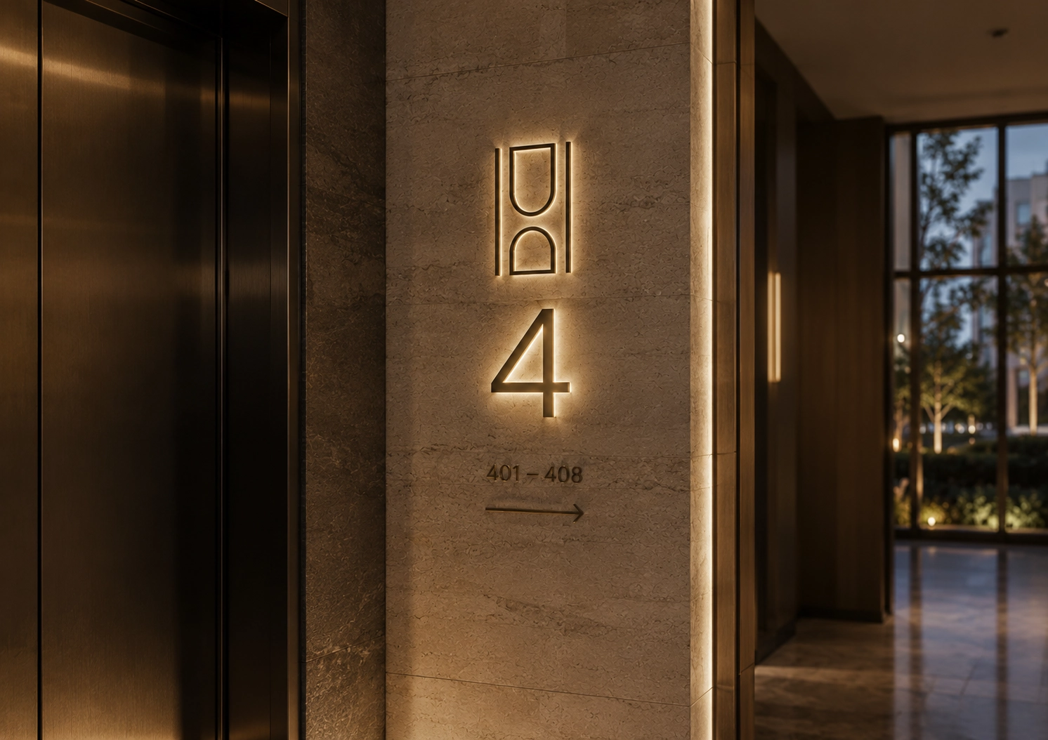
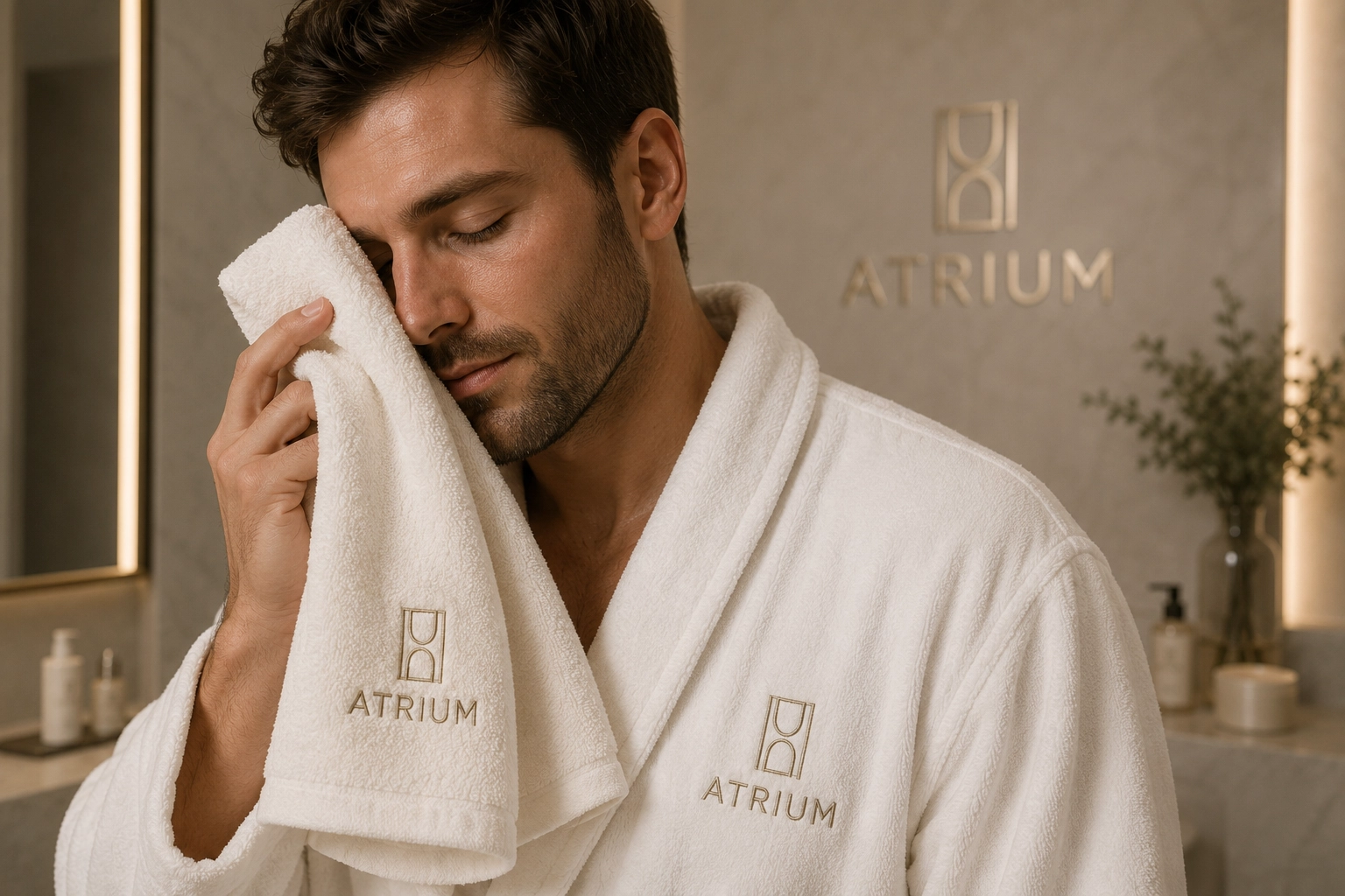
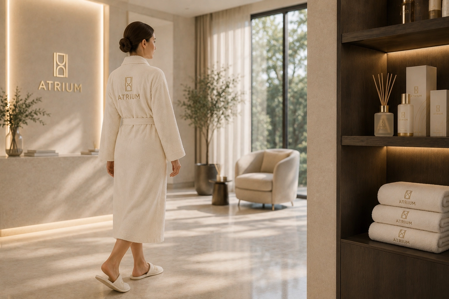
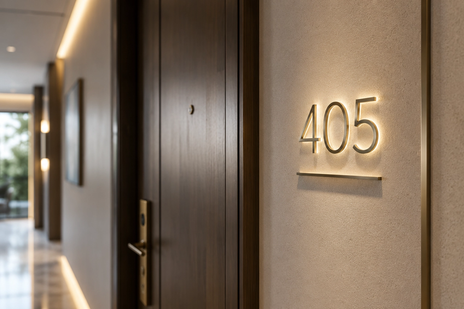
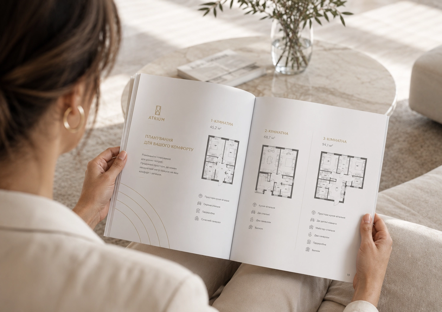
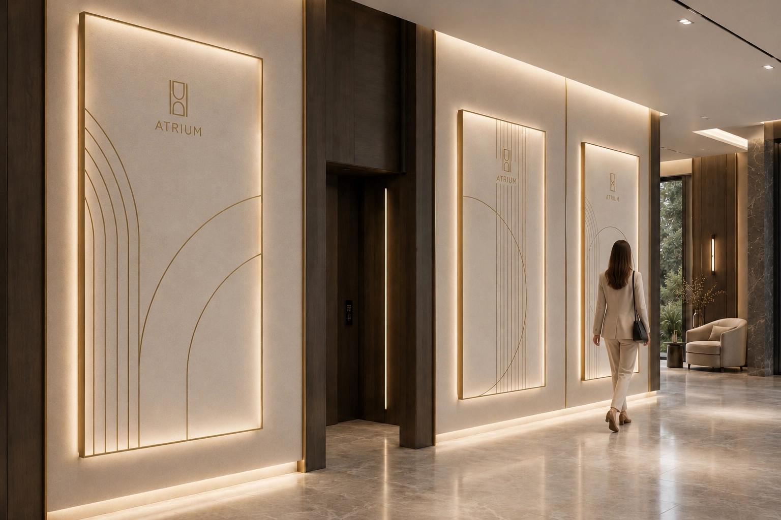
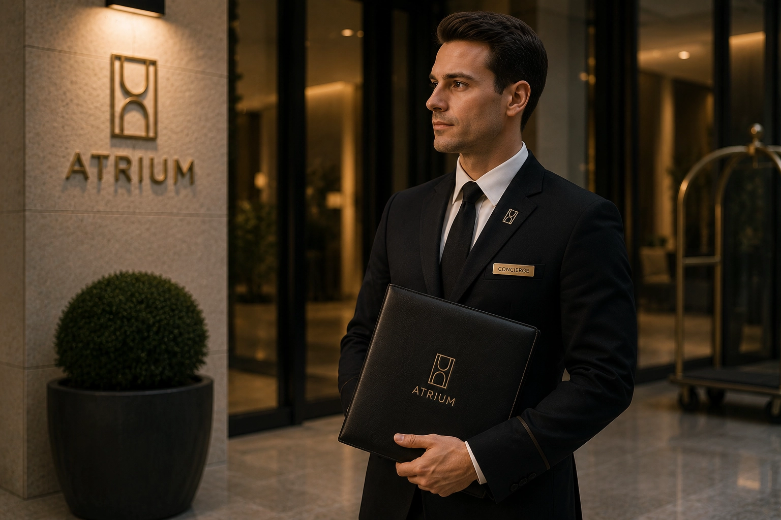
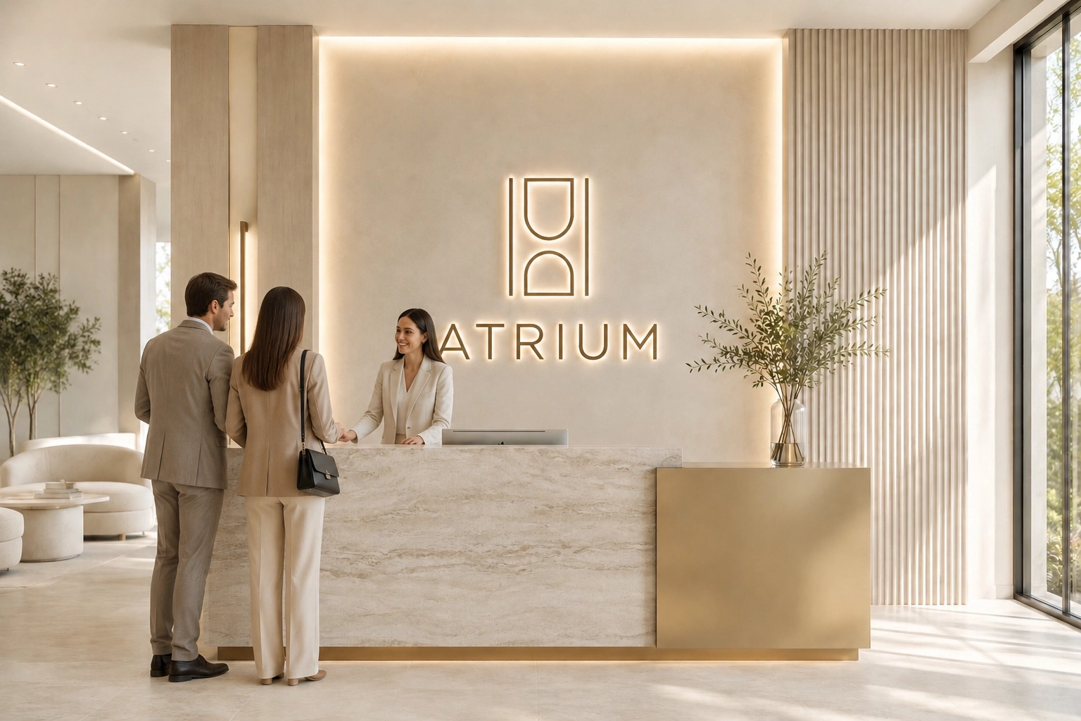
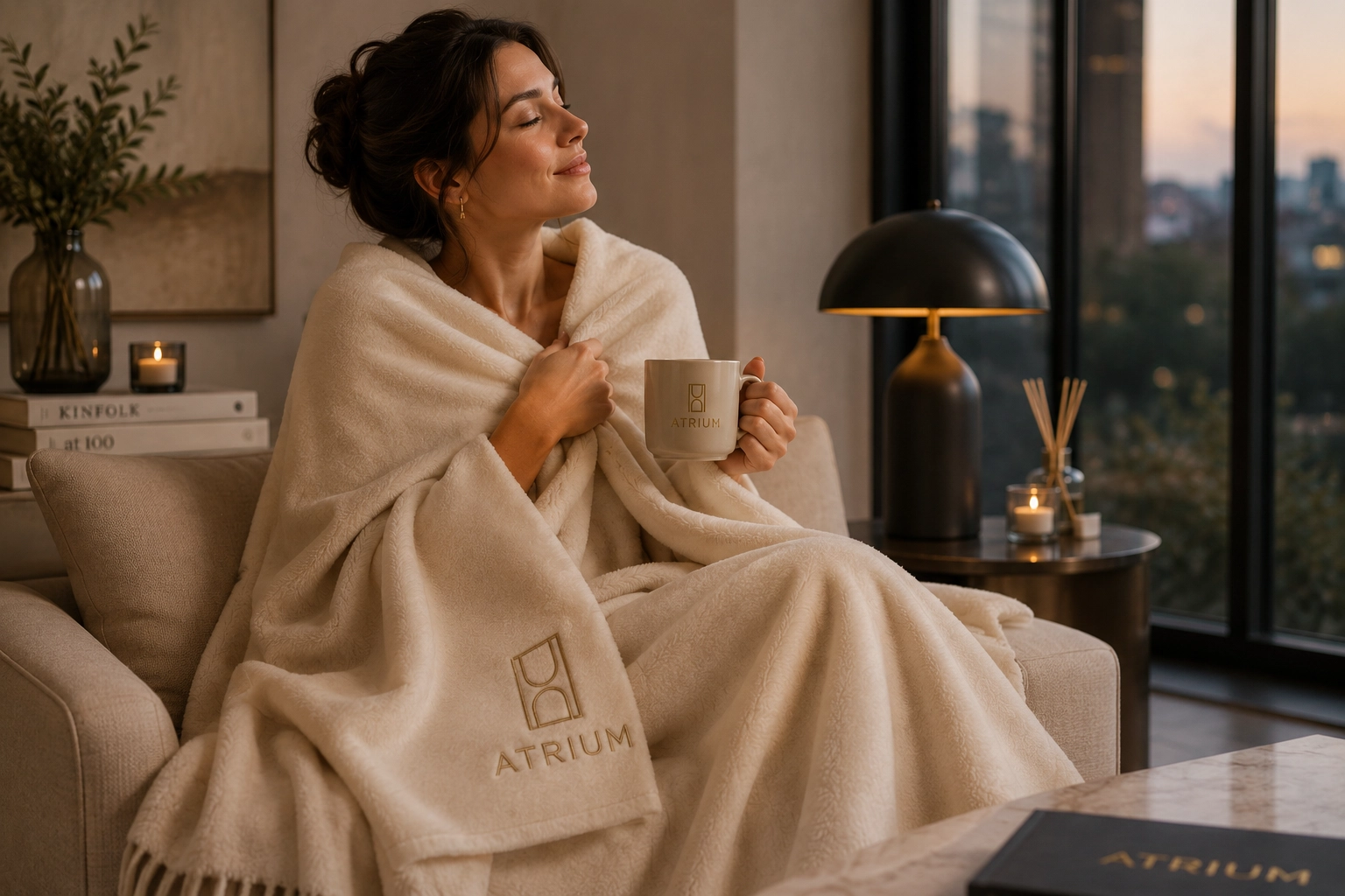
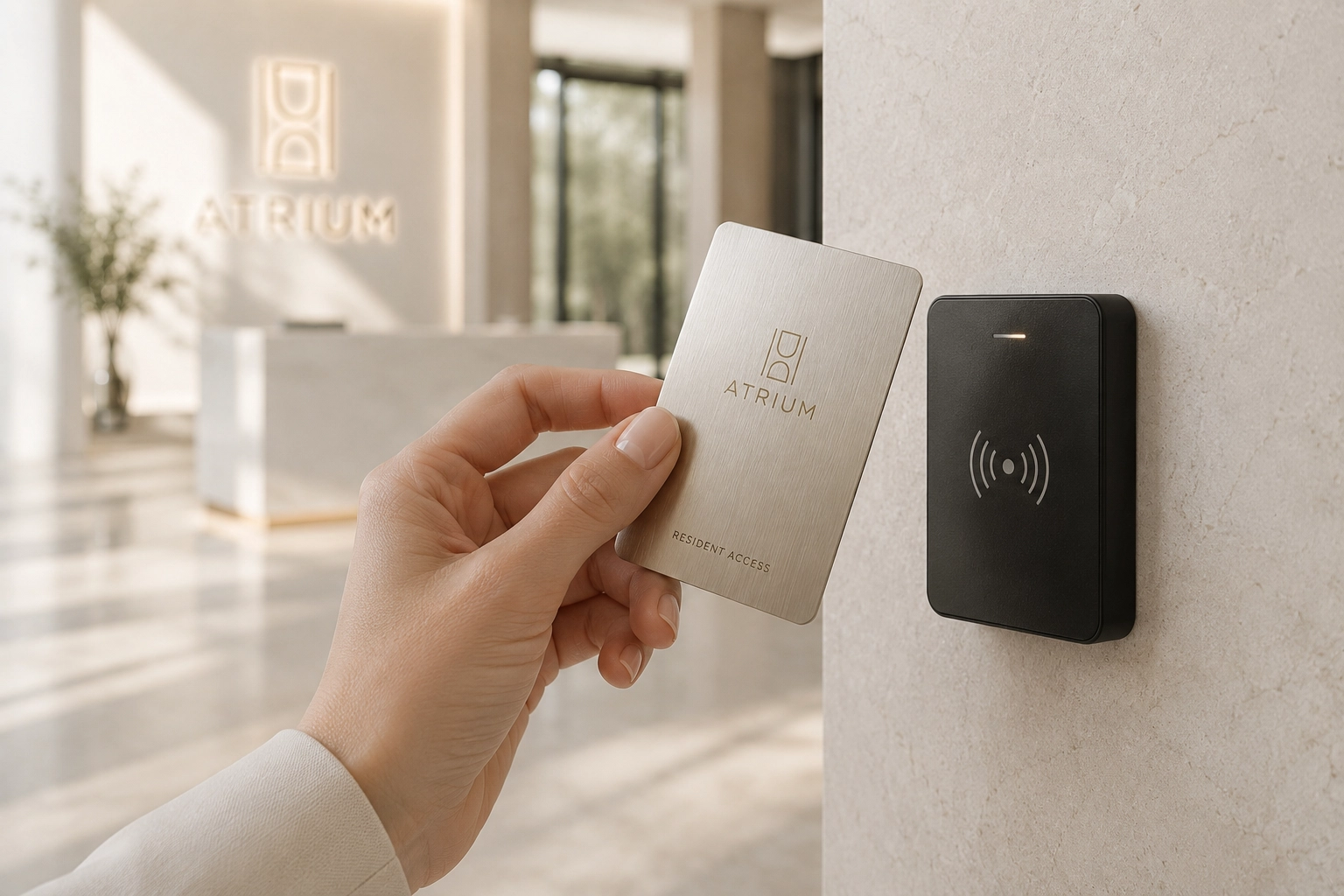
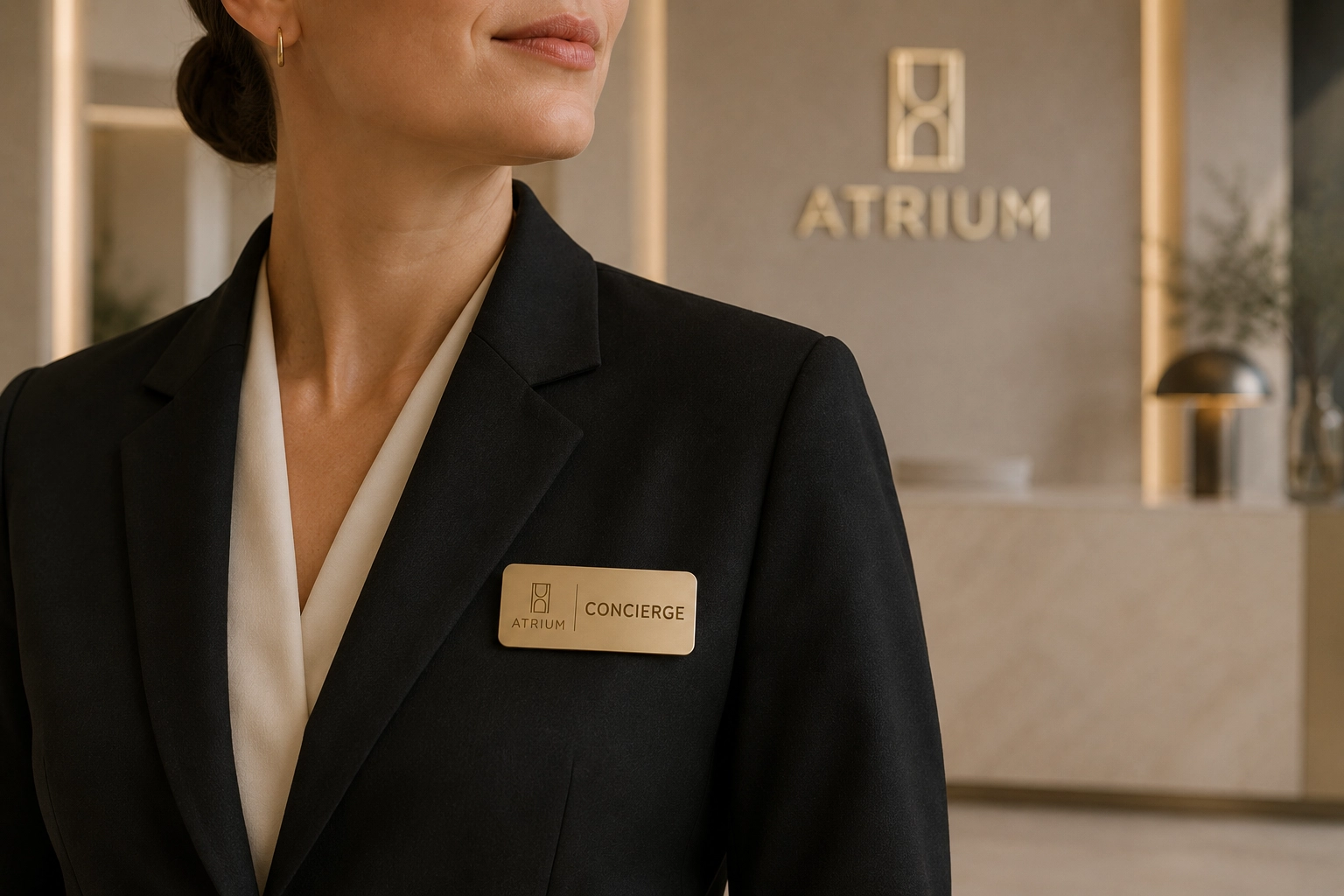
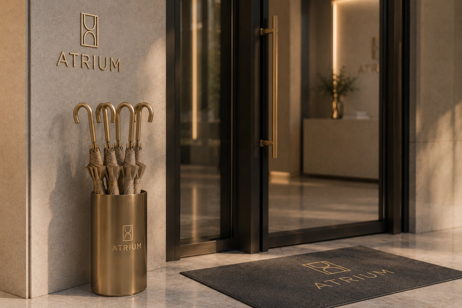
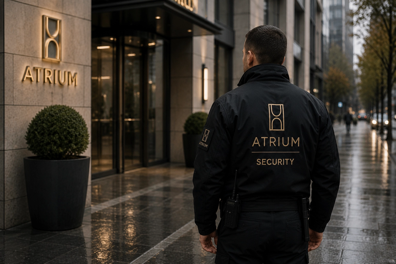
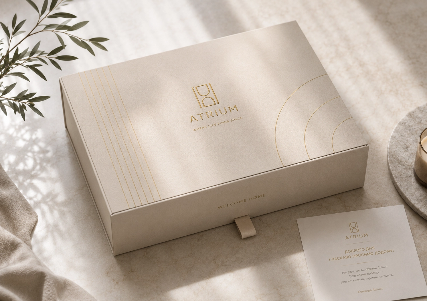
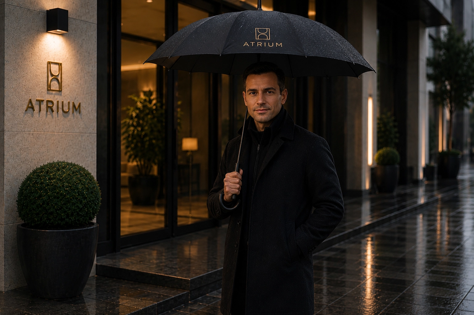
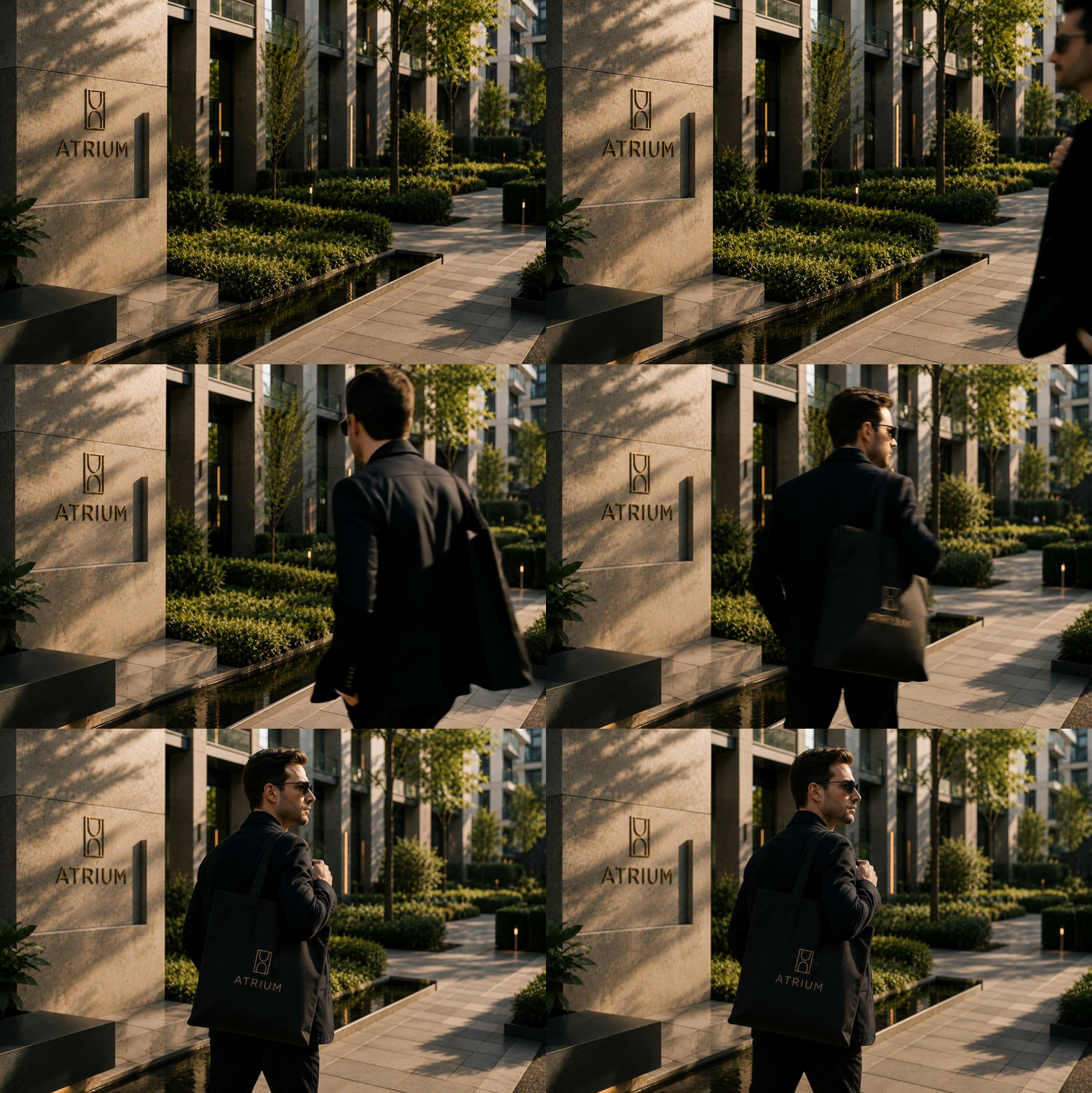
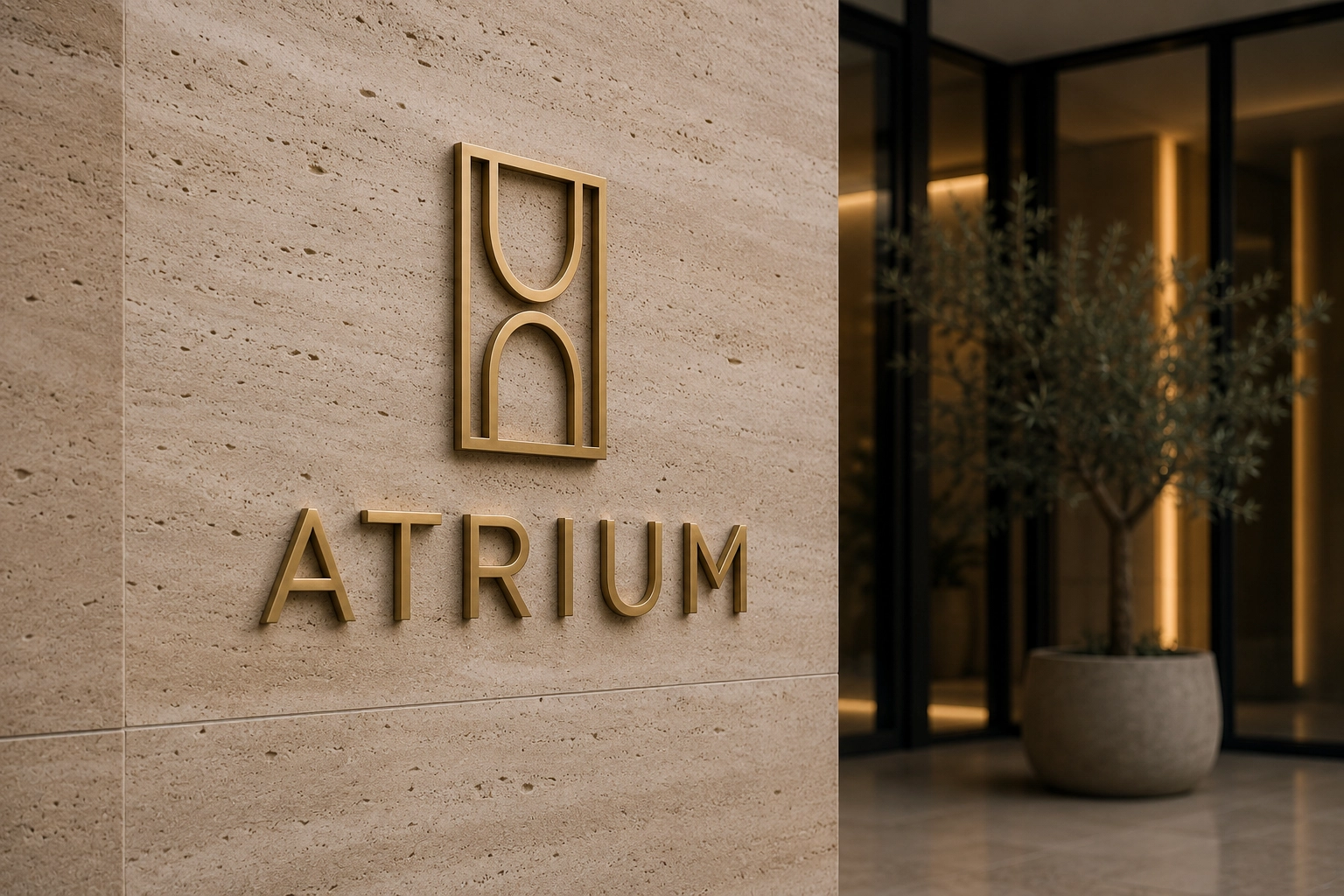
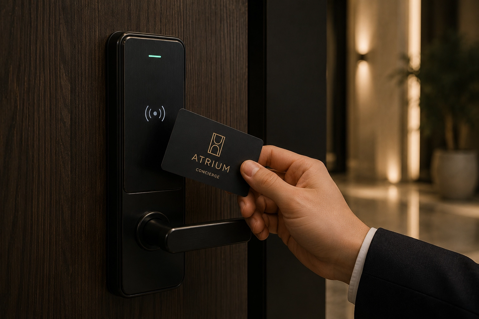
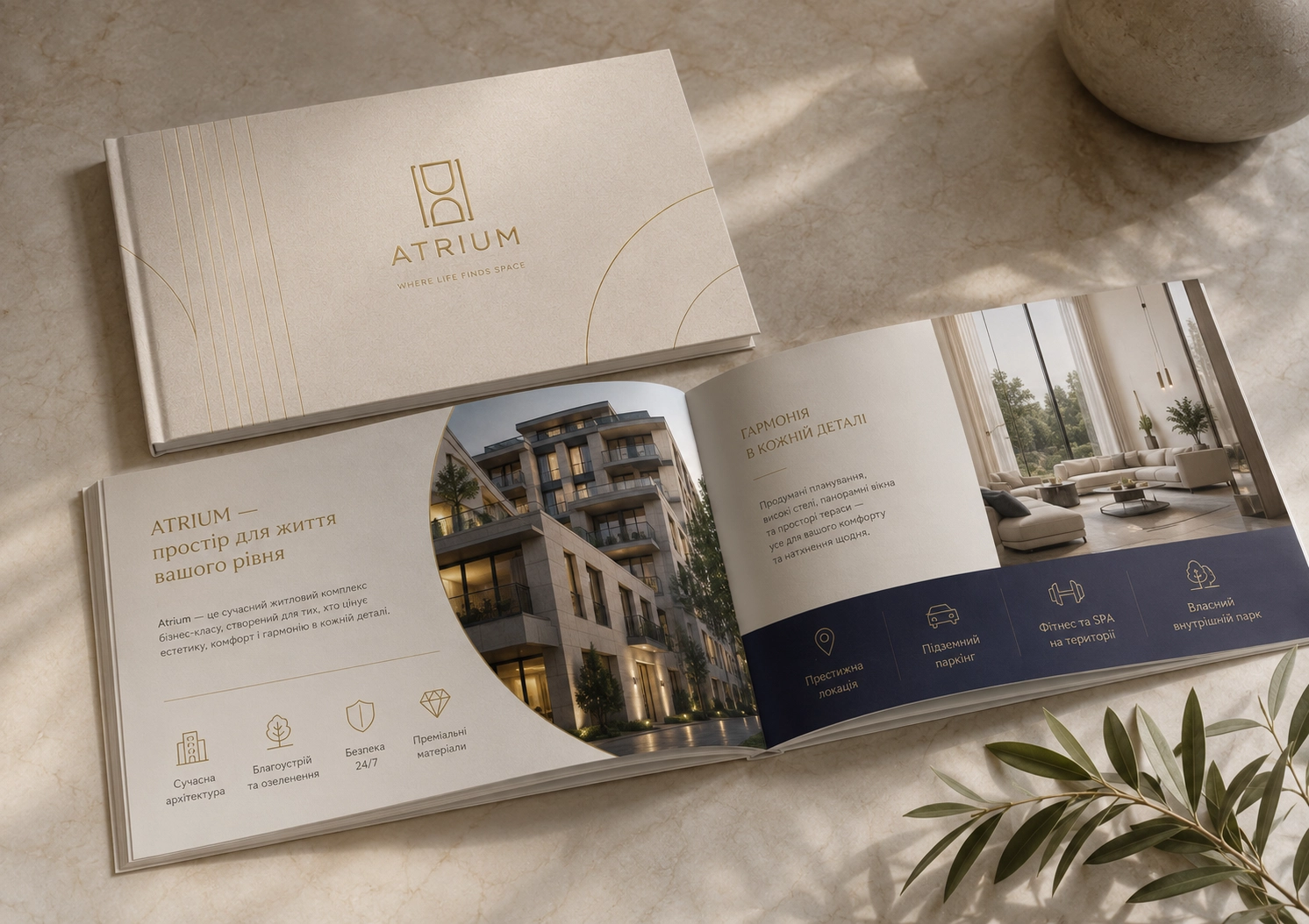
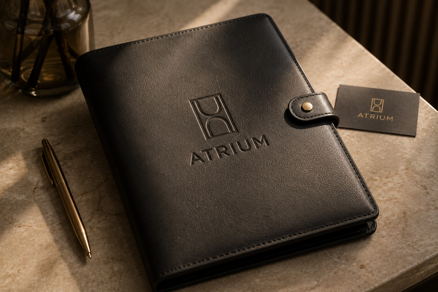
Logo redesign and brand identity concept, print layout, in a new concept for the comfortable apartments — ATRIUM
ПРИЧИНИ РЕБРЕНДИНГУ
Логотип та візуальна ідентика, розроблені понад 15 років тому, сьогодні виглядають застарілими й відірваними від сучасного контексту. За цей час бренд пройшов значний шлях розвитку, змінилися ринок, аудиторія та внутрішні цінності компанії — але візуальна мова залишилася незмінною. Це створює розрив між тим, ким бренд є сьогодні, і тим, як він себе показує.
TASK
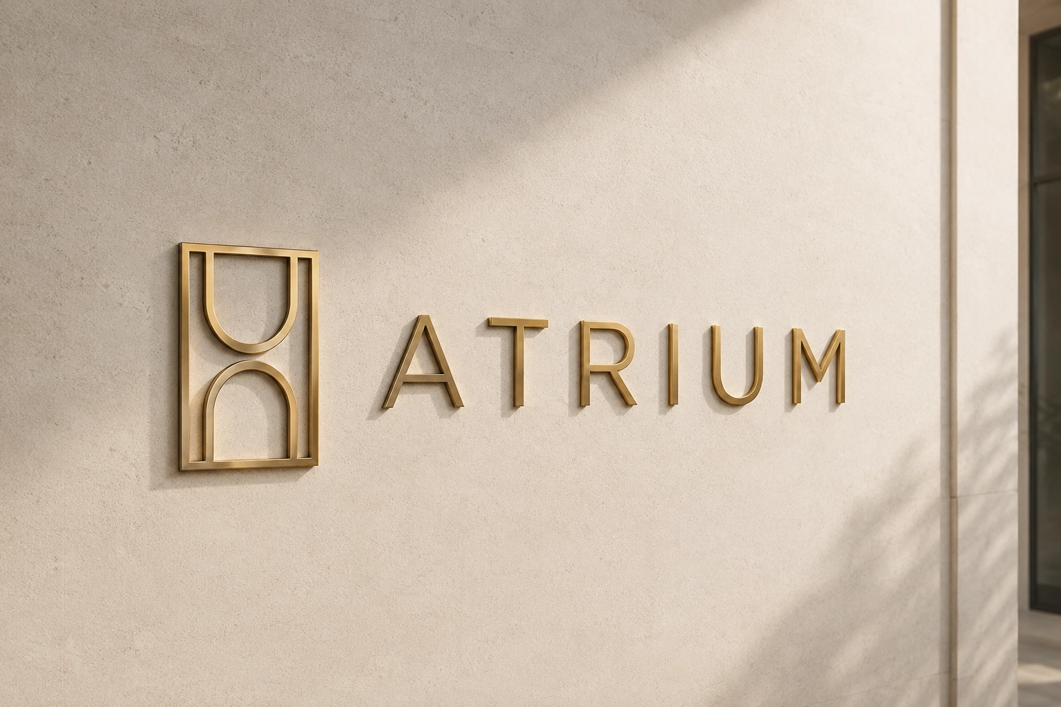
The logo has to work as a mark of status — read faster than the name itself. Its job: to show at first glance the seriousness of the approach, the weight of the reputation, the high value of the offer, and the company’s right to speak with its client as an equal. It is a restrained, confident form with no excess decoration: a mark that doesn’t demand attention by being loud, but holds it by being solid.
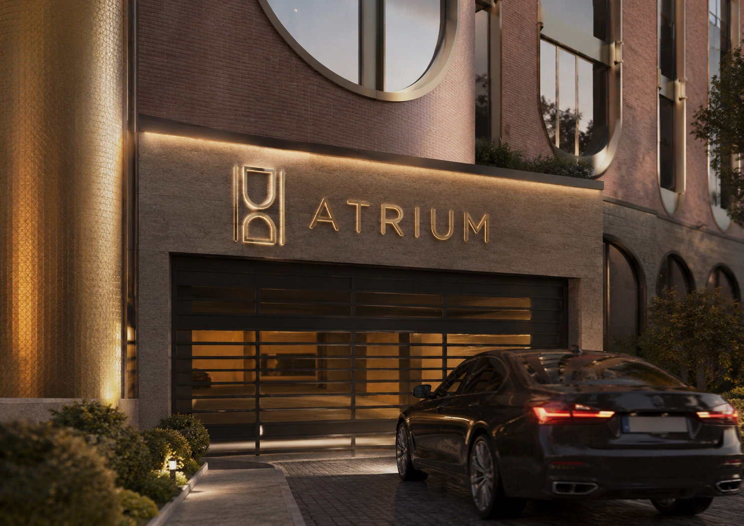
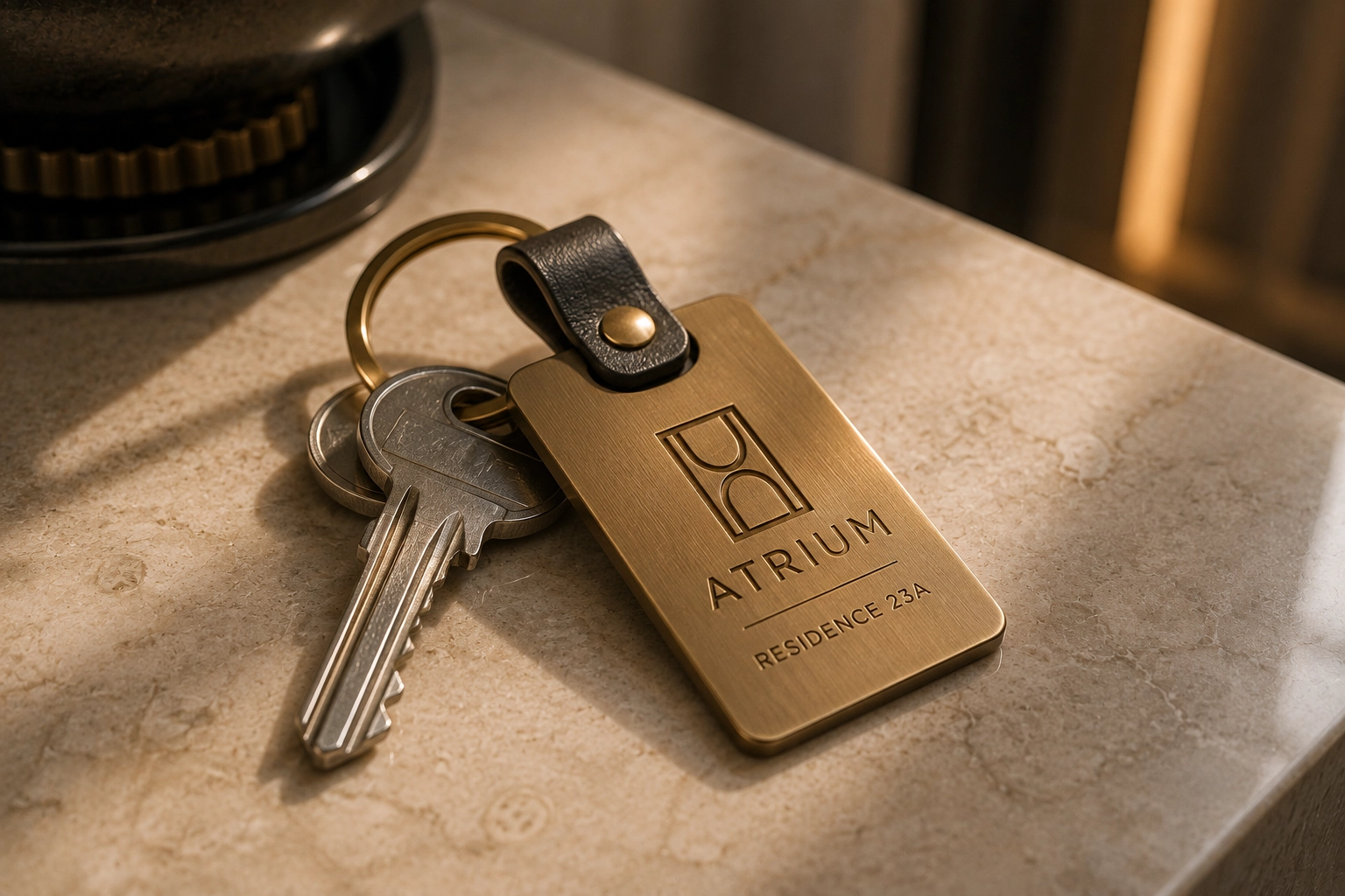
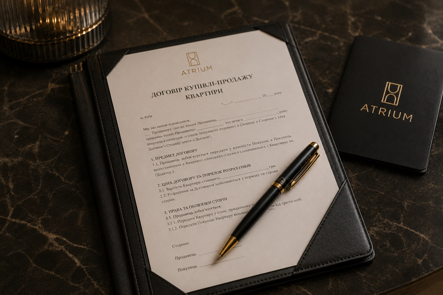
That restraint is exactly what makes the brand whole. One mark, one mood, one logic across every point of contact — from a document and a sign to a presentation and digital media. Recognition here is built not on brightness but on consistency: the client sees the same face of the company everywhere, and each time it becomes clearer and more dependable.
The client should sense prestige and status before the first conversation. The logo has to convey that behind it stands a strong structure with a broad field of competence, able to handle complex matters and take responsibility. Exclusivity lies not in being closed off, but in the fact that access to this level of expertise isn’t open to everyone. Trust is built through precision: if the mark is executed flawlessly, the client expects the same flawlessness in the work.
Key Moods
Elite status
Prestige
Versatility
Exclusivity
Restraint
Points of Differentiation
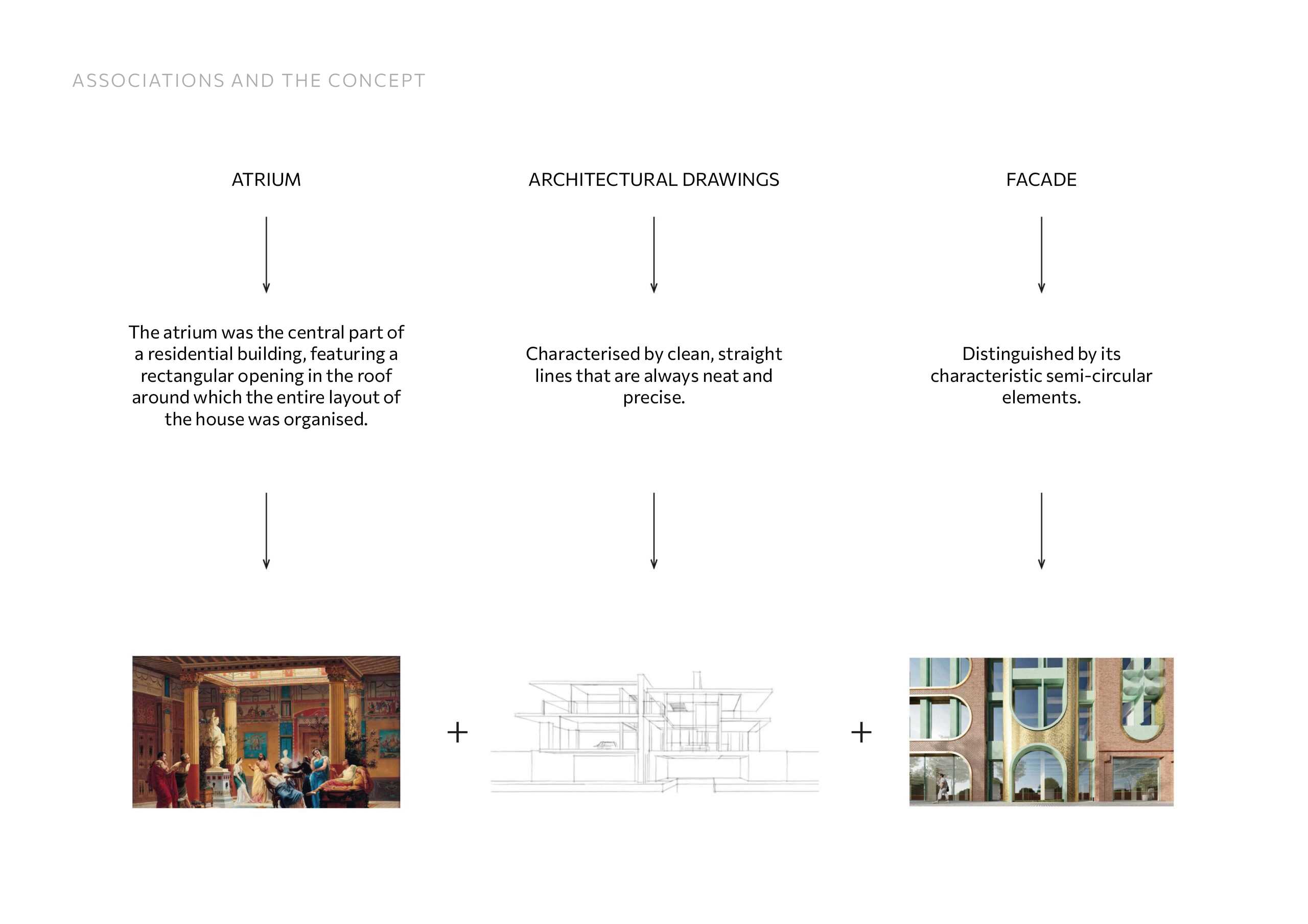
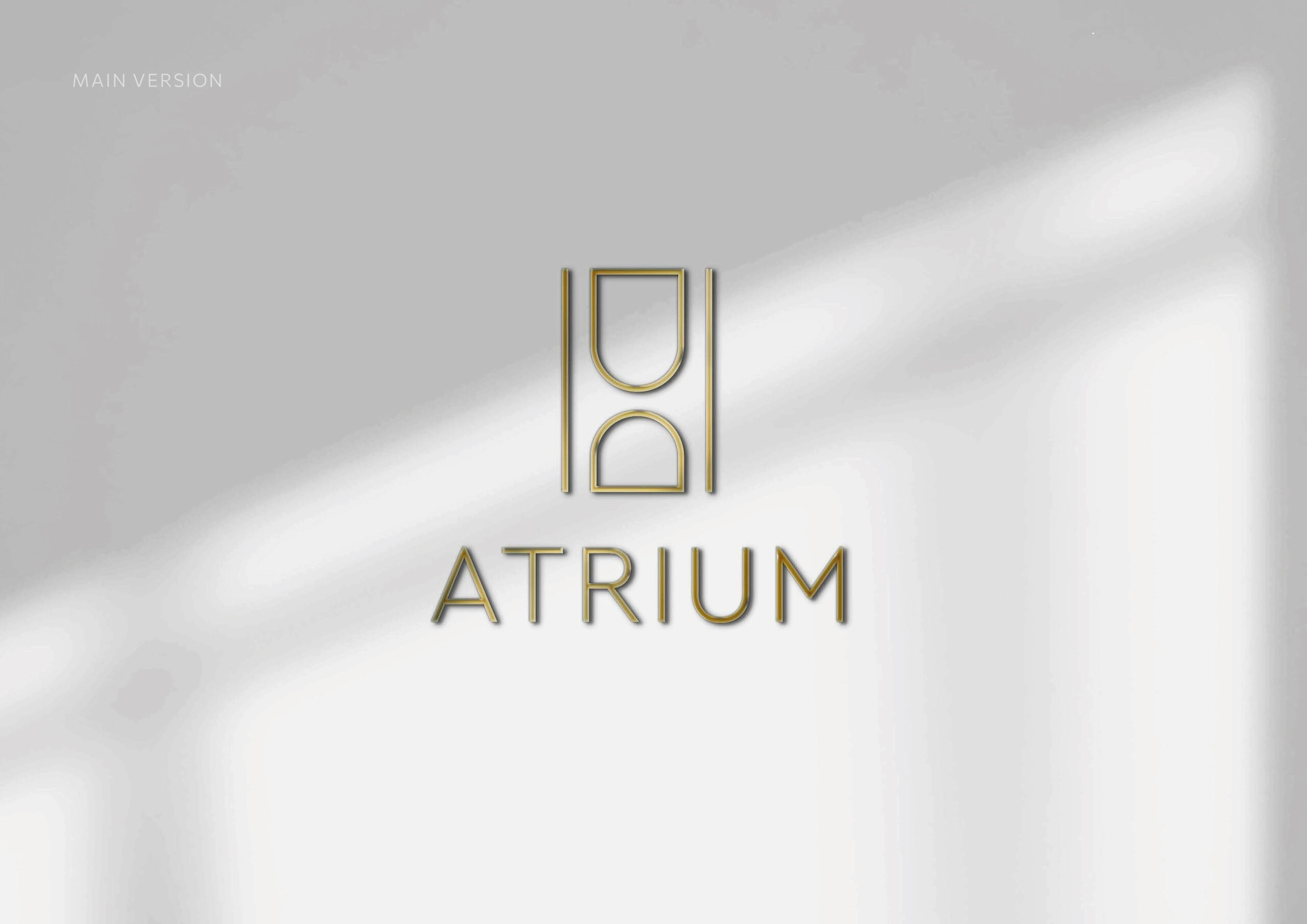
The mark is a stylised depiction of the apartment building’s façade
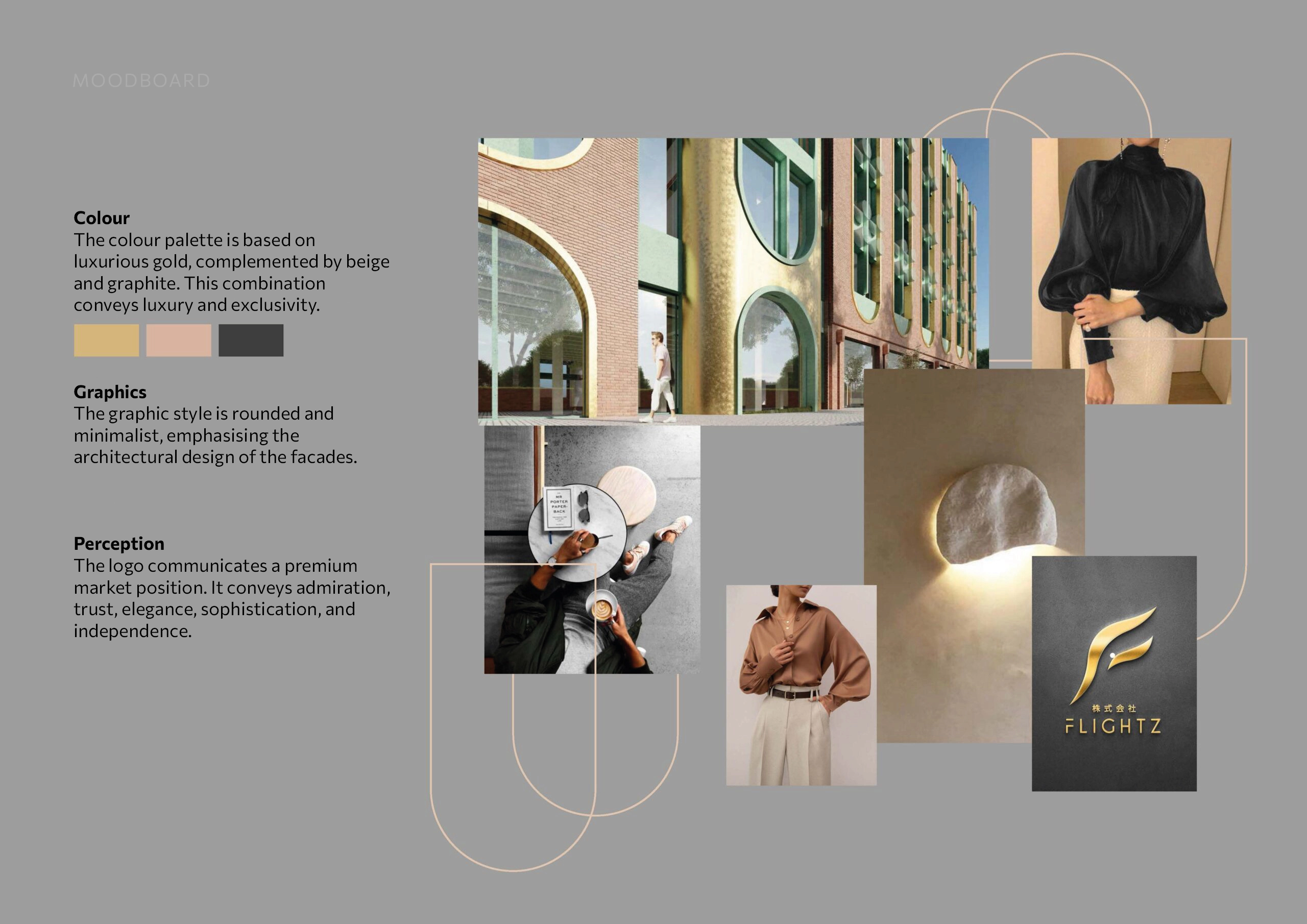
Natural materials: stone, graphite, warm wood, metal
Air in the layouts
Minimalism
Ukraine
Luxury Residences
Logo Redesign, Corporate Identity, Printing Layouts