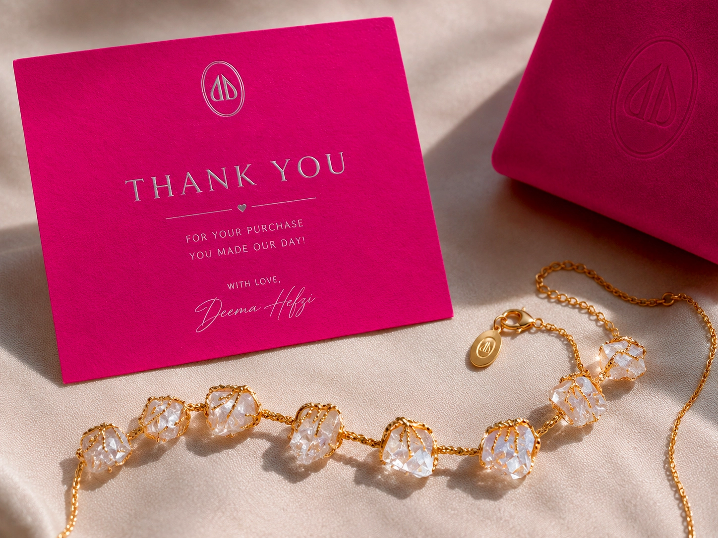
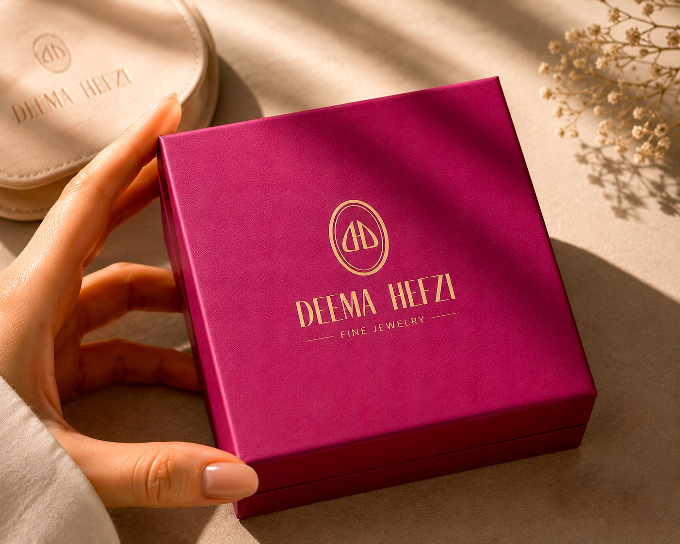
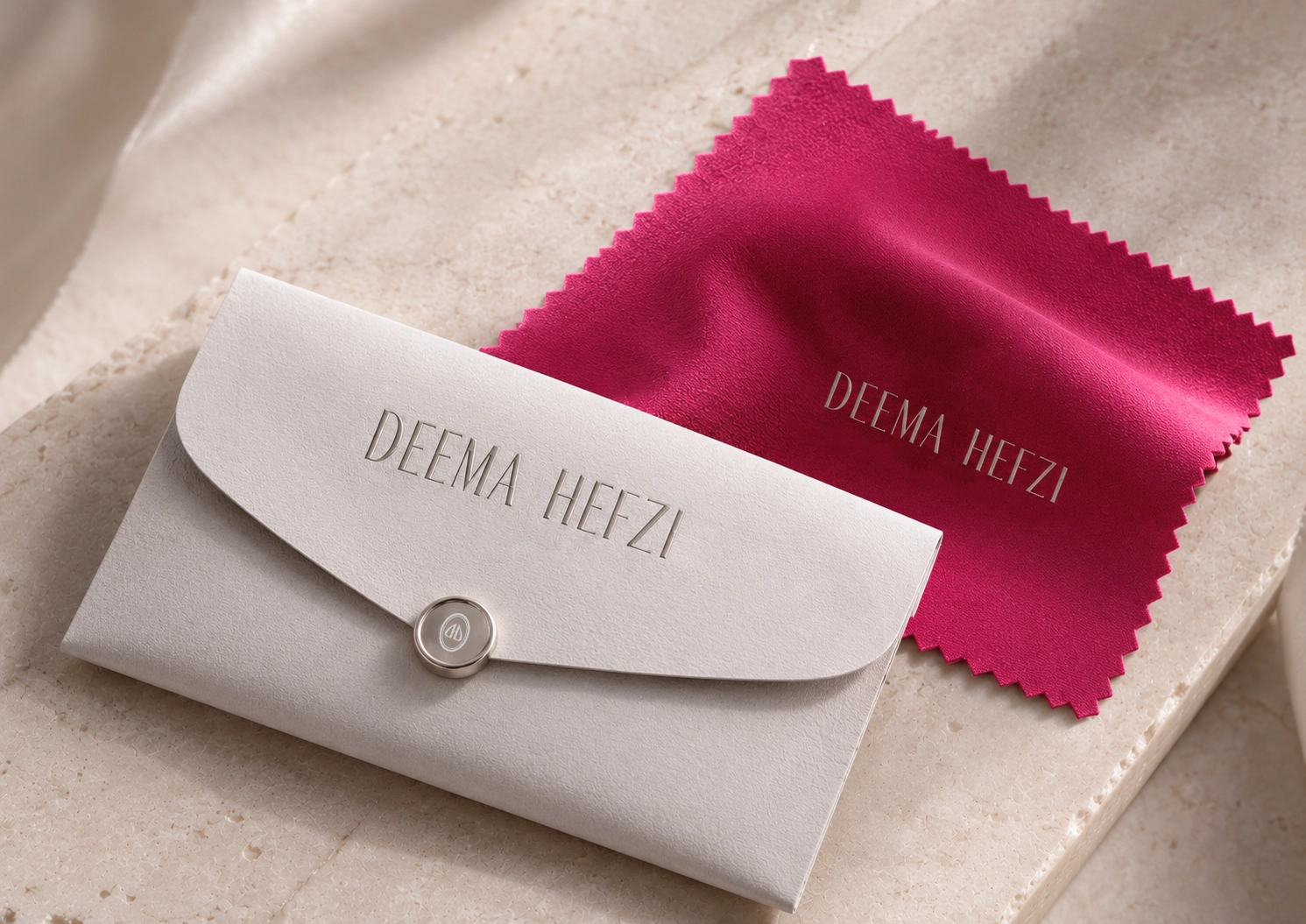
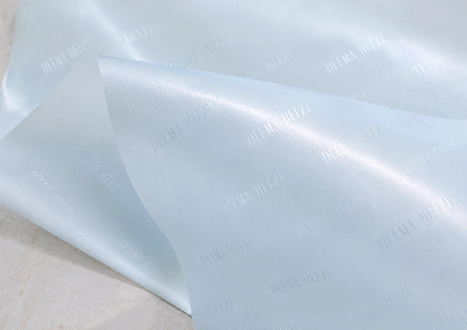
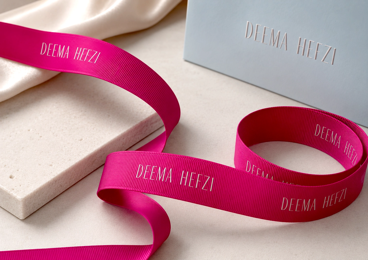
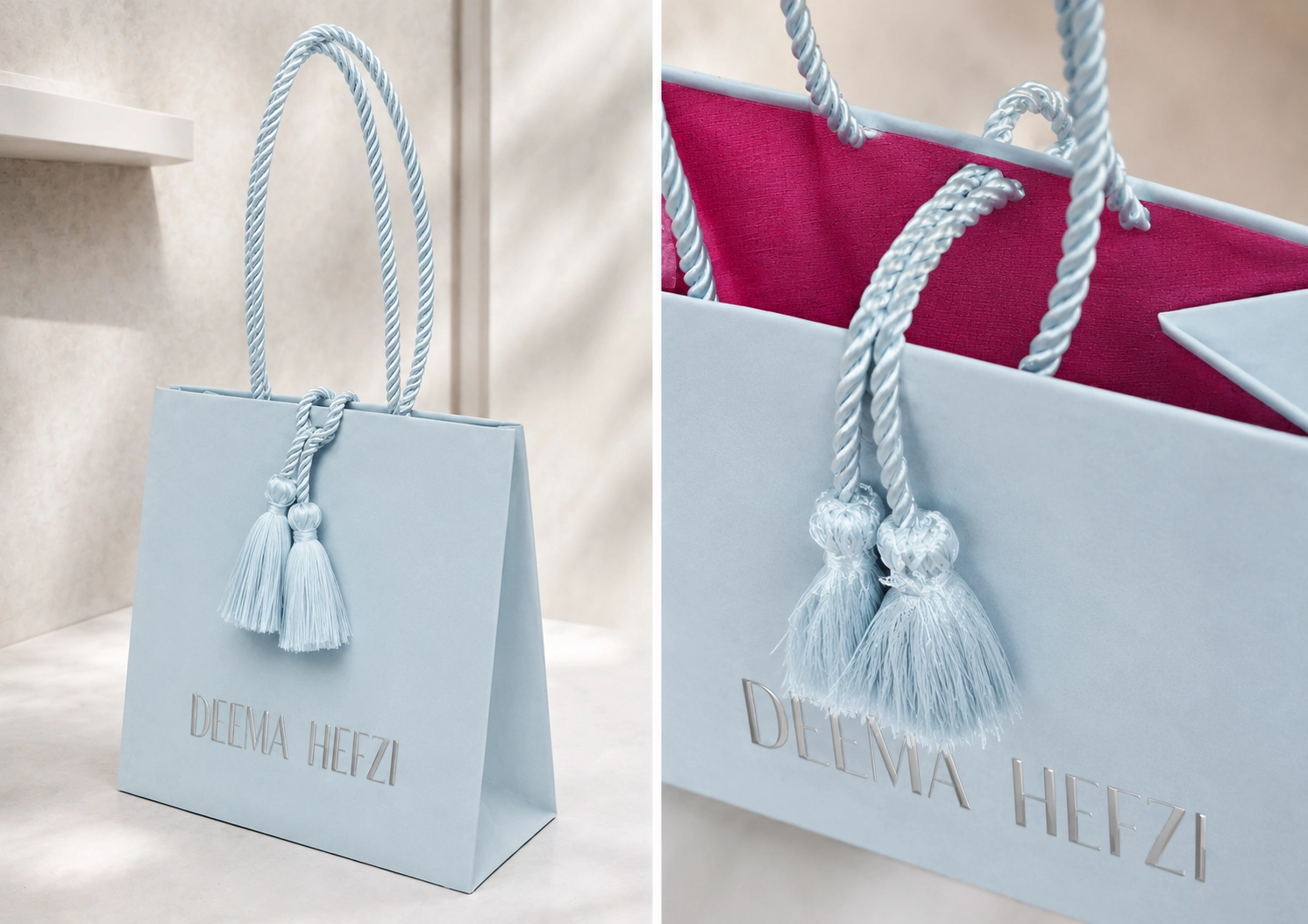
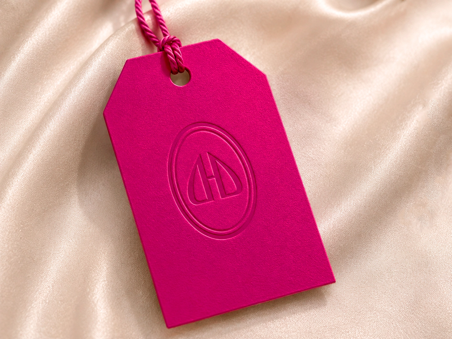
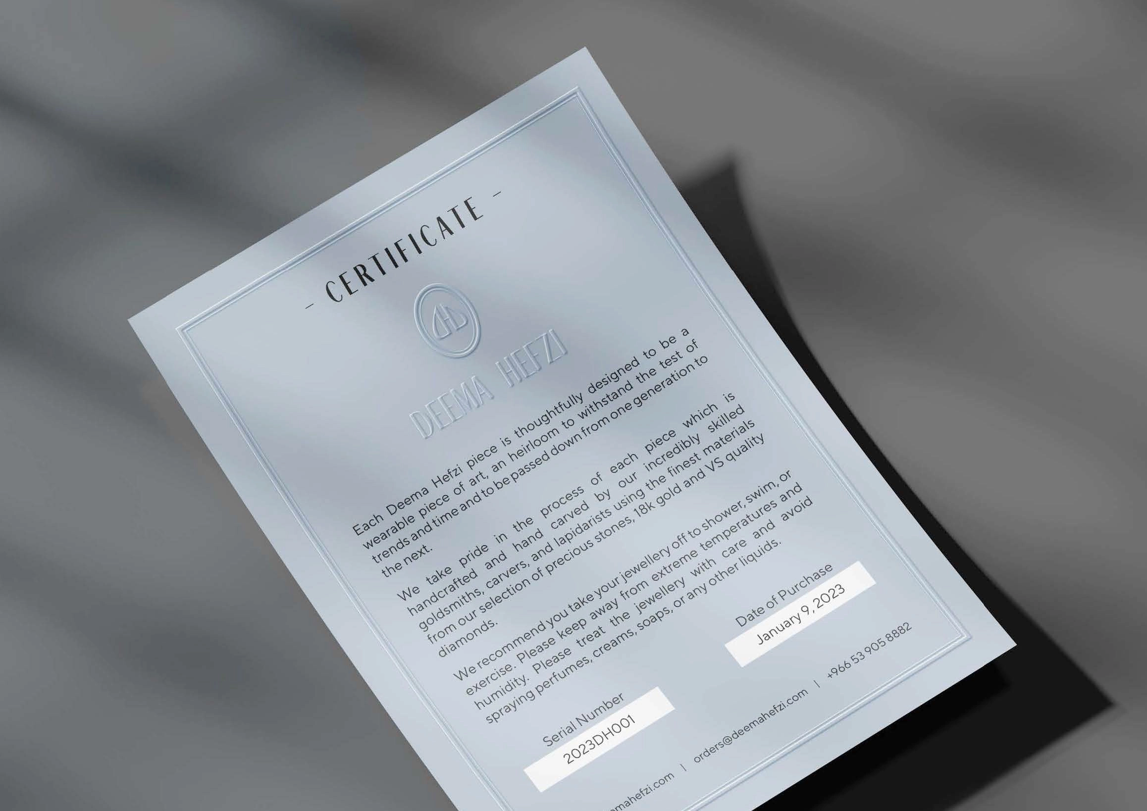
Redesign of the logo and corporate identity concept, layout of printed materials based on the new concept for a handmade jewelry brand
REASONS FOR REBRANDING
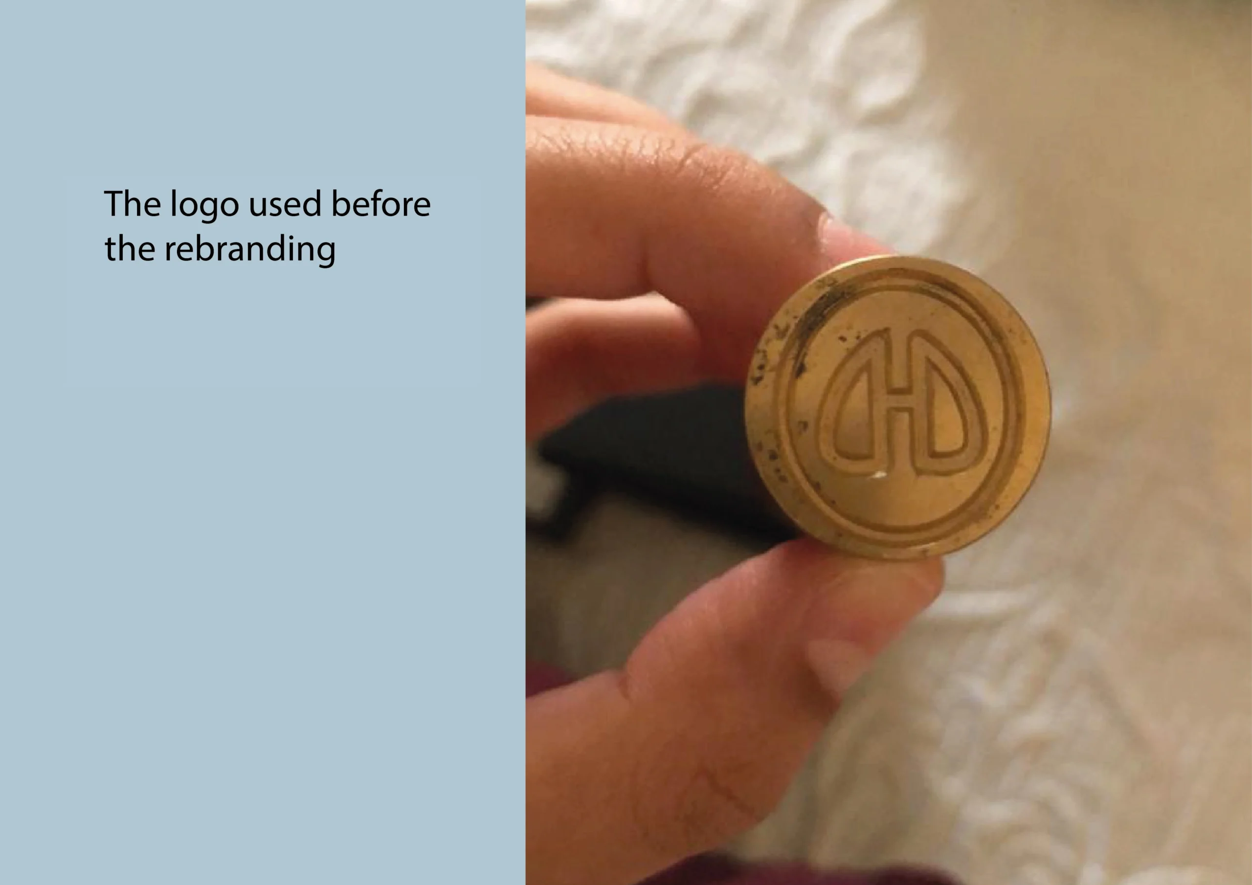
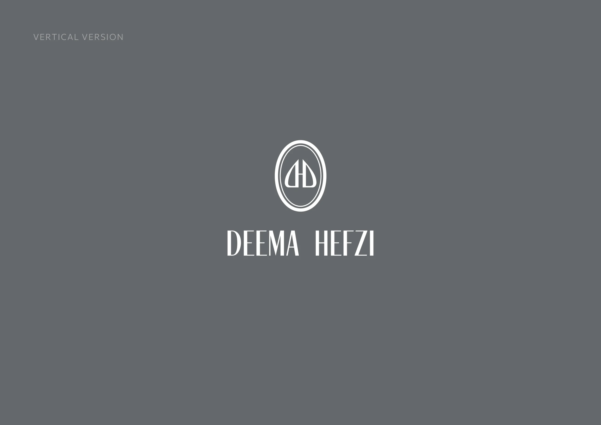
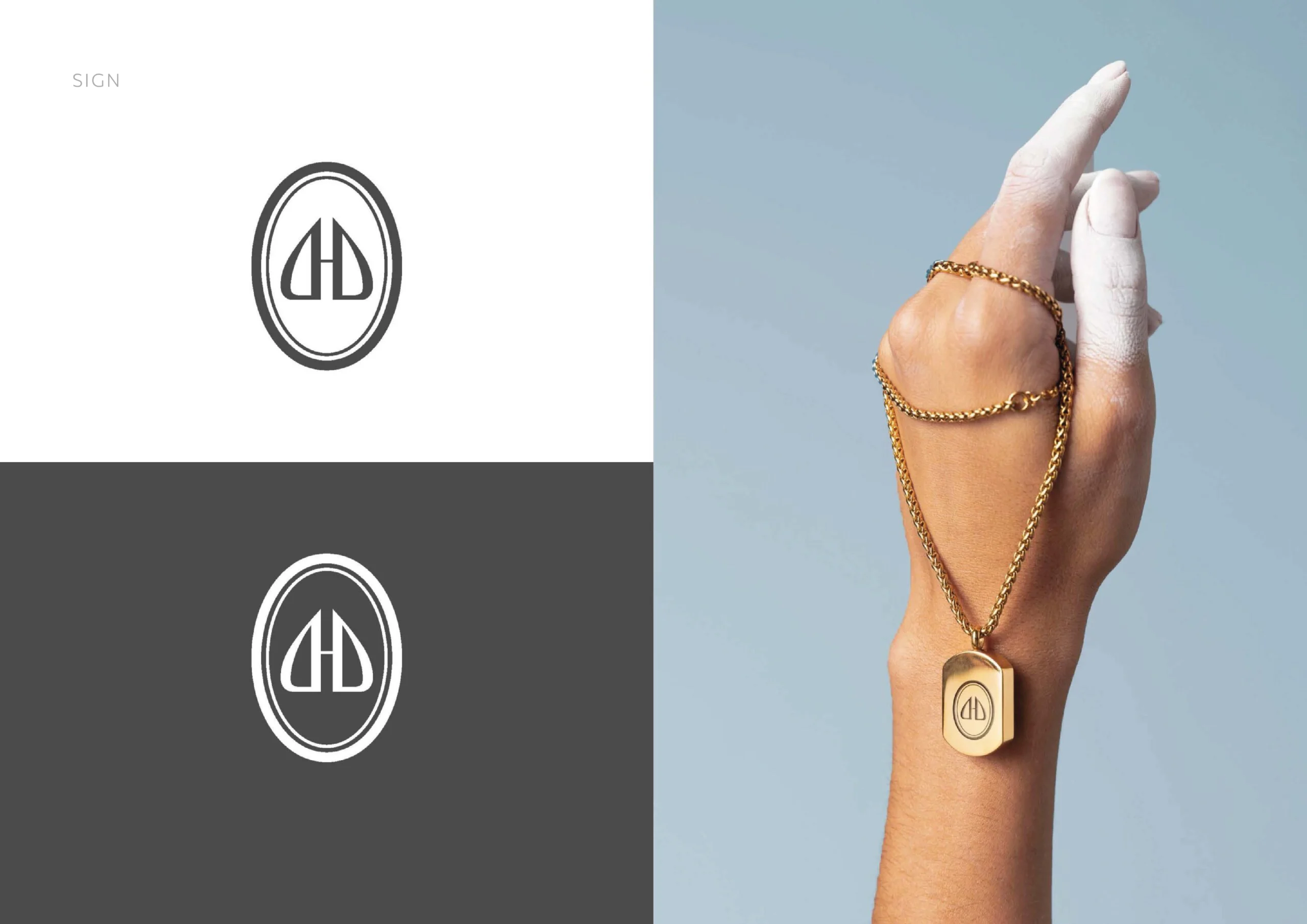
The current logo is based on a strong concept: the first letter of the brand name, “D,” in both its forward and mirror-reversed forms. This is a precise and apt solution that should be retained as the foundation of the new logo.
The problem lies not in the idea, but in its execution. The rough, heavy graphics fail to convey the brand’s essence—its lightness, femininity, and elegance. The logo is easier to read than the product itself, and therefore works against it.
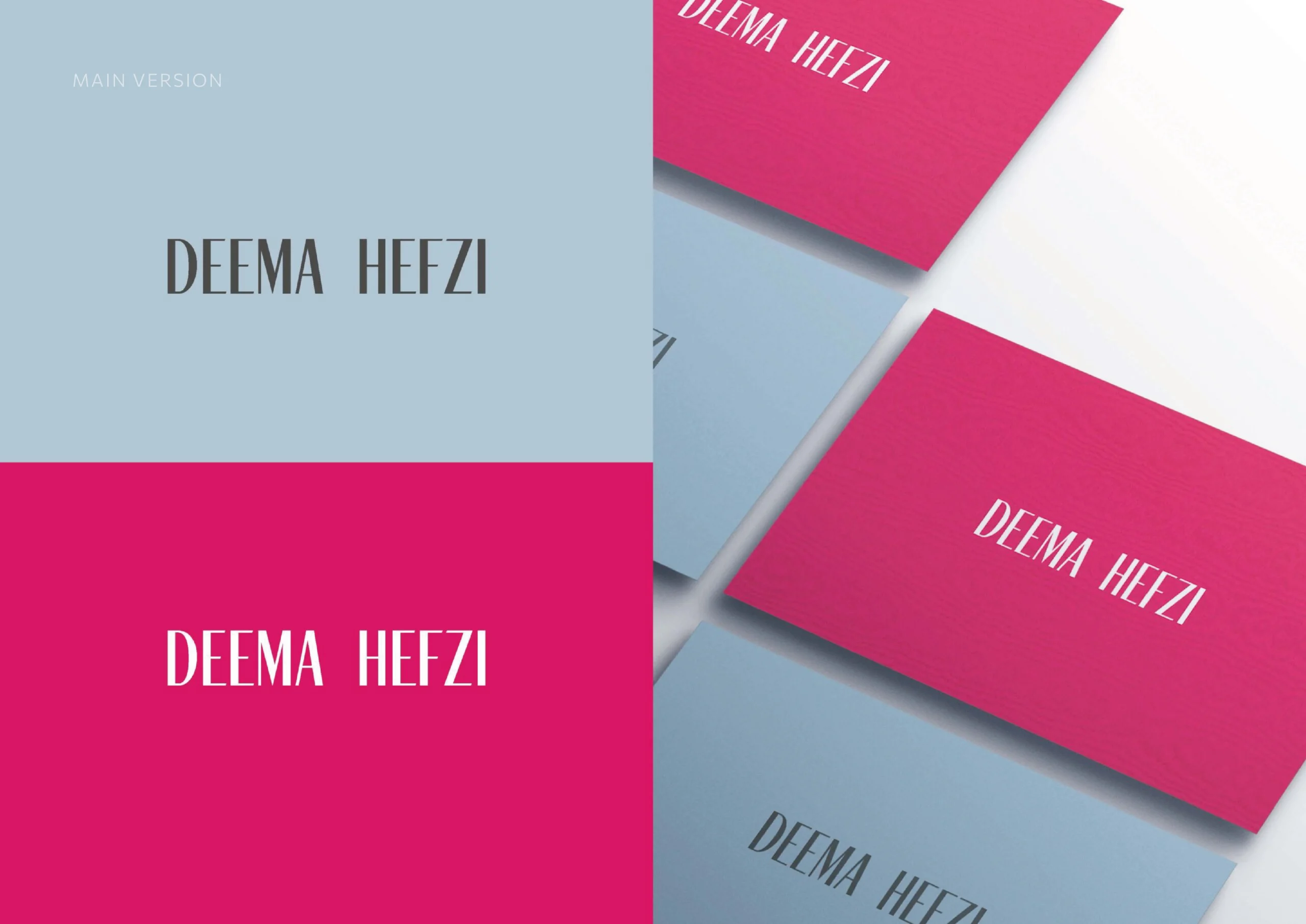
The rebranding retains the idea but gives it the fluidity, precision, and delicacy that the brand demands.
TASK
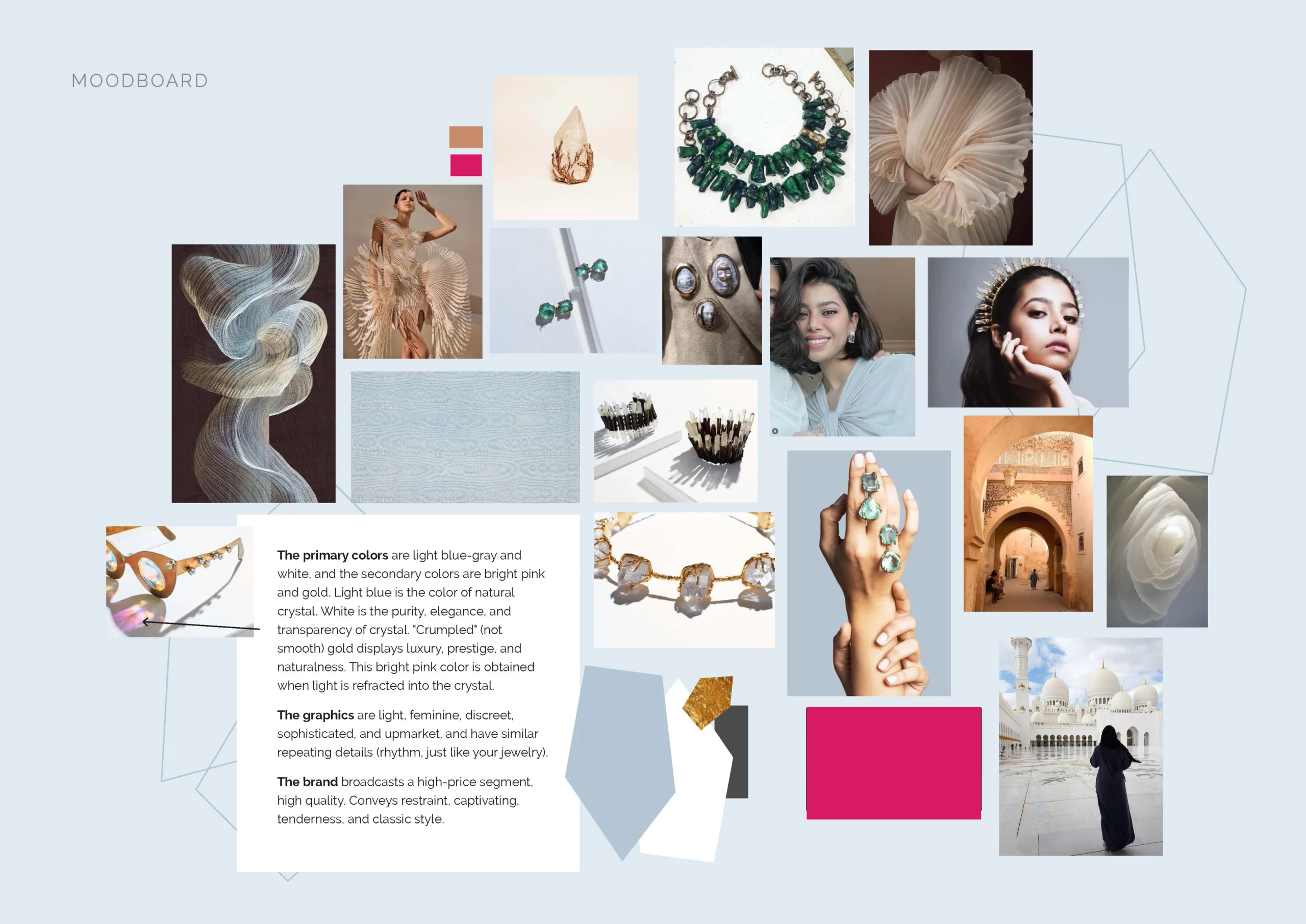
The logo should reflect a classic style, charm, restraint, and sophistication. It should be perceived as a symbol of prestige, status, and elegance: a form that doesn’t need embellishment to be noticed.
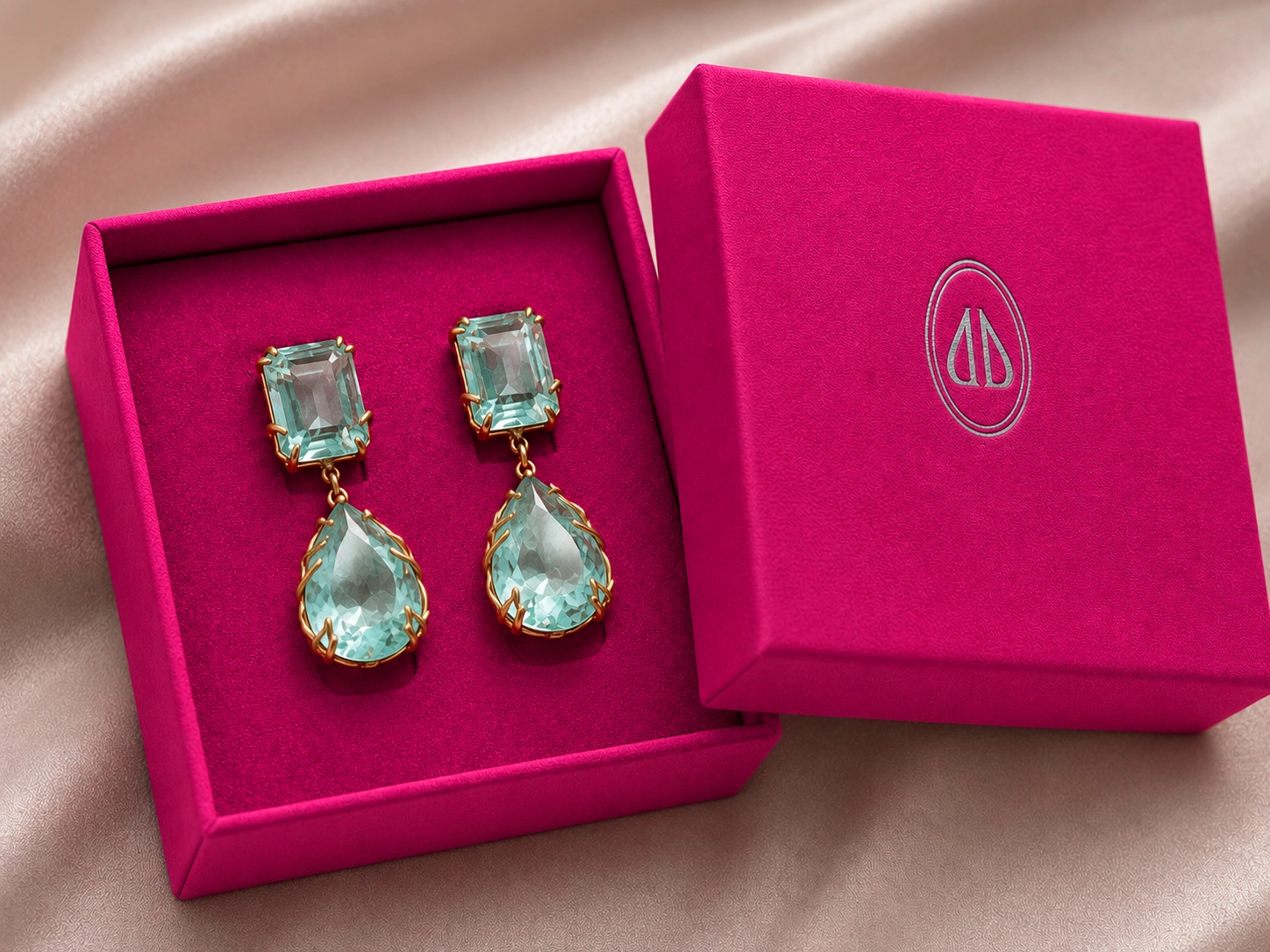
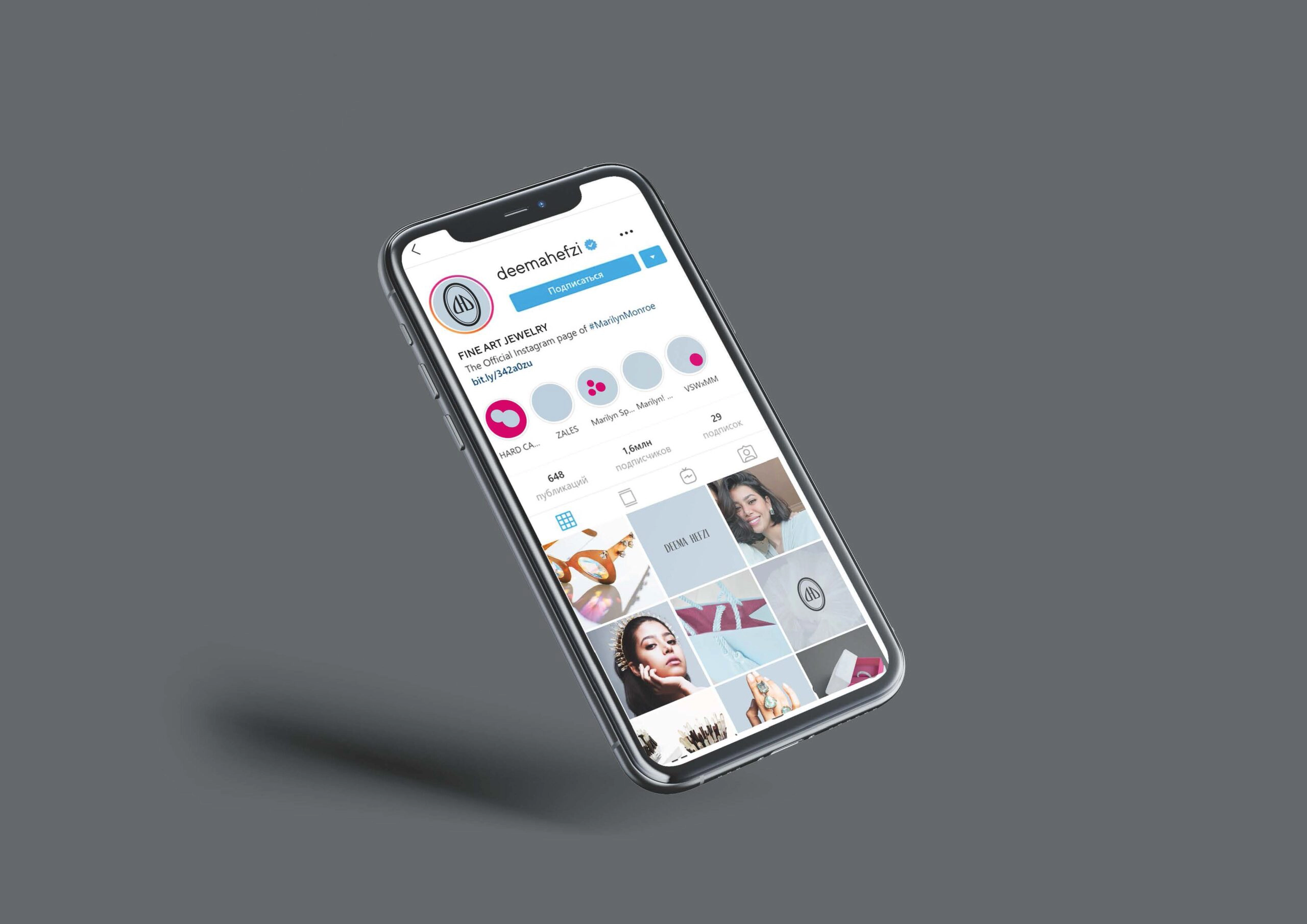
Recognizability here is built not on brightness, but on consistency. One symbol, one mood, one logic across all touchpoints—from packaging and certificates to storefronts, presentations, and digital media. With every encounter, the brand becomes clearer and more trustworthy.
This is a symbol for the discerning client—one who truly appreciates quality and craftsmanship and notices the details. Such a customer sees the level of craftsmanship in the finer details: in the proportions, the rhythm, the clean lines, and in how the logo sits on paper or metal. If the logo is executed flawlessly, the same flawlessness is expected from the product itself. This is exactly how trust and a sense of connection to the brand are born.
Key Moods
exclusivity
refinement
professionalism
meticulous precision
Points of Differentiation
Vibrant raspberry color
Raspberry pattern as a corporate graphic device
Saudi Arabia
Jewelry
Logo Redesign, Corporate Identity, Printing Layouts